Word Count: 5196
List of Figures:
Figure 1: Logo Designs (Oliver Lund, 2026)
Figure 2: Wireframe Designs (Oliver Lund, 2026)
Figure 3: Dark Mode Pages (Oliver Lund, 2026)
Figure 4: Light Mode Designs (Oliver Lund, 2026)
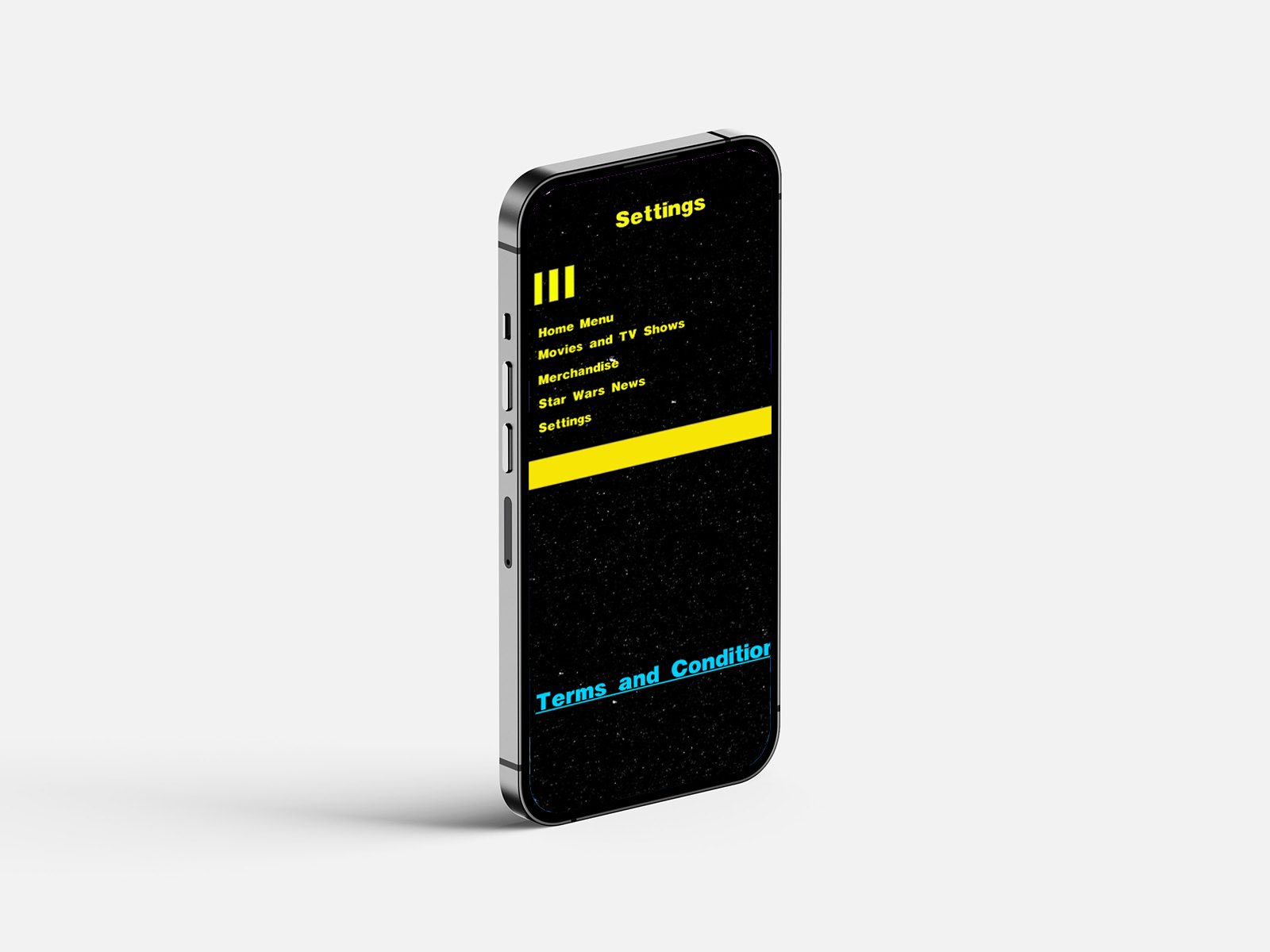
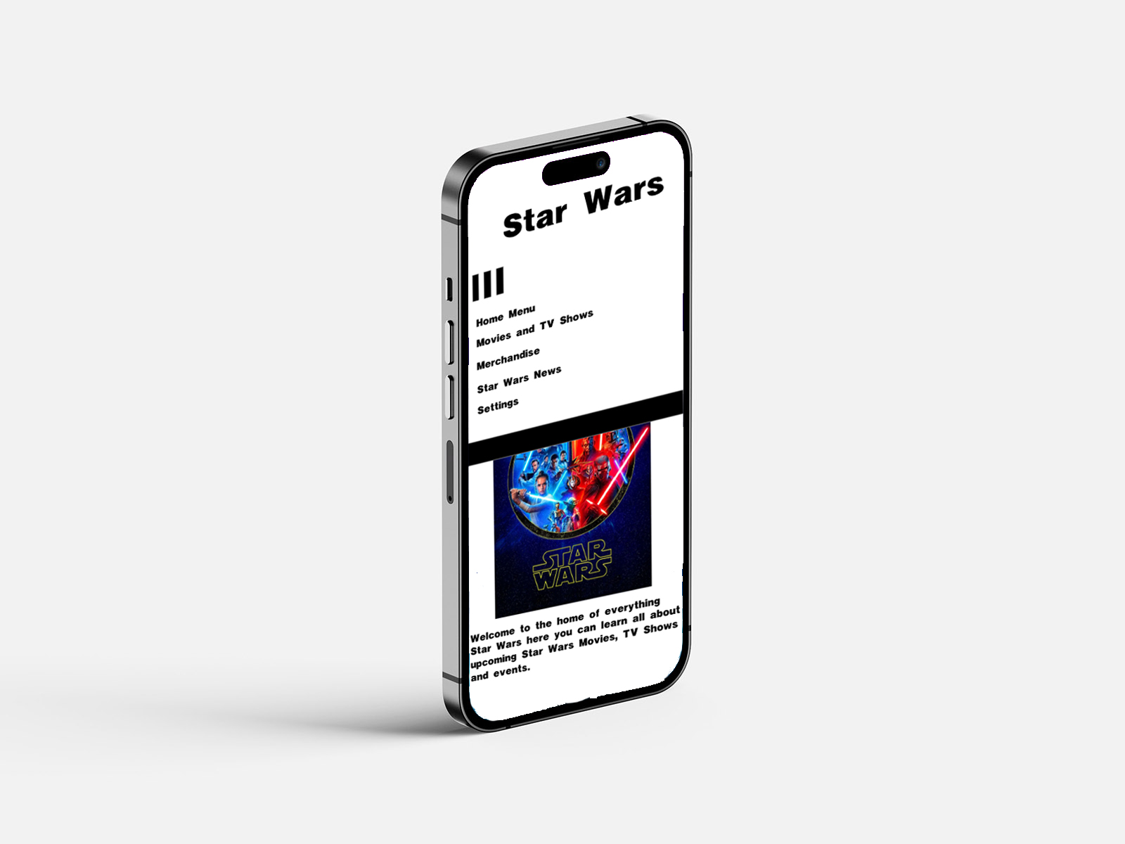
Figure 5: Wireframe Designs on iPhone (Oliver Lund, 2026)
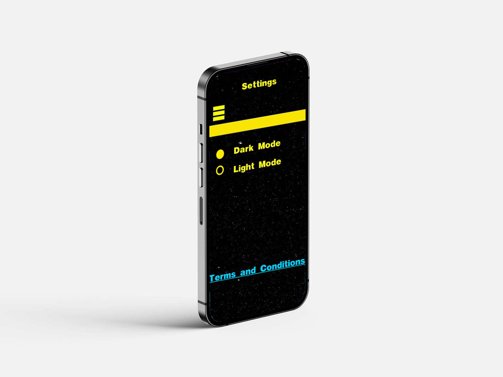
Figure 6: Dark Mode Designs on iPhone (Oliver Lund, 2026)
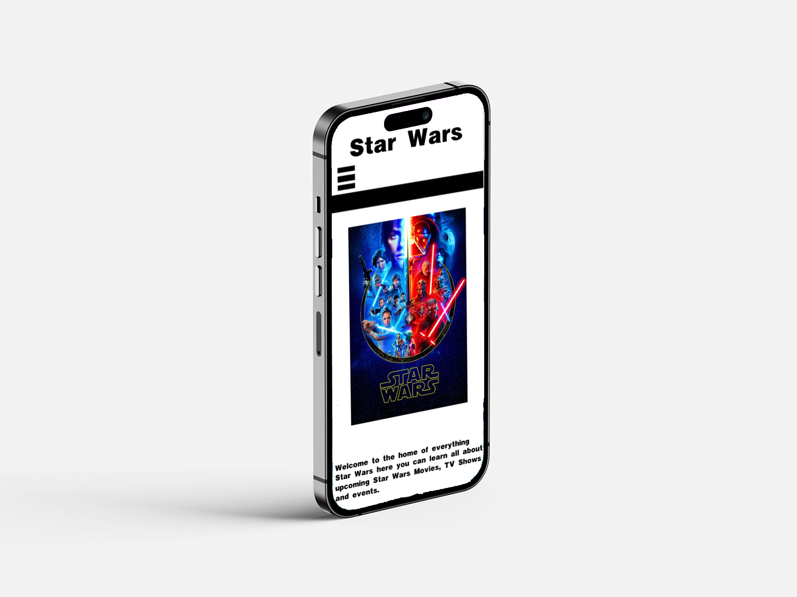
Figure 7: Light Mode Designs on iPhone (Oliver Lund, 2026)
Figure 8: Icons Image (Google Images)
Figure 9: Sketch Designs (Oliver Lund, 2026)
Figure 10: Annotations (Oliver Lund, 2026)
Figure 11: Timeline (Oliver Lund, 2026)
List of programmes used:
Photoshop
Adobe XD
Figma
Introduction
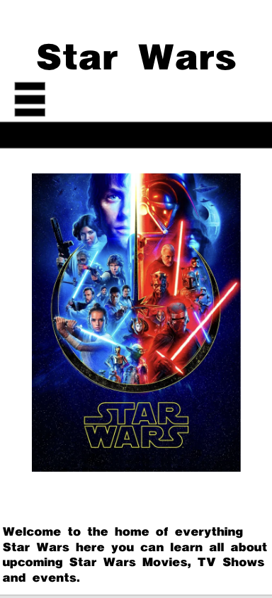
This project explores the design and development of my new app, SW: Media, designed for Star Wars fans. The project aims to create a user-friendly platform where fans of the franchise can access new updates of upcoming films, TV shows, news, and merchandise in one location. I developed this app because news about this franchise is highly fragmented across multiple platforms, forcing fans to rely on numerous sources for information. With this app, you will not have to rely on multiple sources; you can use it to get all the information you need.
In this portfolio, I discuss the design process undertaken to develop this app. This portfolio explores the planning, wireframing, interface design, and development decisions made throughout the project. Tools such as Figma and Adobe XD were used to prototype and design the interface, allowing experimentation with the layout, navigation, and user experience before producing higher-fidelity designs.
The portfolio also reflects the design decisions made during development, with consideration of user experience, accessibility, and usability. In addition, the project will demonstrate how the design aligns with Sustainable Development Goal 10 (Reduced Inequalities) by considering inclusive and accessible design principles.
I designed this application in Adobe XD as an informative mobile platform for Star Wars fans. The sole purpose of the app is to provide users with a centralised location to access upcoming news in the Star Wars franchise, including films, TV shows, news, and merchandise.
Information about the Star Wars franchise is often found on various websites, social media platforms, and online communities. As a result, it can be hard for fans of the franchise to find reliable, accurate, and up-to-date news. This application aims to address this issue by bringing key information, news, and updates of the franchise to the fans through an easy-to-use platform, so they do not have to scour the internet for the right information.
I designed this app to focus primarily on accessibility and usability, allowing users to quickly browse information and navigate to different pages effectively. By clearly structuring information in the interface, the design aims to improve the user experience for fans who want to stay informed about upcoming news and events.
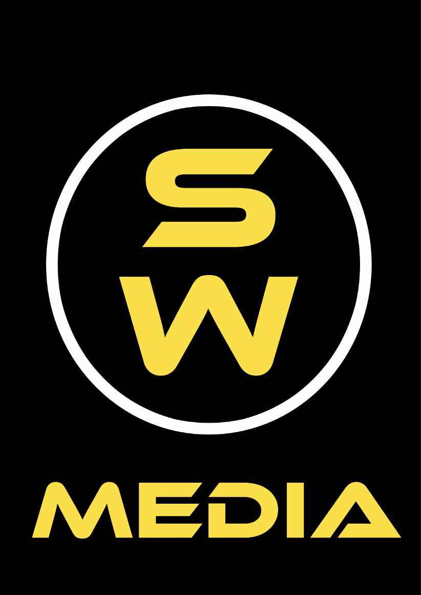
Figure 1: Logo Designs,
Source: Author's own work (Oliver Lund, 2026).
I developed the branding of this app to focus on clarity, recognisability and relevance to the targeted audience. The name SW: Media was created by abbreviating "Star Wars" and adding "media". I chose the word media because this app is designed for all forms of media and news across those industries, such as film, TV shows, news, and merchandising. Shortened naming conventions also help make the name more memorable for the audience. Shortened branding conventions are commonly used in digital media to make it easier for the audience to remember and help ensure compatibility across multiple devices such as phones, tablets and computers.
The existing iconography within the Star Wars universe heavily inspired the logo designs. In three of the logo designs, I used logos that are prominently featured in the Star Wars franchise: the Jedi and the Sith logos. This was done to help establish immediate visual recognition and familiarity for users, which is an important aspect for effective brand identity design.
The third logo was developed by merging the Jedi and Sith logos. The combined design approach was made to help position this as a centralised hub for all forms of Star Wars media and news. The merging logo was meant to convey getting the best of both worlds, whether that is Jedi or Sith. However, whilst the design is thematically strong, there is a potential limitation to originality, as relying on existing franchise symbols can make the app itself seem less distinctive. Future iterations of the logo can explore more distinctive visual elements to create a stronger, standalone identity.
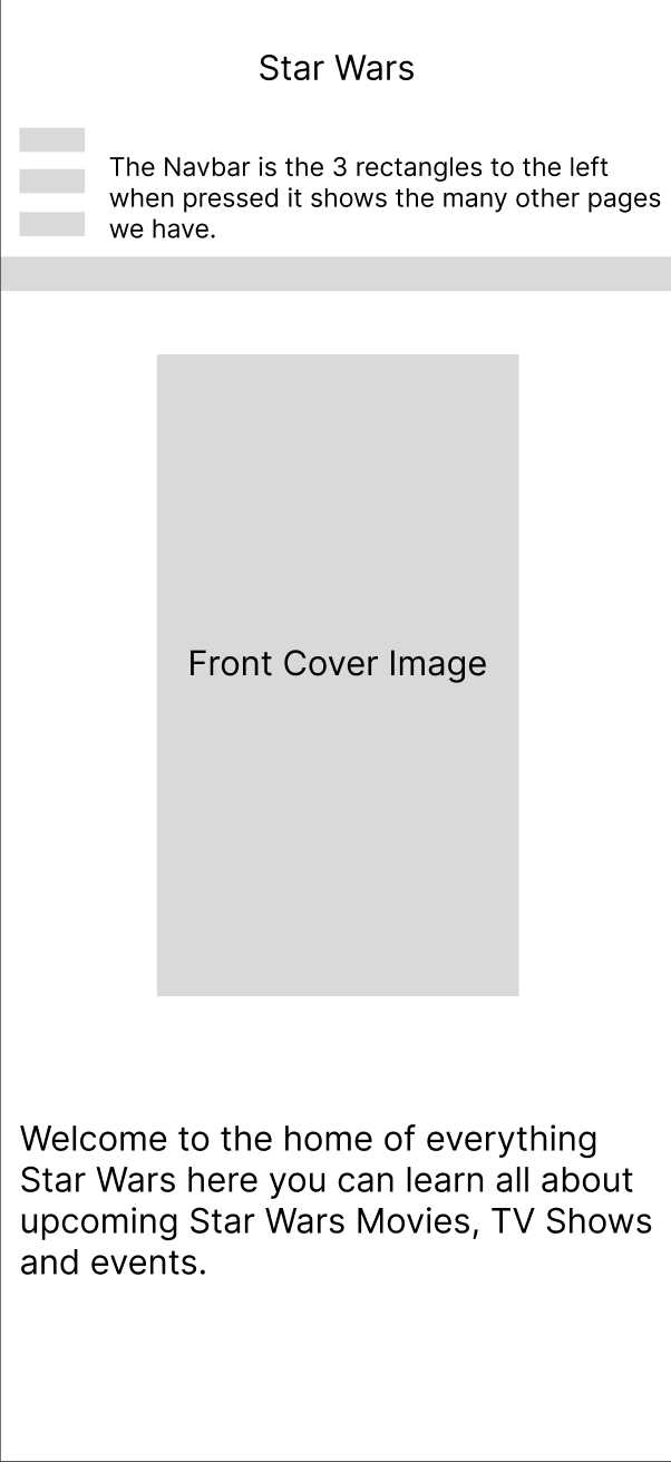
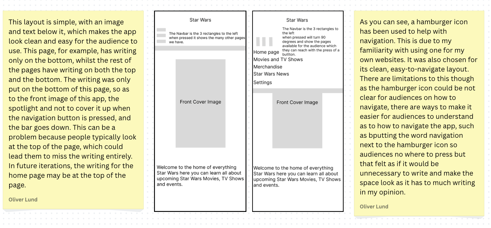
Figure 2: Wireframe Designs,
Source: Author's own work (Oliver Lund, 2026).
Wireframing is an important part of the user interface design process as it prototypes layout ideas before further developing them into high-fidelity designs. The wireframes I created in Figma focus on the app's layout, navigation, and structure, rather than just visual styling. This stage allowed me to experiment further with multiple layout structures and gave me a clearer understanding of how the app should function visually and practically.
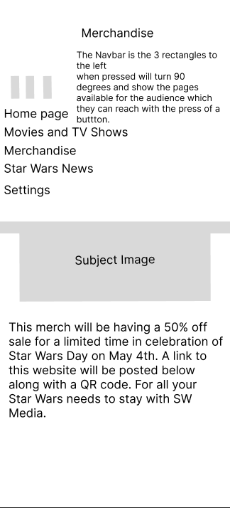
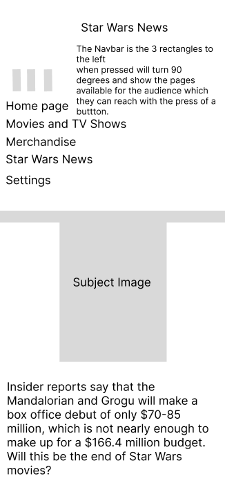
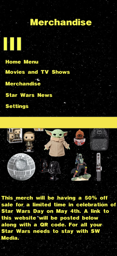
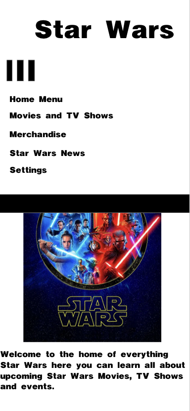
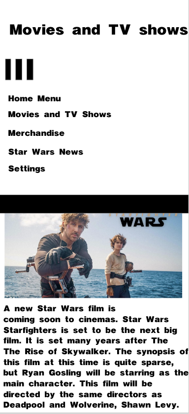
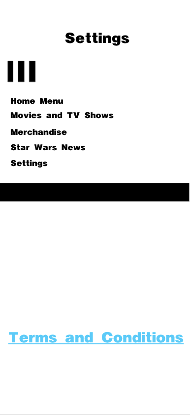
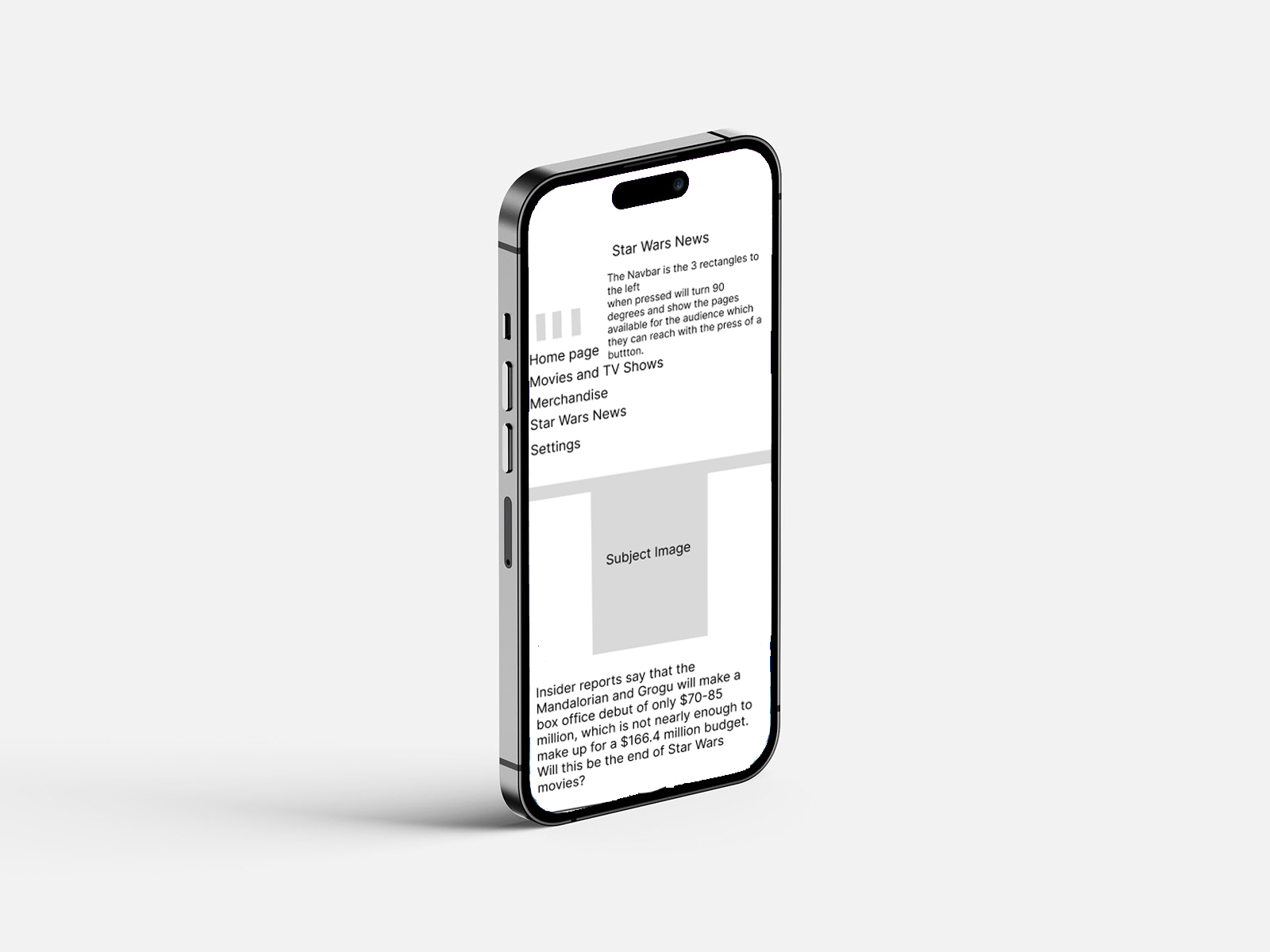
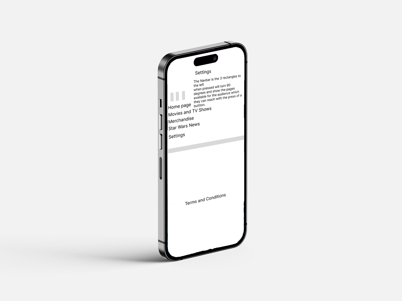
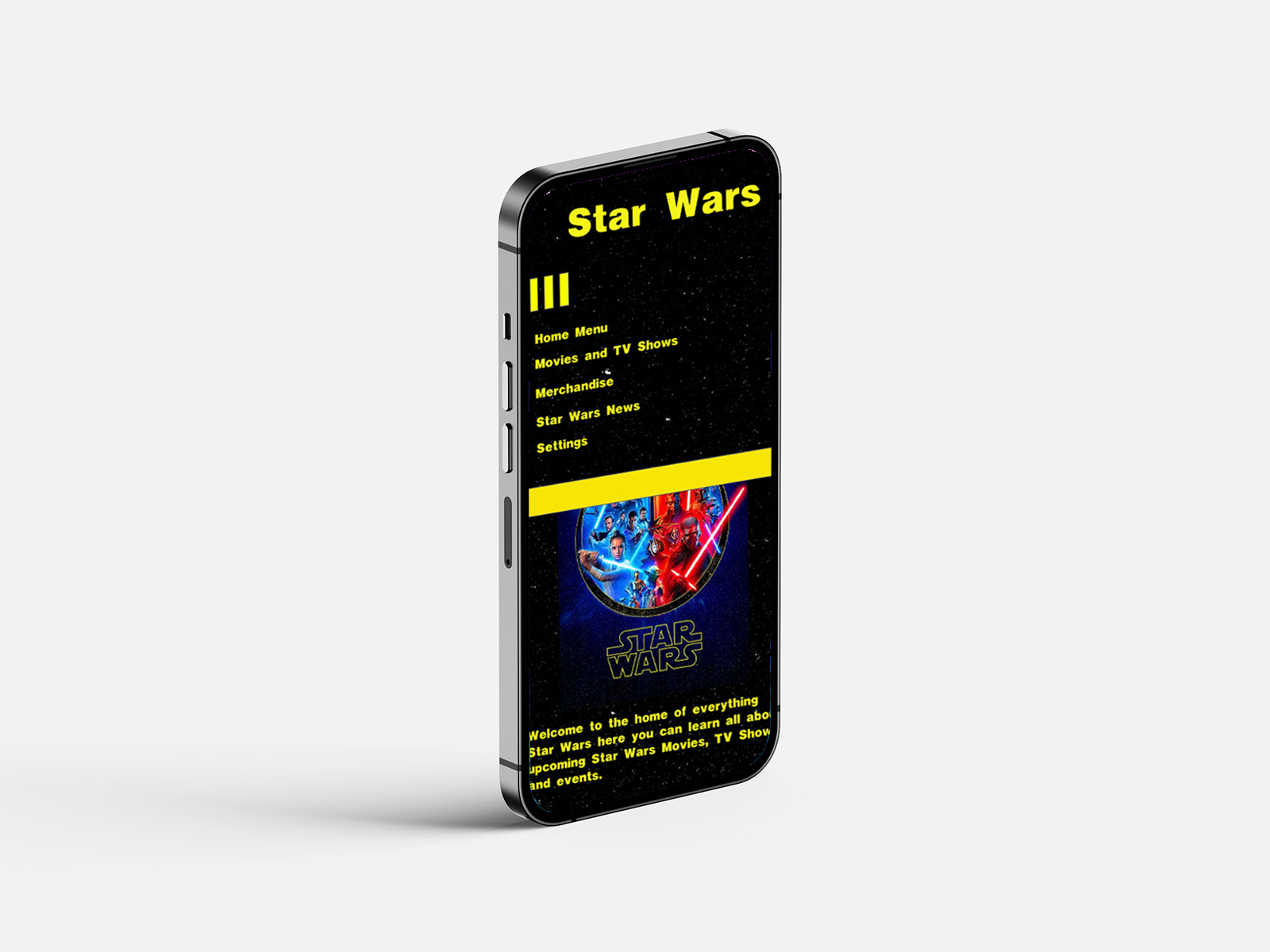
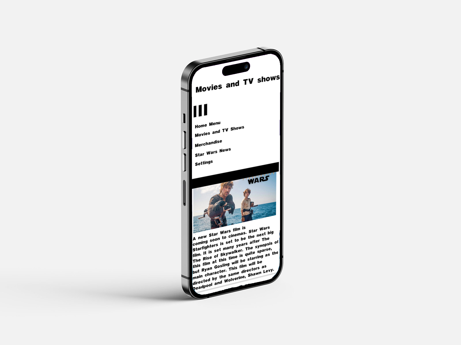
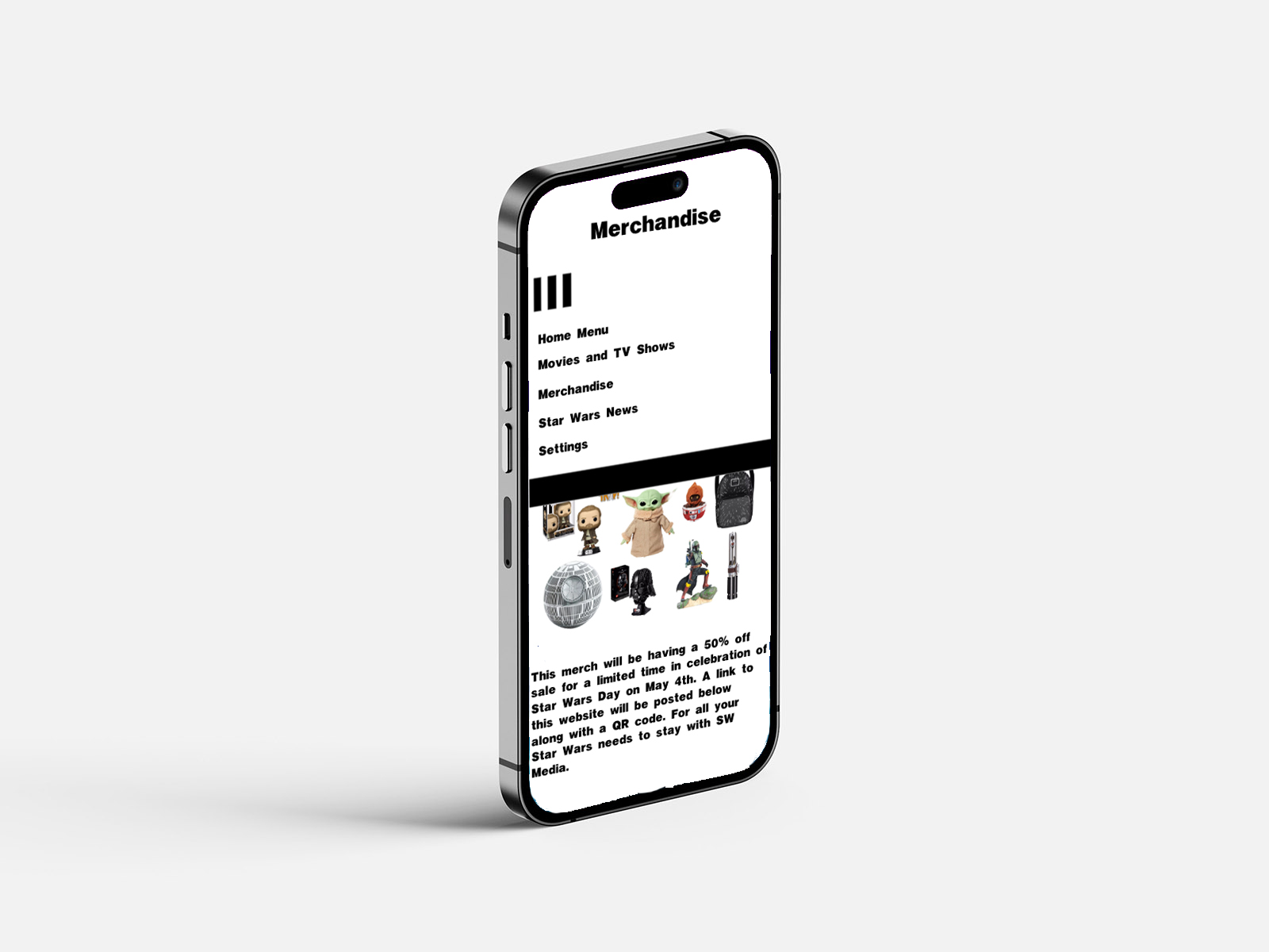
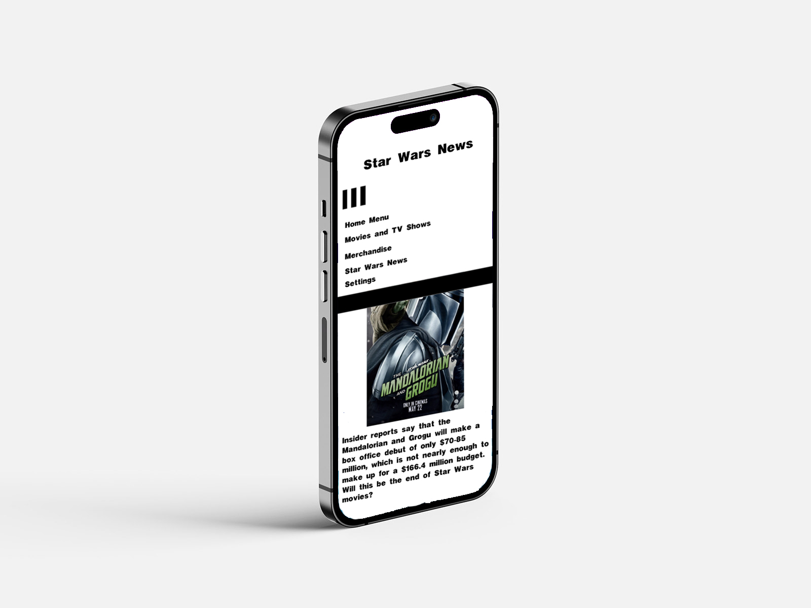
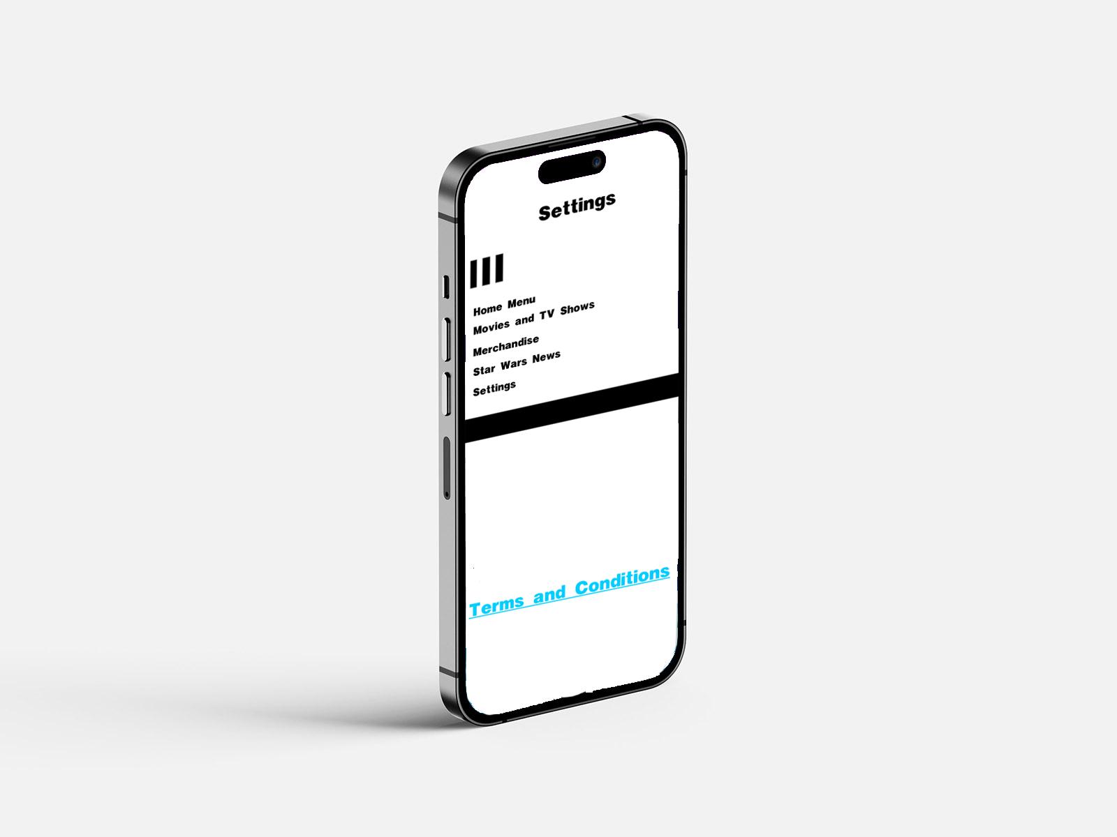
The layout shown in the wireframes follows a common mobile UX convention to ensure familiarity and ease of use. A hamburger icon on the left of the screen helped people navigate key sections of the app, such as films, TV shows, news, and more. The use of a hamburger icon aligns with established interface design conventions that promote familiarity and ease of navigation for the audience (Tidwell, Brewer, and Valencia, 2019). However, while patterns such as this can improve usability through recognition, they can also cause problems and reduce the visibility of navigation options compared to more advanced menu systems (Tsiodoulos, 2016), highlighting a trade-off between simplicity and discoverability.
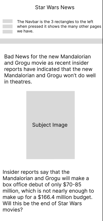
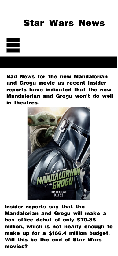
Information hierarchy played a significant role in structuring the interface, with key information, such as breaking news about upcoming films and TV shows, placed at the top, since that is where people typically look first when opening the app. Secondary information, such as discussing what the film is about, would be further down the page, although it is important; announcing the film would be at the top to help grab people's attention and encourage them to continue reading.
Several Wireframe iterations were made before arriving at a final layout. The early iterations explored different navigation placements and content structures. During the redesign, I refined the user journey and removed unnecessary features to make the app easier to use for all consumers. This resulted in a clean and accessible design for all users.
The target audience for this application is Star Wars fans who actively follow news about the franchise, such as upcoming films, TV shows, news, and merchandise. Therefore, these wireframes help structure the app to prioritise quick access to updated information and media content, ensuring users can browse more quickly and navigate to the information they want with ease.
The wireframes were further developed with mobile usability in mind. Key interactive elements were positioned at the top of the screen to make them easier to see and reach for all app users. This approach follows modern mobile UX design principles, which emphasise ergonomic interaction patterns.
Figma was used to develop the app's wireframes because I am familiar with it, it has design features I like, and it offers prototyping capabilities. The software allowed me to experiment further with different layout ideas for my app and led me to develop these wireframes into higher-fidelity versions in Adobe XD. Furthermore, navigation design plays a critical role in usability, as poorly structured interfaces can negatively impact user interactions and reduce their satisfaction (Umar et al., 2024), suggesting that further refinement of navigation can improve the overall experience.
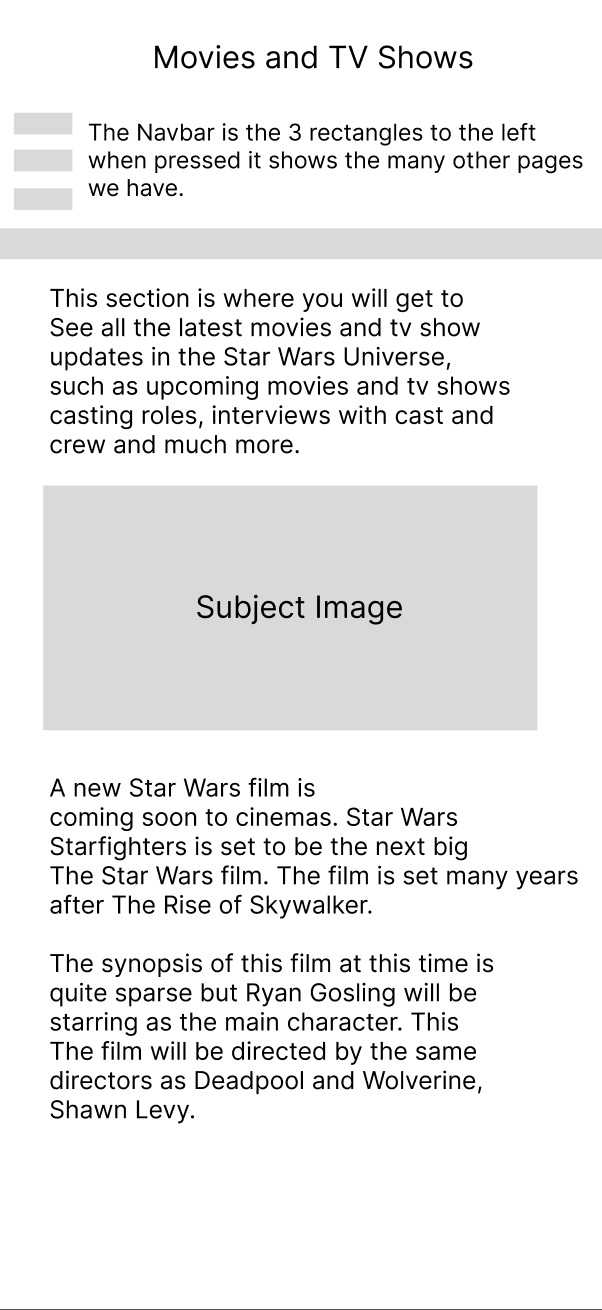
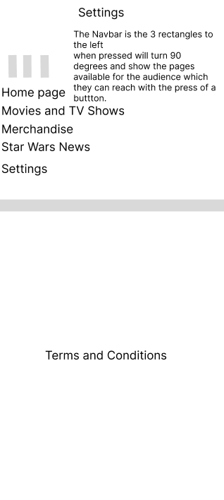
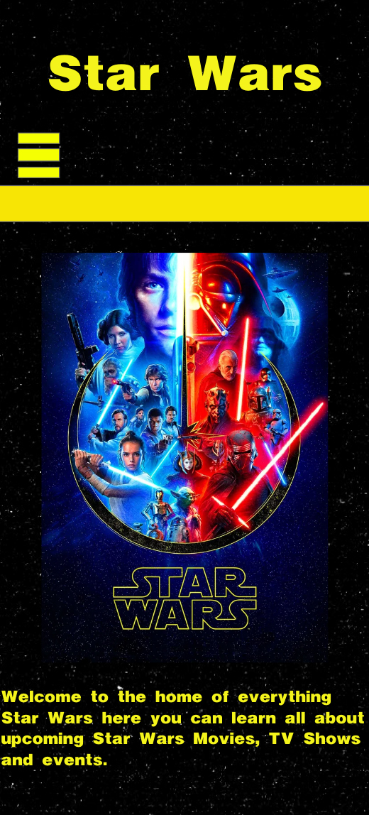
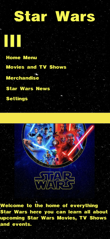
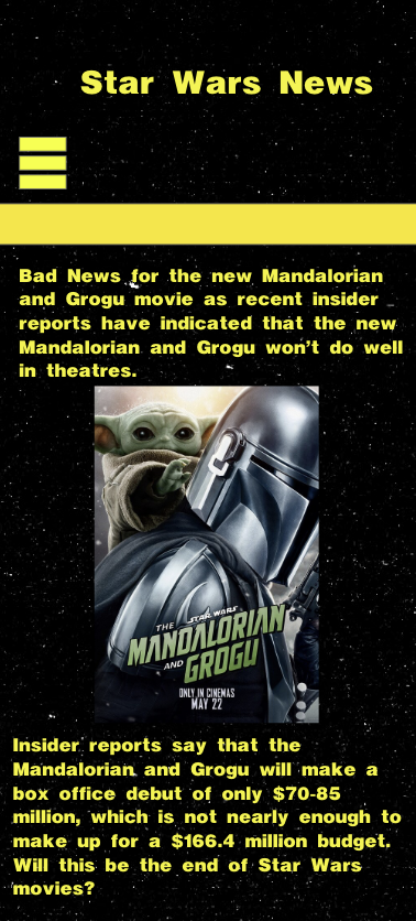
Figure 3: Dark Mode Pages,
Source: Author's own work (Oliver Lund, 2026).
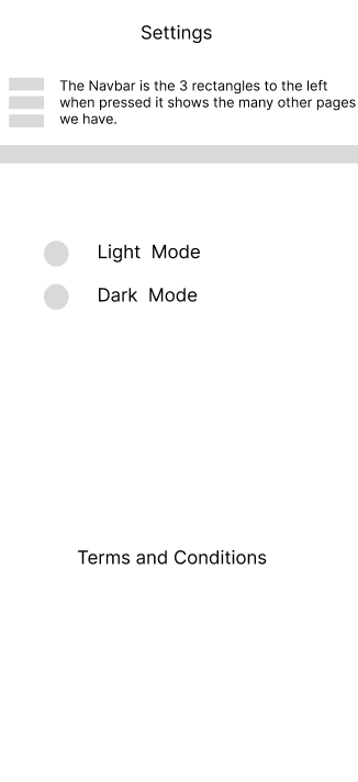
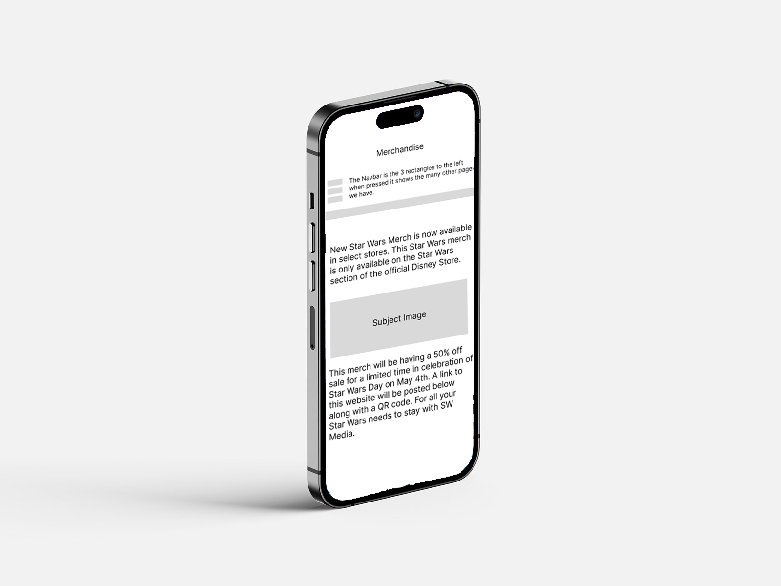
Figure 4: Light Mode Designs,
Source: Author's own work (Oliver Lund, 2026).
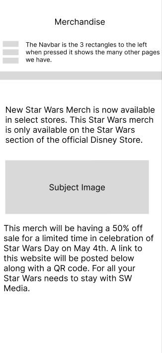
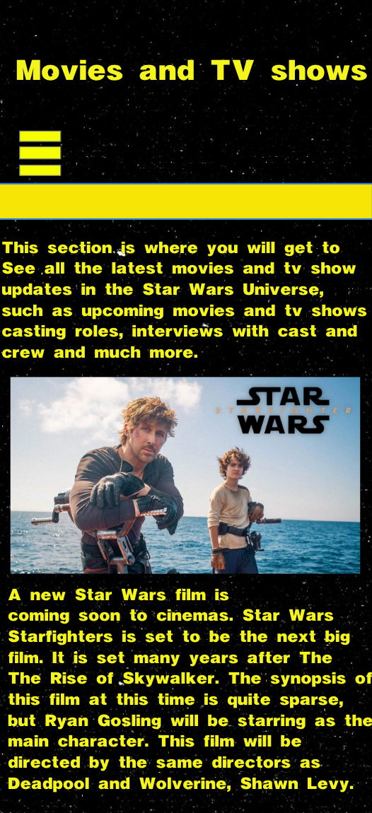
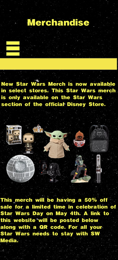
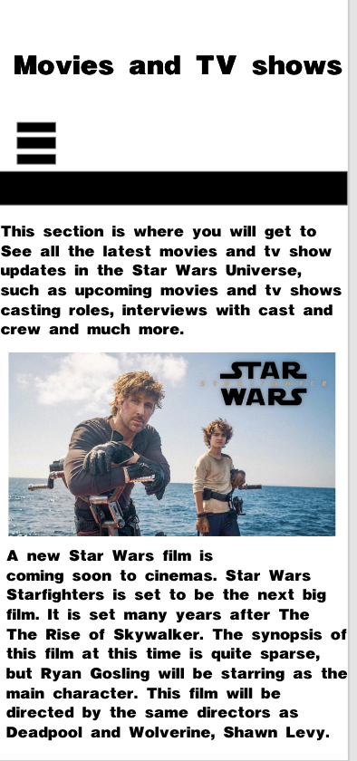
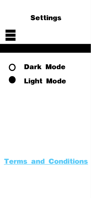
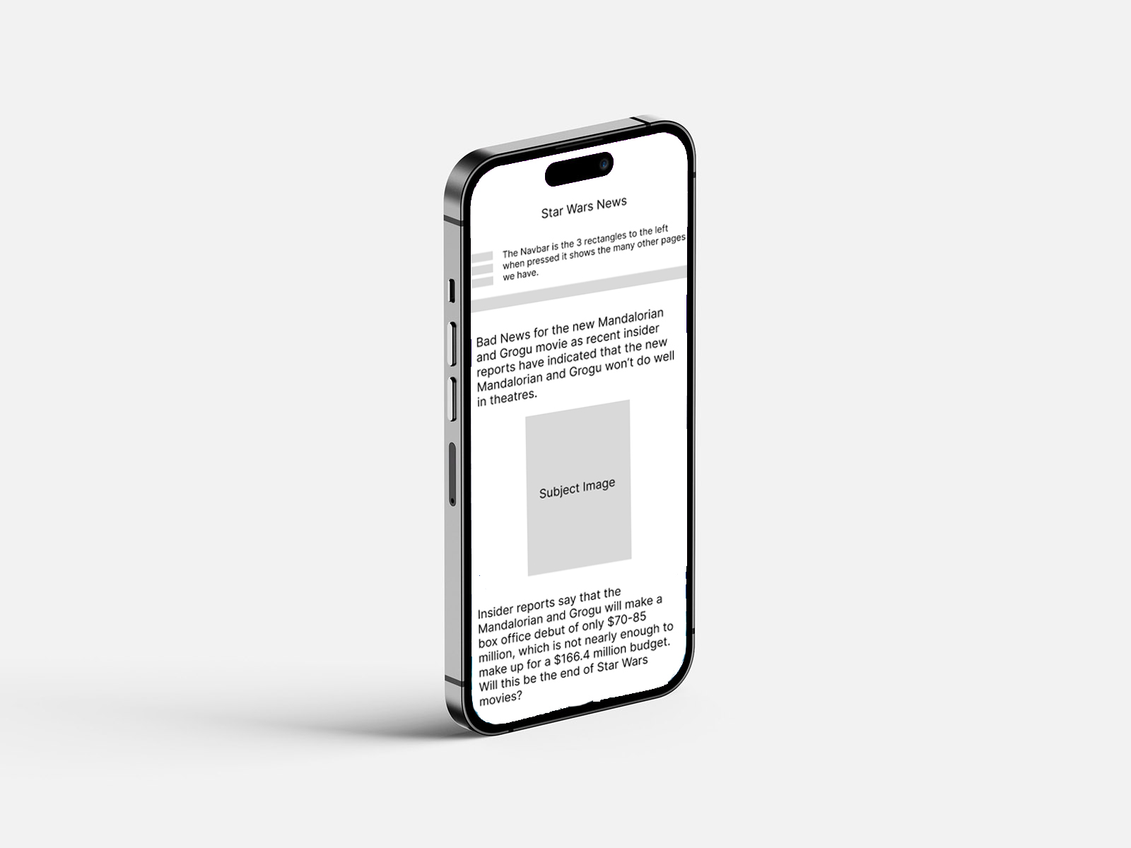
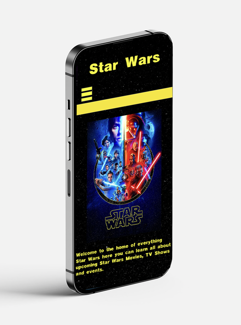
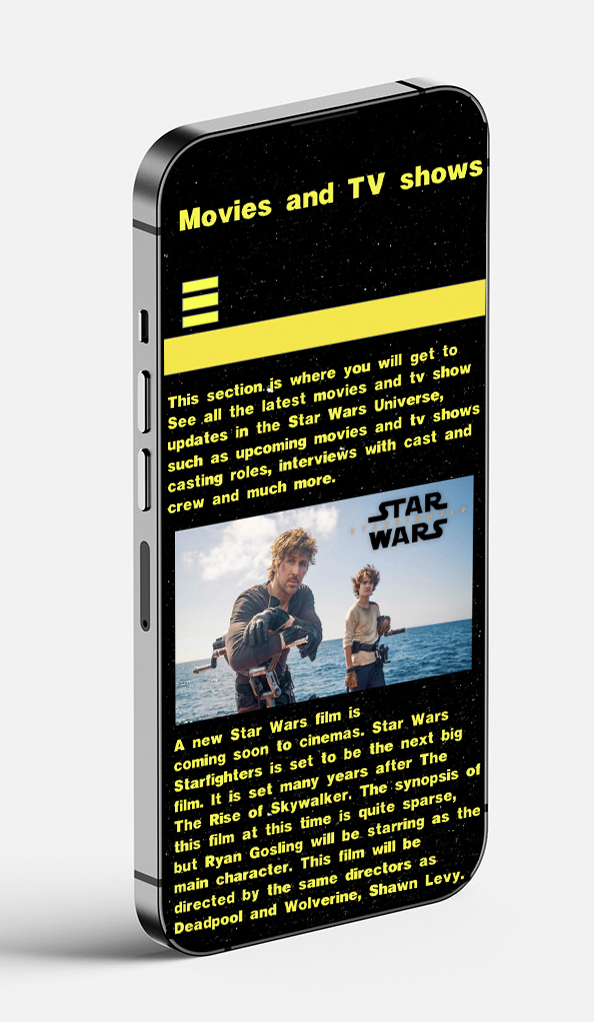
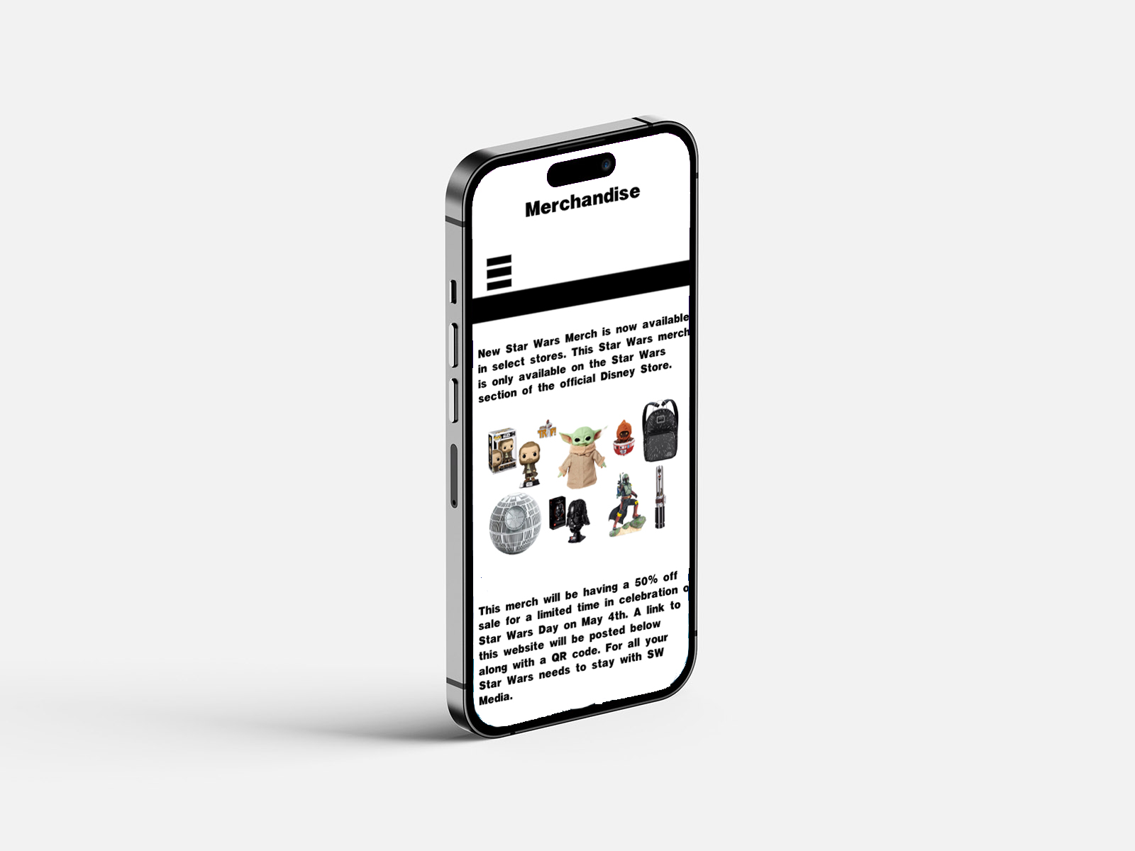
Here are the page designs I created for the app, showing what it would look like if fully coded and functional. As you can see, there are two design options: light mode and dark mode. This will give the audience the option to customise the app's design as they see fit. When designing these pages, I chose to use an iPhone 14 Pro Max format as I believed that to be a suitable format, as iPhone is in the lead of global market shares as of Q4 2025 (Counterpointresearch.com, 2026), meaning that Apple phones are the most sold phone brand in the world, making it suitable to base my designs upon. iPhone is also a brand I currently use, so it helps me understand how the app's layout should look.
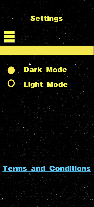
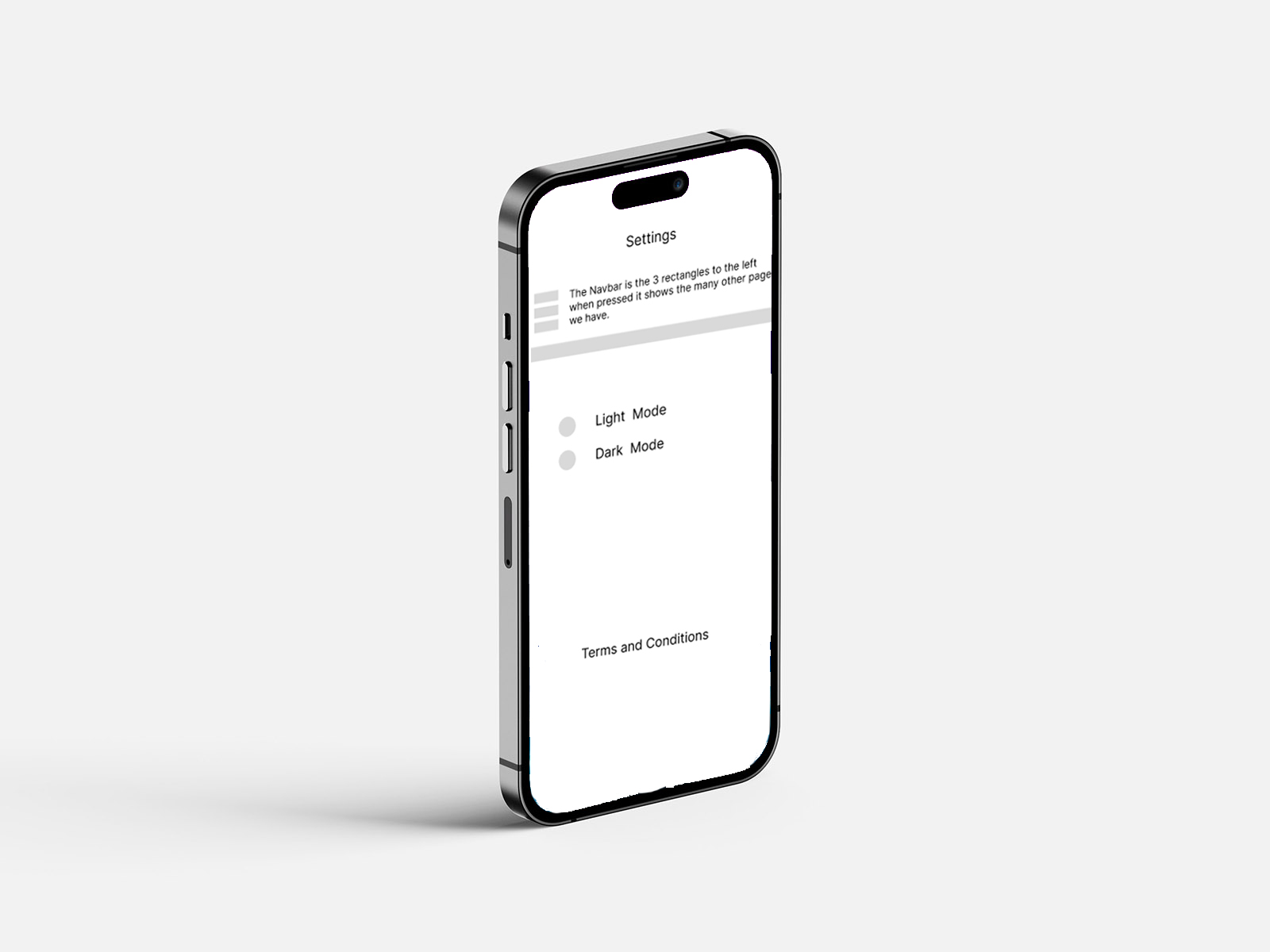
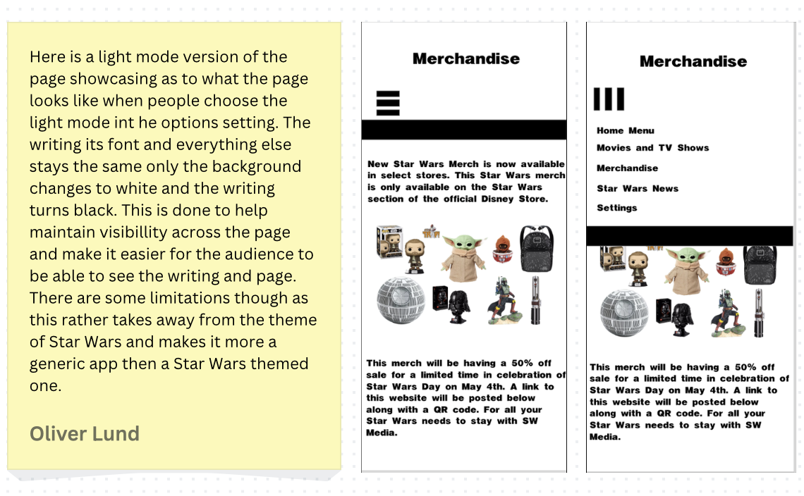
When designing this app, there will be light and dark mode options to improve accessibility for users. Initially, it will be in dark mode, which can be easily changed in the app's settings. It will be designed with dark mode on because it is the more popular choice between light and dark modes (Motin, 2025) and is more in theme with Star Wars, a franchise primarily set in space. The dark mode helps to reinforce the cinematic aesthetic of the Star Wars franchise by reflecting its space-based environment and high-contrast visual style.
Light mode is known to offer many benefits for audience members, such as faster reading and higher comprehension, which is why it will be added as a feature in the app's settings. However, when opening the app for the first time, they will see it is in dark mode, since more people use dark mode. Research suggests that both light and dark mode can impact visual fatigue, although dark mode may help to reduce some symptoms of eye strain depending on the context of use (Sengsoon and Intaruk, 2025). Research suggests that both dark and light modes offer distinct usability advantages depending on context and user preferences (Atsani, Mukaromah, and Haikal, 2025), highlighting the importance of offering customisation rather than relying on a single default.
In the context of the Star Wars app, dark mode plays a key role in aligning with the franchise's visual identity and tone and helping to set the theme and tone of the franchise. This is due to the franchise being primarily set in space, and with its high-contrast lighting and cinematic visuals, dark mode further enhances the visibility of the visual elements and strengthens the overall aesthetic of the interface.
Dark mode also helps support the franchise's accent colours, such as blue and red, used for its lightsabers. These can guide the audience's attention and reinforce the franchise's brand identity. These colours help stand out more effectively against dark mode, improving visual hierarchy and clarity. The use of contrast also contributes to the visual hierarchy in interface design, guiding user attention effectively (Verhoeff, 2012), though excessive reliance on contrast can overwhelm users if not carefully balanced.
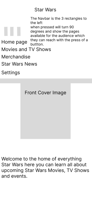
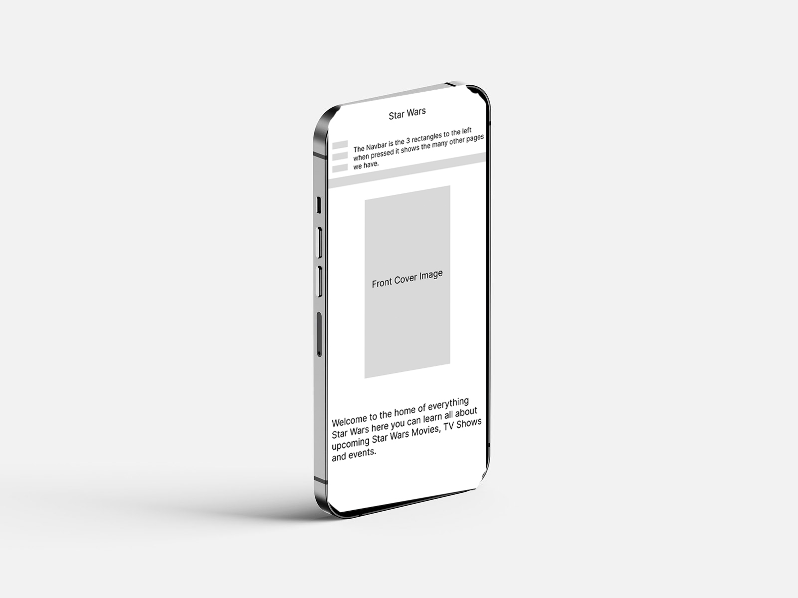
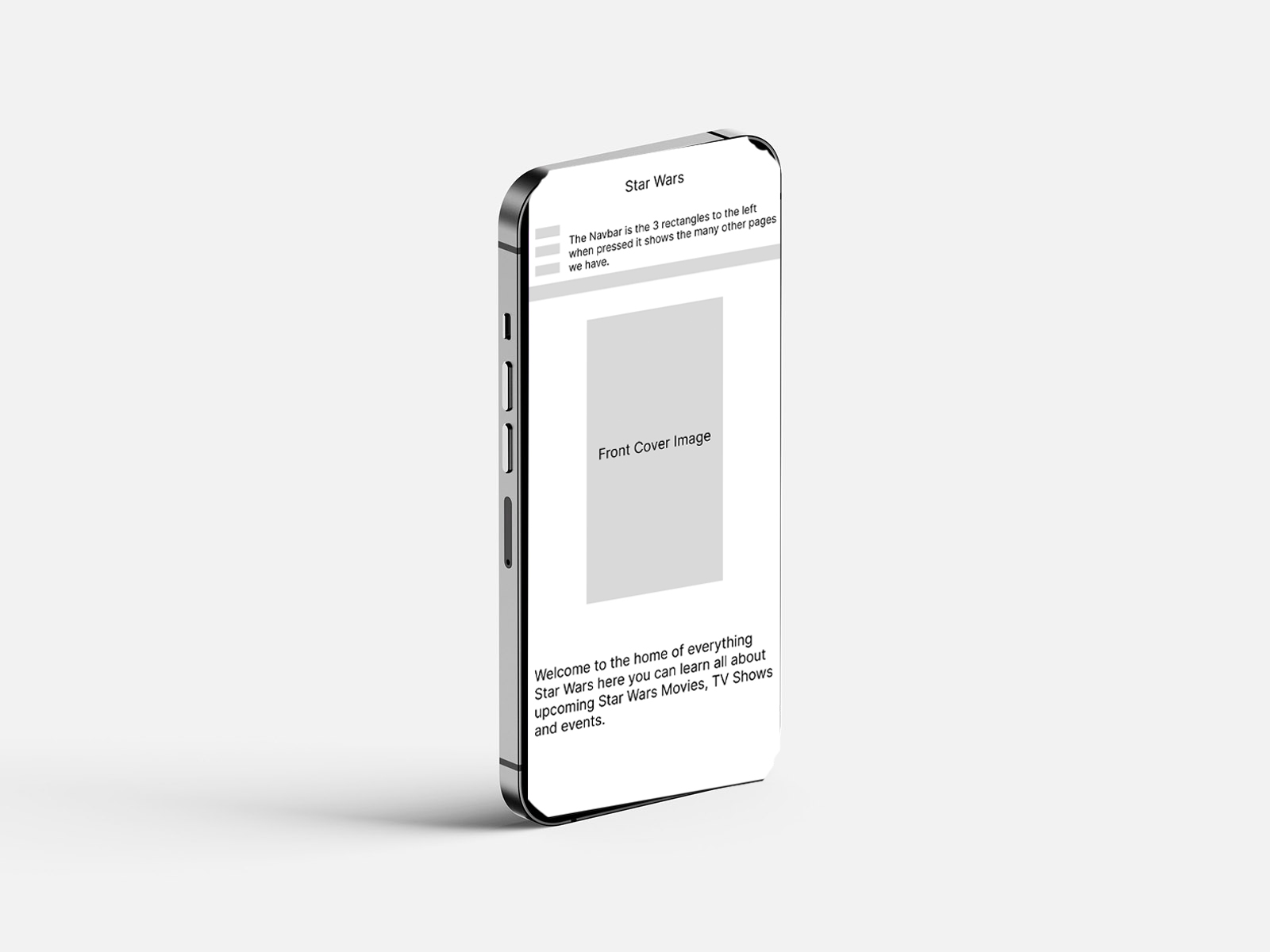
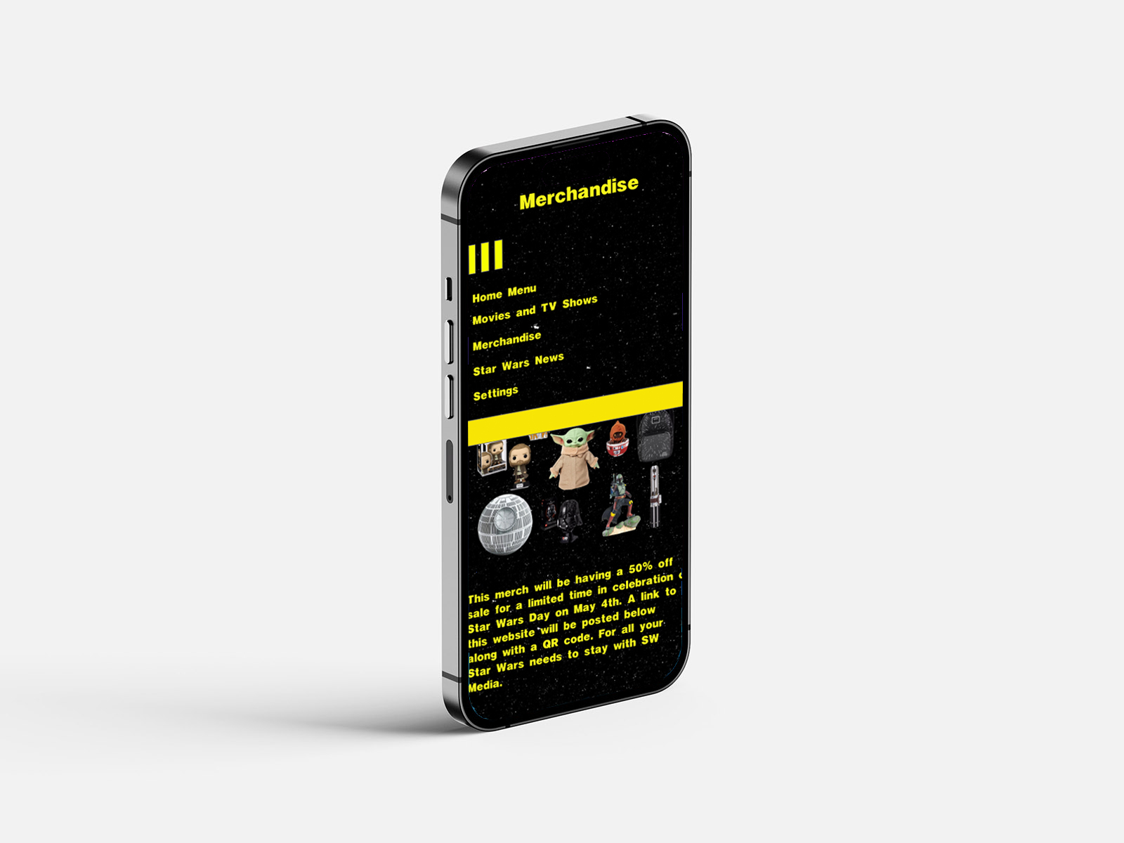
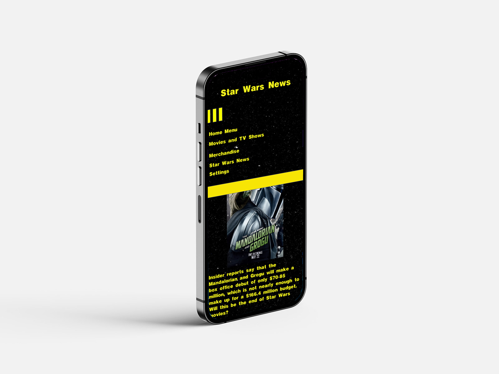
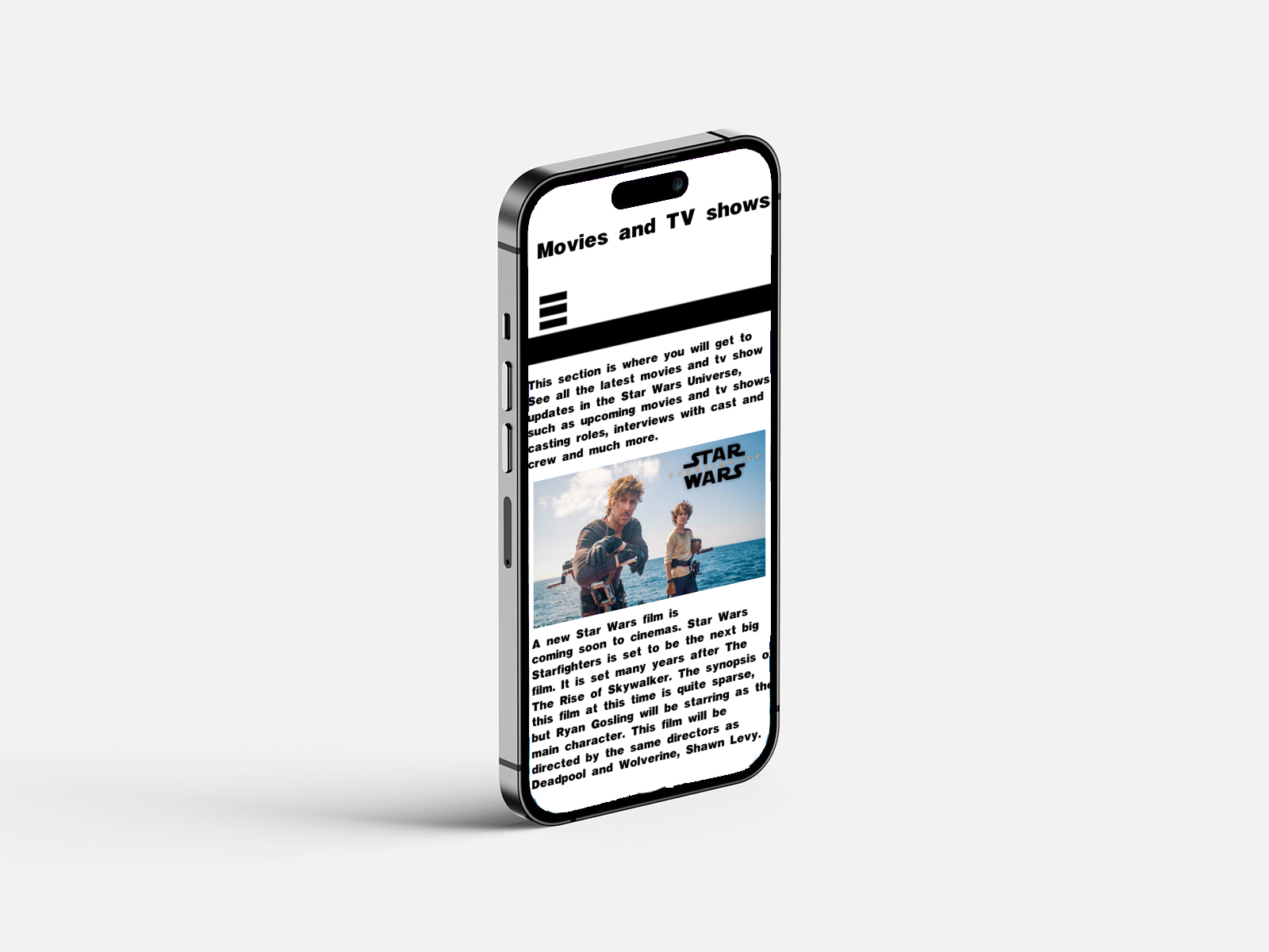
Figure 5: Wireframe Designs on iPhone,
Source: Author's own work (Oliver Lund, 2026).
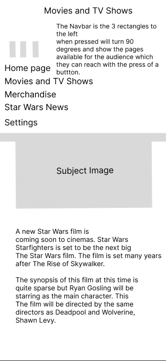
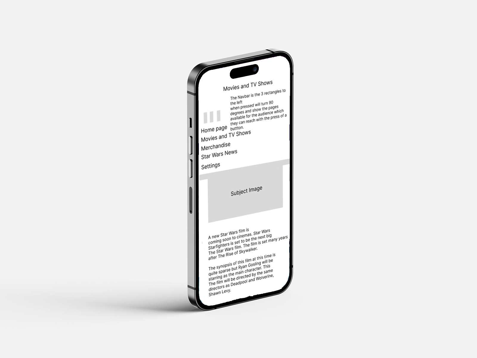
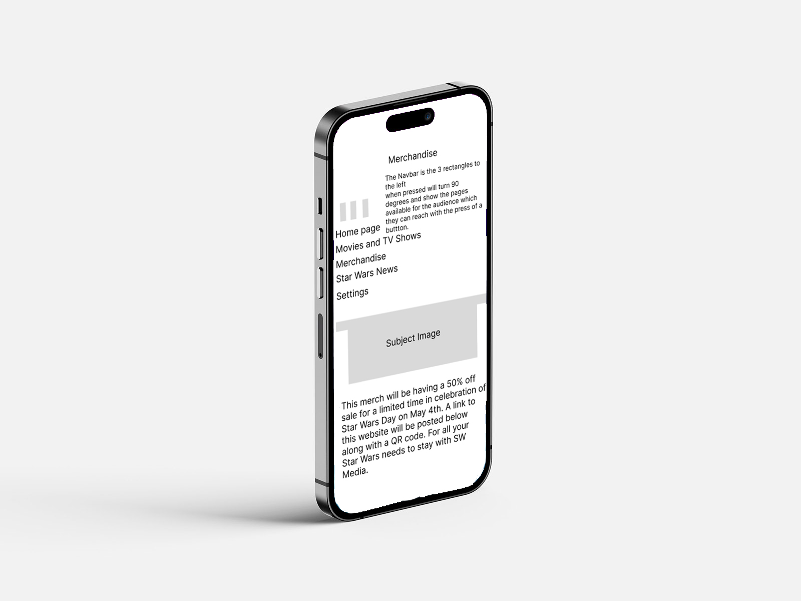
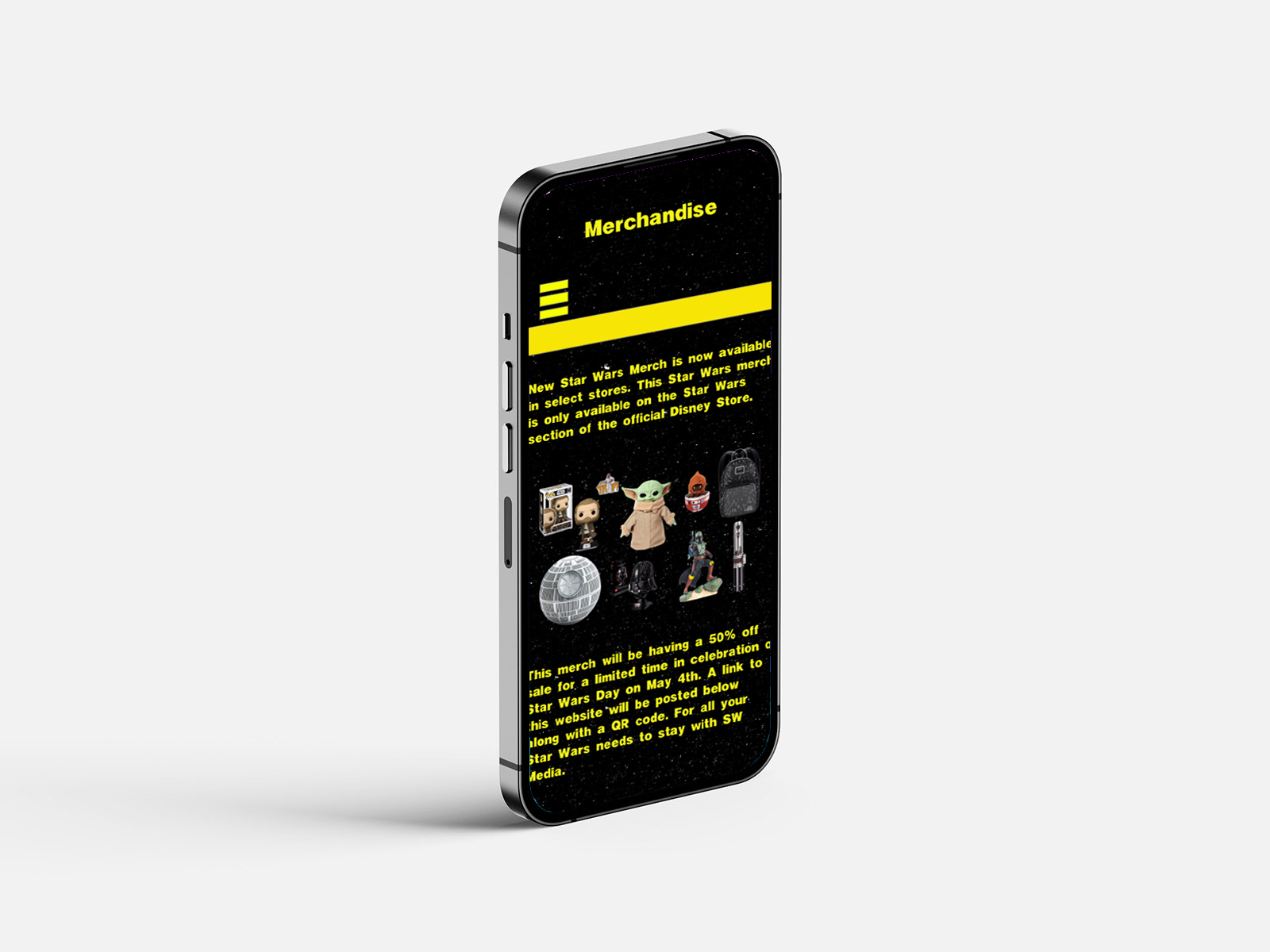
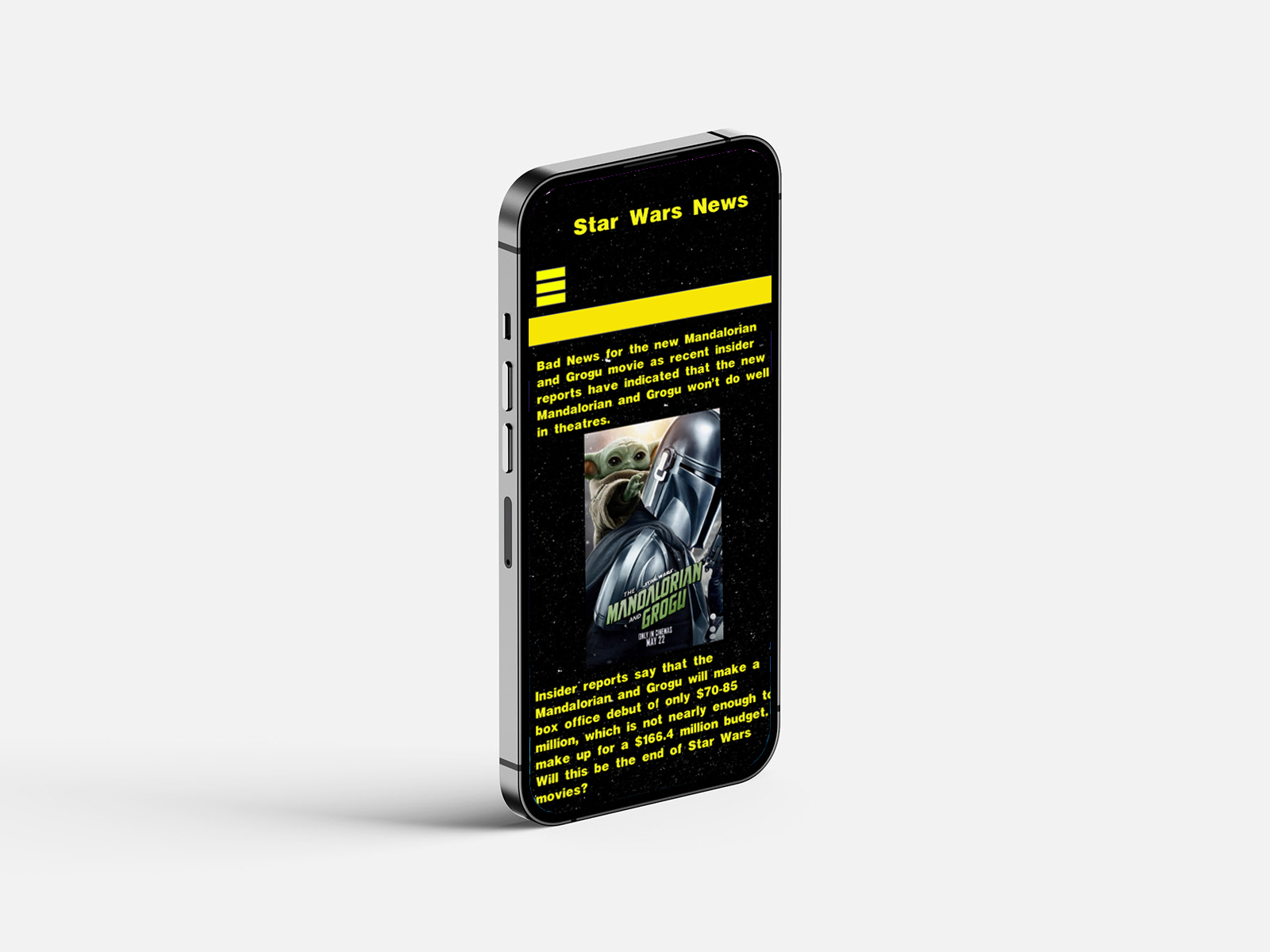
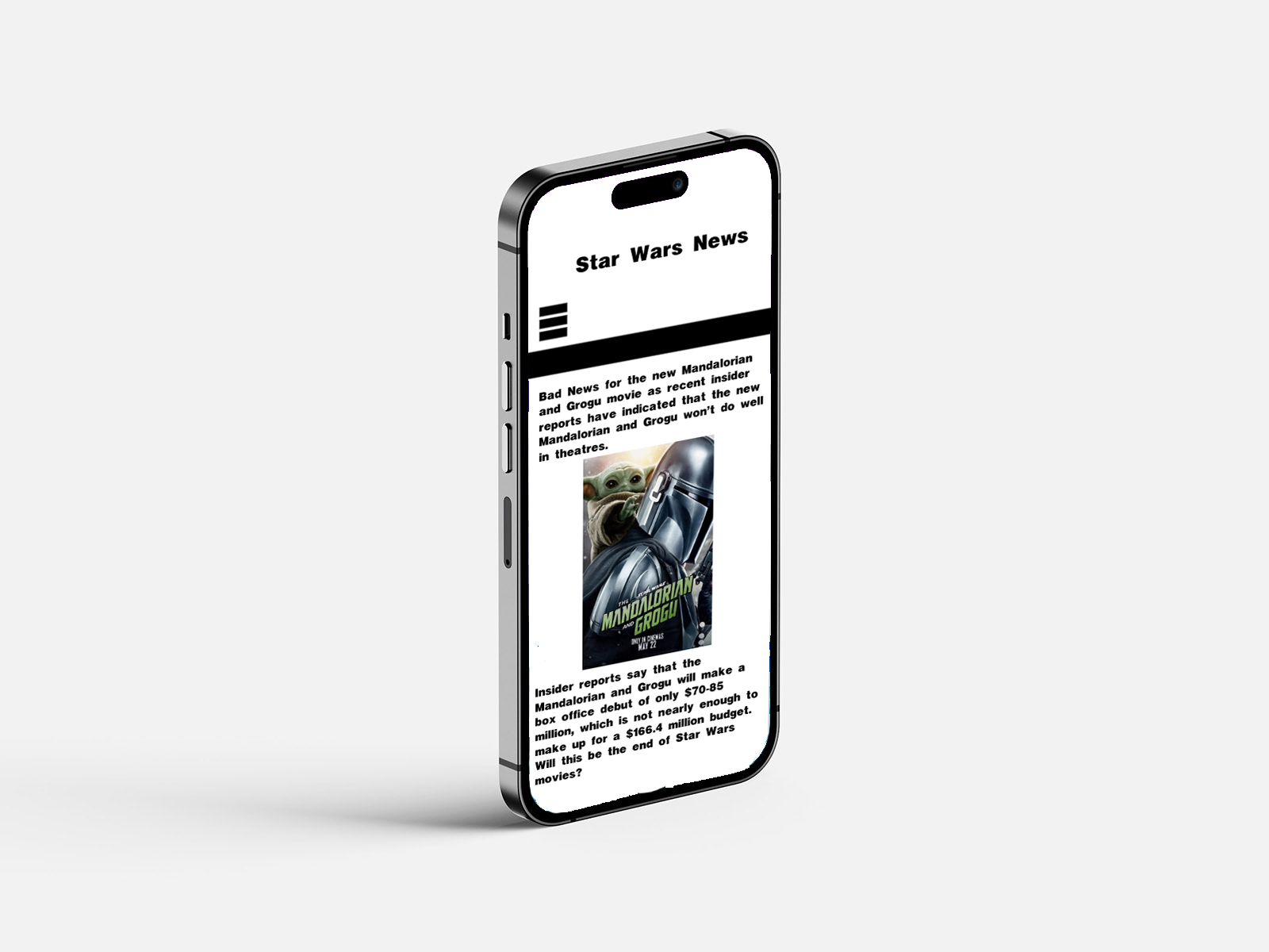
Figure 6: Dark Mode Designs on iPhone,
Source: Author's own work (Oliver Lund, 2026).
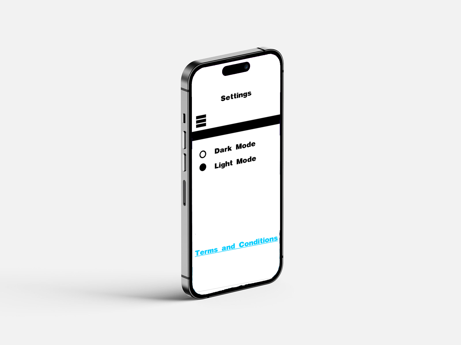
Figure 7: Light Mode Designs on iPhone,
Source: Author's own work (Oliver Lund, 2026).
Here is a further example of what these designs would look like on an iPhone 14 Pro Max. This helps provide a clear representation of exactly what this app would look like on an iPhone and how it fits on the screen. I chose the website called Mockups Design (Mockups Design | Free Premium Mockups, 2026) to help provide an iPhone 14 Pro background layout for these mockups. I used Mockups Design because it was a website I had used in previous mockups, which provides a very clear understanding and a great example of what to expect from designs like my app on the desired screen you are designing for.
Designing the interface for the iPhone 14 Pro Max format allowed me to consider the screen size and the resolution when developing the layout. Due to mobile screens being smaller than laptop screens, for example, I had to prioritise the important content, which is why I positioned key information at the top of the interface, as that is what the eyes of users look at first, as it is what comes on their screen first. It helps make important announcements about upcoming news, films, and TV shows easy for users to see, without making it so crowded with other content that it gets lost among all the information. By designing within the dimensions of an iPhone screen, I ensured that content spacing, typography, and image placement remained clear and readable for all users.
Mobile usability was an important consideration during the design process. Unlike desktop interfaces, mobile interfaces rely heavily on touch. That means key interactive elements, such as buttons, navigation icons, and menus, must be large enough for people to interact with easily. When I was designing the layout in Adobe XD, I paid close attention to the spacing between interactive elements. Hence, no elements were too close, making it easier for people to interact with. This reflects the importance of a touch-based interaction system and of spacing in mobile interface design (Mendoza, 2014). However, limited screen space restricts the visibility of some of the app's content.
Although this design was created for the iPhone 14 Pro Max, the overall layout was developed with responsive design principles in mind. Responsive designs allow for the application to adapt to multiple screen sizes across a huge range of smartphones and devices. By using flexible layout structures and scalable elements in Adobe XD, the design I have created can be adapted for other devices while maintaining a focus on the overall user experience.
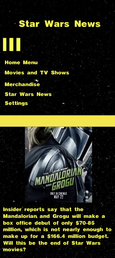
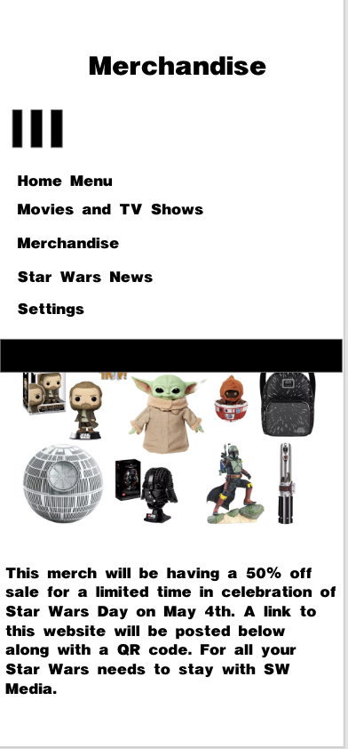
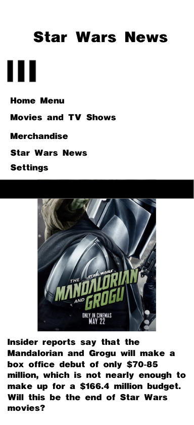
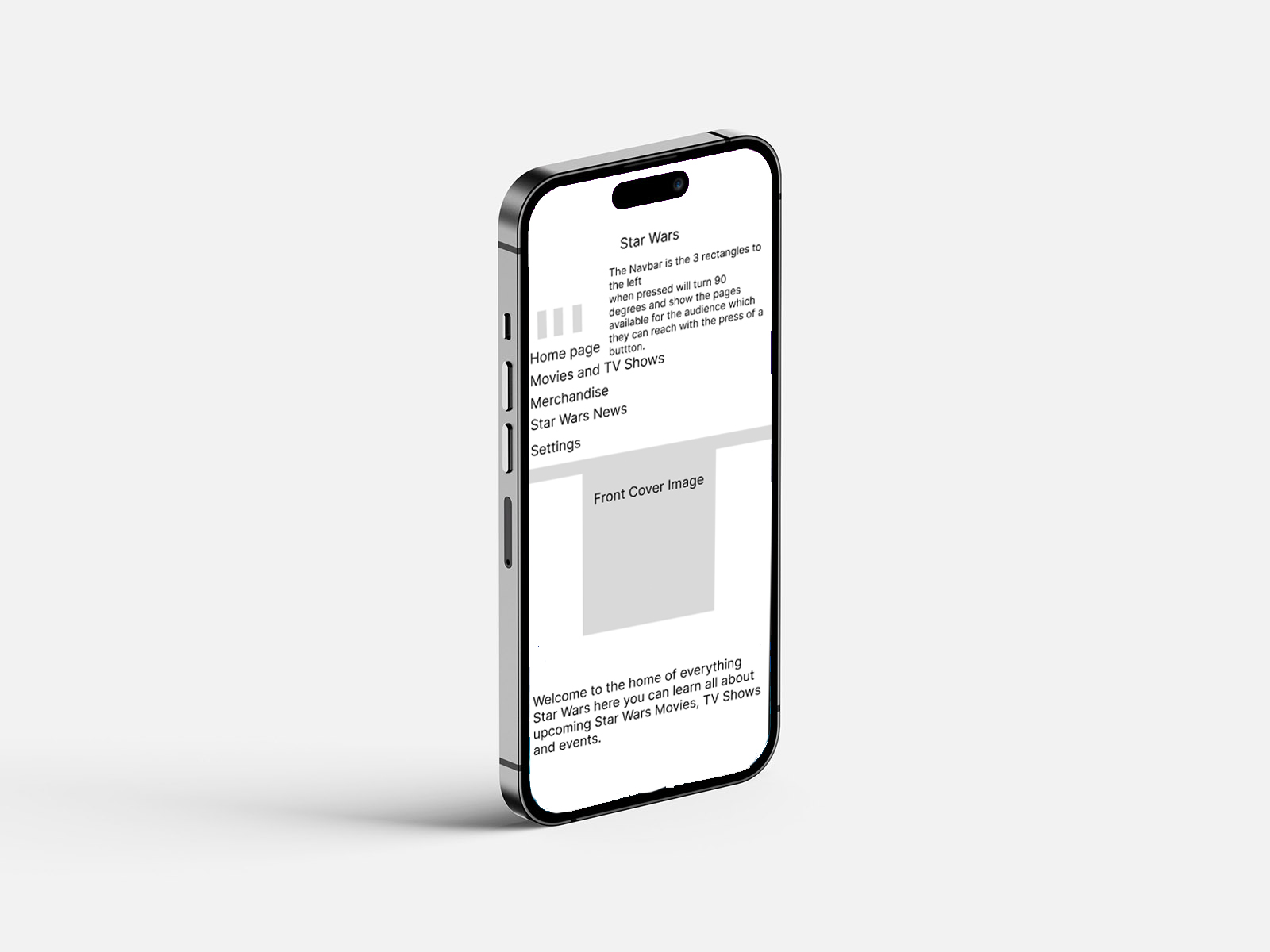
The development of the app SW: Media involved an iterative design process focused primarily on usability and functionality to make it accessible and easy to use for all users. There were many stages in the design process, starting with the initial idea and logo design, then moving on to designing the app's layout and functionality. The initial wireframes and layout for the app were designed in Figma, chosen for its suitability for wireframing and prototyping. When designing the layout, simplicity and functionality were key. This approach aligns with established UX principles that emphasise clarity, consistency, and usability (Grant, 2022), though prioritising simplicity may limit the depth of the app's features. I kept it simple with a navigation system that uses a hamburger icon, as familiar interface patterns can improve usability and make navigation more intuitive for users (Tidwell, Brewer and Valencia, 2019). To make it clear that the hamburger icon was working, when pressed, it rotates 90 degrees to open multiple pages, and when you pressed a page, you would move to the next page.
Later, the design process was moved to Adobe XD to broaden the workflow and reduce reliance on a single app. Adobe XD is widely recognised as an effective tool for interface design and prototyping. The more developed layouts were designed with franchise fans in mind and showcased many aspects of the franchise, including similar typography and a background resembling space. The hamburger icon was retained and integrated into the final layout, as it felt simple and necessary for the app.
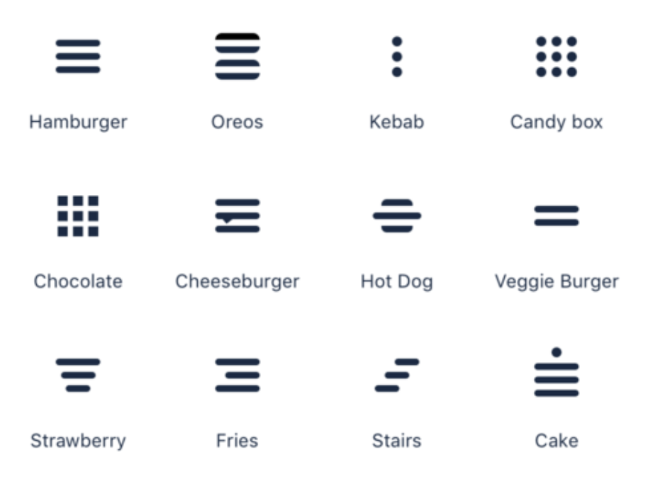
During development, I encountered several design challenges, including interface clutter and navigation consistency. I decided to continue with the three-line hamburger icon design due to it being used in previous work and its visibility on my portfolio website when viewed on a phone. Many navigation icons were considered (See Appendix A), and deciding on the design proved difficult, but experience helped guide that decision. This portfolio website has been widely shared and used without complaints, so it seemed appropriate to continue with it.
What changed in future design iterations was how to showcase the hamburger icon's functionality, rather than simply placing it and saying, "press this to navigate to more pages." It was decided to do something unique to showcase that further, and that is where the 90-degree turn came in. When it turned 90 degrees, it lowered the headbar and displayed the page, making it clear they could change pages and navigate deeper into the app.
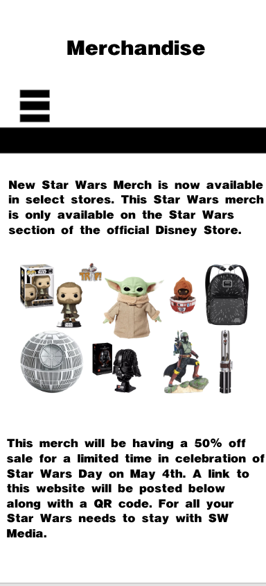
Content hierarchy played a key role in the design process. Wording and imagery for what would be on the actual app were the most important, as they helped give the audience a clear understanding of what they would see when the app became functional, which is the best way to showcase the app. When the app goes live, it will be constantly updated with new information, which could result in more or less writing, leaving insufficient or excessive space on the app's page. To counter this problem, the app will fluctuate to ensure all necessary information is available to the audience.
Dark and light modes were implemented later and are important, as they are widely used in apps these days, so I included them. When designing the app, I wanted to give it a clear representation, so I created two layouts that showcase what the app would look like with each feature implemented. In light mode, it uses a white background and makes all text, icons, and bars black to make them more visible to the audience.
Logo design was also a key part of this app's design; there were many different logo designs for the app's front cover, drawing heavily on the franchise it is inspired by, such as the Jedi and Sith symbols. SW: Media with the black-and-white circle felt the most appropriate, as the Jedi and Sith symbols felt too on the nose and could have been used in the app instead. Why SW: Media was chosen was its simplicity, which gave the audience a clear understanding of what the app is about. SW stands for Star Wars, and the word Media means that this app will cover anything media-related to the Star Wars franchise. There was some difficulty deciding what the app's logo should be, but it felt more appropriate to go with something original rather than a direct franchise asset.
One of the most important lessons I learned throughout this project was the importance of balancing simplicity with functionality in app design. Focusing on that idea helped provide a basis and understanding for designing this app. Learning from mistakes along the way was also a key part of the process, such as making the pages too cramped and not structuring them properly, or making a poor representation of what wireframes and light mode would look like by poorly editing and implementing the designs on a mockup of an iPhone 14 Pro. These lessons will be implemented in future app design work.
This project helped me understand the importance of designing for user needs and usability rather than just prioritising aesthetics. I had not started using Adobe XD, and now, due to this project, I have learned it and harnessed my skills with it even further, whilst also further enhancing my skills in Figma. I prototype my work in Adobe XD and design main pages for phone layouts. In the past, I primarily created layouts for laptop use. These skills will help me further develop apps in the future, as I now know how to prototype and design them to fit phones of all sizes.
Another key consideration when designing this app was the hamburger icon. Whilst a hamburger is widely recognisable and iconic, I thought it appropriate for this website, partly because of that. Another reason the hamburger icon was chosen was its familiarity from my own website. When looking up other icons that could be used, such as kebab, chocolate, and many others (See Appendix A). The hamburger icon enabled a clean, minimalist interface that was important to my simple website design and helped keep navigation easy for audiences.
However, the hamburger icon had its own limitations. This reflects a common usability issue, as hidden navigation systems can reduce discoverability for users (Umar et al., 2024), potentially limiting engagement with deeper content. One of the main drawbacks of the hamburger icon is that it reduces the visibility of some options when not pressed, which can be confusing for audience members who are not familiar with similar icons or do not understand its function. This could potentially impact users, as users may not look at the whole app and may not get a clear understanding of how to navigate further. Despite the hamburger icon still being implemented into the app due to its usefulness, familiarity and simplicity.
Spacing and layout played an important role in the design of this app. When designing the spacing and layout, I tried to maintain a clear, uncluttered design to make it easier for audiences and prevent overwhelming them. This was achieved by maintaining a clear, structured layout with images and by keeping the text not so large as to take up most of the page. I made sure the writing and images were not too close together to maintain a clean layout, which could also improve readability. I chose which content would appear first on each page so audiences would read what is most important at the start of the app, and I placed images in the middle to help them understand what they were reading. There are limitations to keeping the spacing and layout simple, as it can limit how much information is shown and may require users to scroll further to reach the information they want.
Photoshop was also used in the later stages of the design process to create realistic mockups of the app on an iPhone 14. While Adobe XD was effective for designing layouts and prototyping interactions, Photoshop allowed the designs to be placed in a real-world context. This helped visualise what the app would look like on an actual device, providing a more accurate representation of scale, spacing and overall presentation. This was very useful for improving the clarity and readability of the app's interface on a screen. There are some limitations, though: these mockups are static and not functional for user testing, and they are only used for presentation, so they have no practical use.
Throughout the project's development, there was clear growth in both my technical skills and my design approach. At the beginning of the project, my main focus was the app's visual appearance, helping ensure it matched the Star Wars franchise's theme. However, as the project progressed, my approach to this app shifted towards a well-functioning, minimalist design that prioritised user experience and usability. I also developed a stronger understanding of how layout, spacing and navigation influence how users interact with an interface, rather than just how it looks. My ability to use design tools such as Figma and Adobe XD also improved significantly as I became more confident in creating wireframes, refining layouts, and developing more structured, functional designs. This project helped me understand the importance of designing with the user in mind, rather than designing purely on personal preference. This aligns with broader research in user experience design, which emphasises the importance of designing interactive systems that respond effectively to users' wants and needs (Marcus and Rosenzweig, 2020). As a result, I am now more aware of how to create designs that are not only visually appealing but also effective, practical, and accessible for my target audience, a skill I will carry forward into future design work. Effective interface design requires balancing usability, functionality, and user expectations to create intuitive experiences (Shneiderman et al., 2017), a balance that became increasingly evident as the project progressed.
The overall success of this project is that it has solved the problem it set out to address: stopping the news of the Star Wars franchise from becoming so fragmented. The reason it is believed to have solved that problem is that creating many pages dedicated to further explaining what is happening with the franchise has stopped audience members from having to search for more information about this franchise outside of this app, stopping the unnecessary fragmentation of news stories of upcoming projects and more in the Star Wars franchise.
I believe that the biggest strengths found in this app are its well-structured navigation system, centralised information design, and consistent visual identity. These strengths help make the app easier to use and create a stronger experience for Star Wars fans.
There are some limitations to this app's design, such as a lack of real user testing, potential for more features, and the fact that it is only a prototype. These limitations highlight the importance of iterative design and usability testing in improving digital products (Umar et al., 2024), as without user feedback, it is difficult to fully evaluate the interface's effectiveness. This is considered a limitation because it prevents the app from progressing beyond its prototype stage and limits what an app of this calibre could do. This does not necessarily affect the app in its current state; it only affects the potential of what this app could be.
A further limitation of the current design work is the lack of additional functionality, such as a bottom search bar, filtering options, and personalised content, which are not yet present in the app's prototype. Whilst the app functions well in its current state without these features, they could help elevate it further and make it easier for its users. Filtering content into categories can make it easier for audiences to find what they are looking for, as can a search bar that instantly delivers results. Without these features, the app works well; with them, it will function even better. This means the prototype is successful as a visual and navigational concept, but less complete as a fully developed user experience because it does not allow users to search, filter, or personalise information.
Some improvements can make this app more successful, such as conducting user testing, adding features like a search bar, and increasing interactivity. If these improvements were implemented in the future, they could further boost this app and take it out of its prototype stage, helping make it a full-fledged app.
This app could function very well as a real app, with a huge fan base and demand for centralised content. This concept helps to demonstrate the strong potential in this being a real-world app due to how large the Star Wars fanbase is and its demand for centralised digital content. This is why, when considering its limitations and addressing them to help it function as a real app, it is important and will be taken into account in future design work. Although this prototype successfully demonstrates the app's visual identity and its navigation structure, the lack of actual user testing limits my ability to evaluate this as a long-term functioning real-world app.
Overall, this app prototype has been very successful and has helped to fix the initial problem that I aimed to solve. The limitations of this app, which prevent it from becoming a real app beyond its prototype, are acknowledged and will be utilised in future design work. Overall, this project strengthened my design skills in tools like Adobe XD and Figma, making this a worthwhile project that has taught me a lot.
This app takes accessibility for all users into great consideration, in line with Sustainable Development Goal 10, which focuses on supporting individuals with disabilities and making the app easier to navigate for them. In the context of my work, this can involve ensuring that certain aspects of my app are easy to access for all users, regardless of background, ability, or technological experience.
This app aims to support SDG 10 by prioritising clear navigation, simple layouts, and well-spaced content. An example of this is a hamburger icon at the top of the page that instantly grabs people's attention and makes it easy to navigate the app. Using familiar design patterns, such as the hamburger icon, for clear navigation to help people with certain disabilities use my app with ease, is a clear example of incorporating accessibility into my app. These design decisions align with broader efforts to reduce inequality through improved accessibility in digital environments (United Nations, 2025). However, they do not fully address wider issues such as unequal access to technology or varying levels of digital literacy.
Accessibility was also considered when designing the app, including the typography, spacing, and clear navigation system. This reflects inclusive design principles that aim to make digital products usable for a diverse range of users (Gilbert, 2019; Margherita and Constantine, 2020), although accessibility in design alone does not guarantee equal user experiences for all. This helped ensure that the information could be easily understood and navigated. These design decisions help to create a platform that users can quickly access news and updates about the Star Wars franchise without unnecessary complications.
My project aimed to create an app based on the Star Wars franchise that helps stop news coverage of it from being so fractured and provides a central hub for all the information so that fans can read franchise news they know is reliable and accurate.
I believe this app successfully achieved its original goal by creating a centralised news source, reducing the need for fragmented news sources. Creating this user-friendly app with a simple layout, accurate information, and an easy navigation system for fans has solved the problem of fragmented Star Wars news.
This app has many key strengths, such as light and dark modes that let users change the app's theme. The strong theme and branding of this app help attract fans of the franchise to try it and give it a chance to become a popular app for all users. These strengths contribute to this app functioning as a strong and effective prototype.
There are limitations in the app design, including the lack of user testing. The app was not fully developed with code to function as an app and was still in its prototype stage, so there was not much to test. Logo originality for two of the three designed apps was also a bit of a problem, as greater originality could have strengthened the apps' identity. There are also very few features in the app aside from the navigation system, which makes it overall limited.
Overall, I learned how to design UX and UI in Adobe XD and create wireframes in Figma. I also learned the importance of simplicity in app design, which will help make this app more appealing to audiences. Whilst learning the importance of simplicity, I also learnt the importance of structure and maintaining it. I also learned the importance of designing this app for users, since it is for fans. All these skills helped with the overall design of this app and made it what it is.
Future improvements could include user testing, adding more features, and refining the design. Implementing these improvements will make this a more enriching and successful app for all users and fans of the franchise, and will also enhance my design skills.
My goal is to turn this into a real-world, functioning app, and I will need a team to help make it work. I would need software developers to help turn my app design into a functioning app by laying out the code to make it work. I would need some UI/UX designers to help further refine the app's design layout and improve usability for the audience. I would also need testers to help test the app's functionality and ensure there are no bugs and that the app works well. A content manager would also be needed to continually update the app with new content so the audience has more to read when they open it. A project manager would also be needed to help organise the team, manage deadlines, and keep the app's development on track. These are the necessary members I need for my team to make this a real-world, functioning app.
Overall, this project significantly improved my understanding of UI and UX design principles whilst also further strengthening my technical skills in Adobe XD and Figma.
Atsani, M.R., Mukaromah, I.A. and Haikal, M. (2025). The Role of Color in User Experience: A Systematic Literature Study of User Preferences for Dark and Light Mode. Journal of Information Technology and Digital Systems, 2(1), pp.41–54. Available at:
https://doaj.org/article/449f4dd4e9e14e5584f777600e5320f0
[Accessed 20 April 2026].
Counterpointresearch.com. (2026). Apple Reaches All-time Revenue Record Driven by iPhones. [online] Available at:
https://counterpointresearch.com/en/insights/apple-reaches-all-time-revenue-record-driven-by-iphones
[Accessed 29 April 2026].
Gilbert, R.M. (2019). Inclusive Design for a Digital World. 1st ed. [online] Berkeley, CA: Apress. Available at:
https://ebookcentral.proquest.com/lib/winchester/reader.action?docID=6000719&c=RVBVQg&ppg=1
[Accessed 19 April 2026].
Grant, W. (2022). 101 UX Principles - 2nd Edition: Actionable Solutions for Product Design Success. 2nd ed. [online] Birmingham, England: Packt Publishing, Limited. Available at:
https://ebookcentral.proquest.com/lib/winchester/reader.action?docID=6992203&c=UERG&ppg=1
[Accessed 25 April 2026].
Marcus, A. and Rosenzweig, E. (2020). Design, User Experience, and Usability. Design for Contemporary Interactive Environments: 9th International Conference, DUXU 2020, Held as Part of the 22nd HCI International Conference, HCII 2020, Copenhagen, Denmark, Proceedings, Part II; 1. 1st ed. [online] Cham: Springer International Publishing AG. Available at:
https://ebookcentral.proquest.com/lib/winchester/reader.action?docID=6273263&c=RVBVQg&ppg=1
[Accessed 28 April 2026].
Margherita, A. and Constantine, S. (2020). Universal Access in Human-Computer Interaction. Design Approaches and Supporting Technologies: 14th International Conference, UAHCI 2020, Held as Part of the 22nd HCI International Conference, HCII 2020, Copenhagen, Denmark, Proceedings, Part I; 1. [online] Cham: Springer International Publishing AG. Available at:
https://ebookcentral.proquest.com/lib/winchester/reader.action?docID=6000719&c=RVBVQg&ppg=1
[Accessed 21 April 2026].
Mendoza, A. (2014). Mobile User Experience. First Edition ed. [online] Amsterdam: Elsevier. Available at:
https://www.sciencedirect.com/book/monograph/9780124095144/mobile-user-experience#authors
[Accessed 23 April 2026].
Mockups Design | Free Premium Mockups. (2026). Free mockups | Mockups Design | Easy to download. [online] Available at:
https://mockups-design.com
[Accessed 17 April 2026].
Motin, M. (2025). Dark Mode vs. Light Mode: Insights from A/B Testing User Preferences. [online] Mondaysys.com. Available at:
https://mondaysys.com/dark-mode-vs-light-mode-insights-from-a-b-testing-user-preferences/
[Accessed 30 April 2026].
Sengsoon, P. and Intaruk, R. (2025). Immediate Effects of Light Mode and Dark Mode Features on Visual Fatigue in Tablet Users. International Journal of Environmental Research and Public Health, [online] 22(4), p.609. Available at: https://pmc.ncbi.nlm.nih.gov/articles/PMC12027292/ [Accessed 8 May 2026].
Shneiderman, B., Plaisant, C., Cohen, M., Jacobs, S., Elmqvist, N. and Diakopoulos, N. (2017). Designing the User Interface: Strategies for Effective Human-Computer Interaction, Global Edition. Sixth Edition ed. [online] Boston: Pearson. Available at:
https://ebookcentral.proquest.com/lib/winchester/reader.action?docID=5186087&c=UERG&ppg=2
[Accessed 1 May 2026].
Tidwell, J., Brewer, C. and Valencia, A. (2019). Designing Interfaces: Patterns for Effective Interaction Design. 3rd ed. [online] Sonoma County, California: Sebastopol, CA: O’Reilly. Available at:
https://ebookcentral.proquest.com/lib/winchester/reader.action?docID=5996435&c=RVBVQg&ppg=1
[Accessed 29 April 2026].
Tsiodoulos, D. (2016). Comparison of Hamburger and Bottom Bar Menu on Mobile Devices for Three Level Navigation. [online] Available at:
https://www.diva-portal.org/smash/record.jsf?pid=diva2%3A922114&dswid=-5606
[Accessed 1 May 2026].
Umar, M., Hussain, I., Mahmood, T., Mirza, H.T. and Nadeem, M. (2024). Design Strategies to Minimize Mobile Usability Issues in Navigation Design Patterns. Information, [online] 15(11), pp.732–732. Available at:
https://go.gale.com/ps/i.do?id=GALE%7CA818337121&v=2.1&it=r&u=ucwinch&p=AONE&aty=shibboleth
[Accessed 26 April 2026].
United Nations (2025). Goal 10 | Reduce Inequality within and among Countries. [online] United Nations. Available at:
https://sdgs.un.org/goals/goal10
[Accessed 24 April 2026].
Verhoeff, N. (2012). Mobile Screens: the Visual Regime of Navigation. [online] Amsterdam: Amsterdam University Press. Available at:
https://ebookcentral.proquest.com/lib/winchester/reader.action?docID=1002958&query=&c=RVBVQg&ppg=1
[Accessed 27 April 2026].
Ballard, B. (2007). Designing the Mobile User Experience. 1st ed. [online] John Wiley & Sons, Incorporated. Available at:
https://ebookcentral.proquest.com/lib/winchester/reader.action?docID=291269&c=UERG&ppg=1
[Accessed 20 April 2026].
Castro, L.M. (2023). Updates on Software Usability. [online] IntechOpen. Available at:
https://mts.intechopen.com/storage/books/11920/authors_book/authors_book.pdf
[Accessed 20 April 2026].
Cohen, R. and Wang, T. (2014). GUI Design for Android Apps. [online] Apress L. P. Available at:
https://ebookcentral.proquest.com/lib/winchester/reader.action?docID=3078299&query=&c=UERG&ppg=1
[Accessed 23 April 2026].
de Sá, M. and Carriço, L. (2011). Designing and Evaluating Mobile Interaction : Challenges and Trends. 1st ed. [online] Now Publishers. Available at:
https://ebookcentral.proquest.com/lib/winchester/reader.action?docID=3383755&c=UERG&ppg=1
[Accessed 25 April 2026].
Fling, B. (2009). Mobile Design and Development; 1. 1st ed. [online] O’Reilly Media, Inc. Available at:
https://ebookcentral.proquest.com/lib/winchester/reader.action?docID=536629&c=RVBVQg&ppg=1
[Accessed 29 April 2026].
Jones, M. and Marsden, G. (2006). Mobile Interaction Design. 1st ed. [online] Chichester: John Wiley & Sons. Available at:
https://ebookcentral.proquest.com/lib/winchester/reader.action?docID=255361&c=UERG&ppg=1
[Accessed 2 May 2026].
Kantamneni, S. (2022). User Experience Design: a Practical Playbook to Fuel Business growth; 1. 1st ed. [online] Hoboken, N.J: Wiley. Available at:
https://ebookcentral.proquest.com/lib/winchester/reader.action?docID=6976105&c=RVBVQg&ppg=1
[Accessed 22 April 2026].
Matrai, R. (2010). User Interfaces. [online] InTech eBooks. IntechOpen. Available at: https://mts.intechopen.com/storage/books/6115/authors_book/authors_book.pdf [Accessed 24 April 2026].
Nudelman, G. (2013). Android Design Patterns. 1st ed. [online] New York, NY, USA: John Wiley et Sons Ltd. Available at:
https://ebookcentral.proquest.com/lib/winchester/reader.action?docID=1129581&c=RVBVQg&ppg=1
[Accessed 1 May 2026].
Think Design (2025). Dark Mode vs Light Mode UX: What Users Really Prefer. [online] Medium. Available at:
https://medium.com/@marketingtd64/dark-mode-vs-light-mode-ux-what-users-really-prefer-b66b1f5abd3d
[Accessed 27 April 2026].
Figure 8: Icons Image,
Source: Google Images.
Appendix A:
Here is an image of the many icons that were considered before deciding on the Hamburger Icon.
Appendix B:
Figure 9: Sketch Designs,
Source: Author's own work (Oliver Lund, 2026).
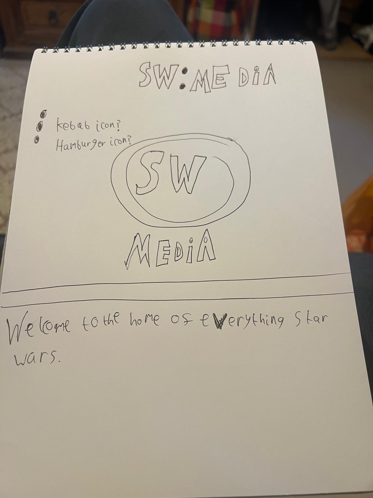
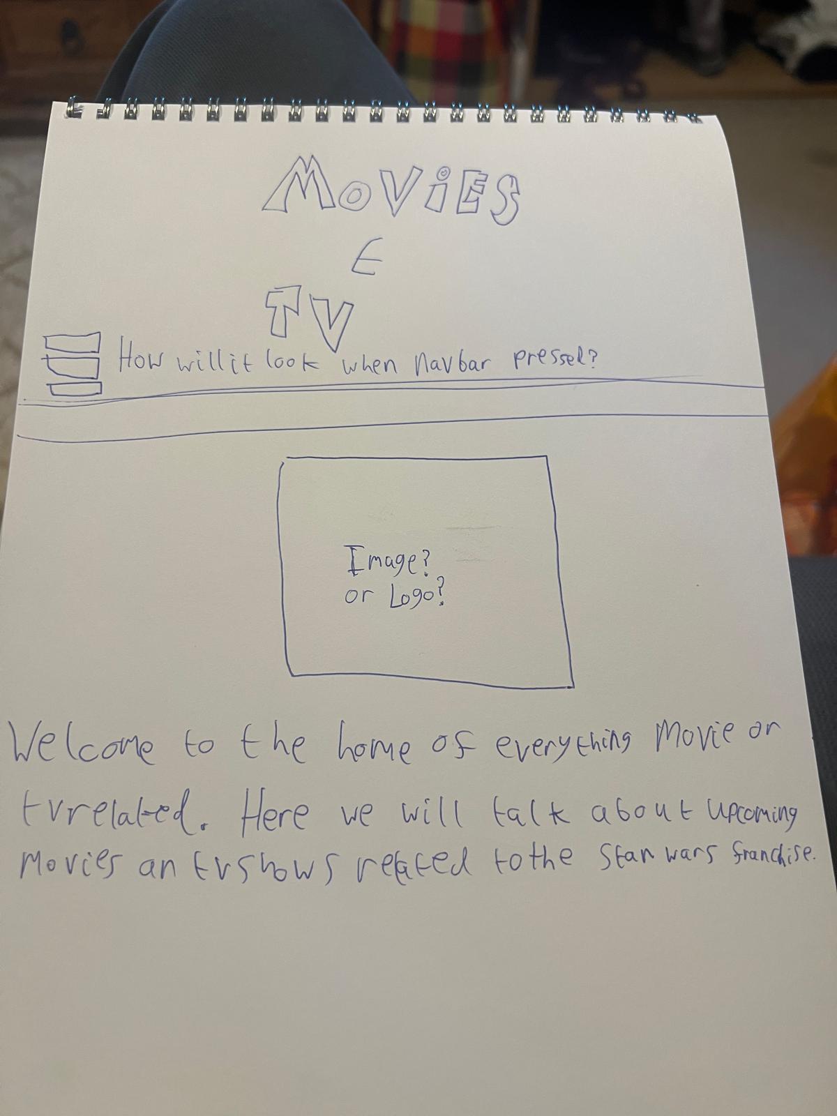
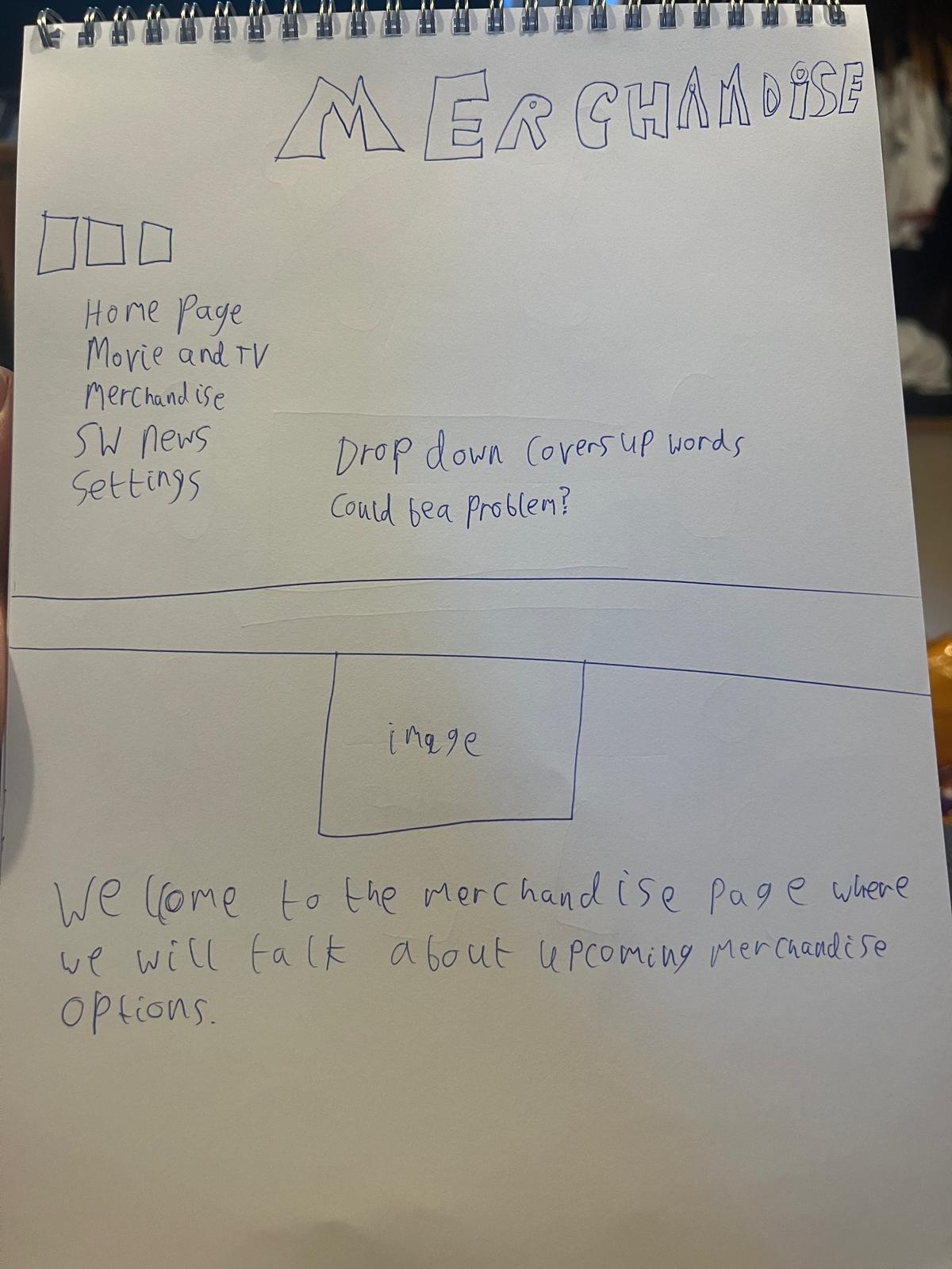
Here are some early sketch designs for the app. These sketches served as a basis for further developing the app. These sketches include annotations questioning whether to use a kebab or hamburger icon and whether the drop-down bars could be problematic. All of these questions and sketches helped me understand how to further improve my app and its designs.
Appendix C:
Figure 10: Annotations,
Source: Author's own work (Oliver Lund, 2026).
Appendix D:
Figure 11: SW: Media Timeline,
Source: Author's own work (Oliver Lund, 2026).
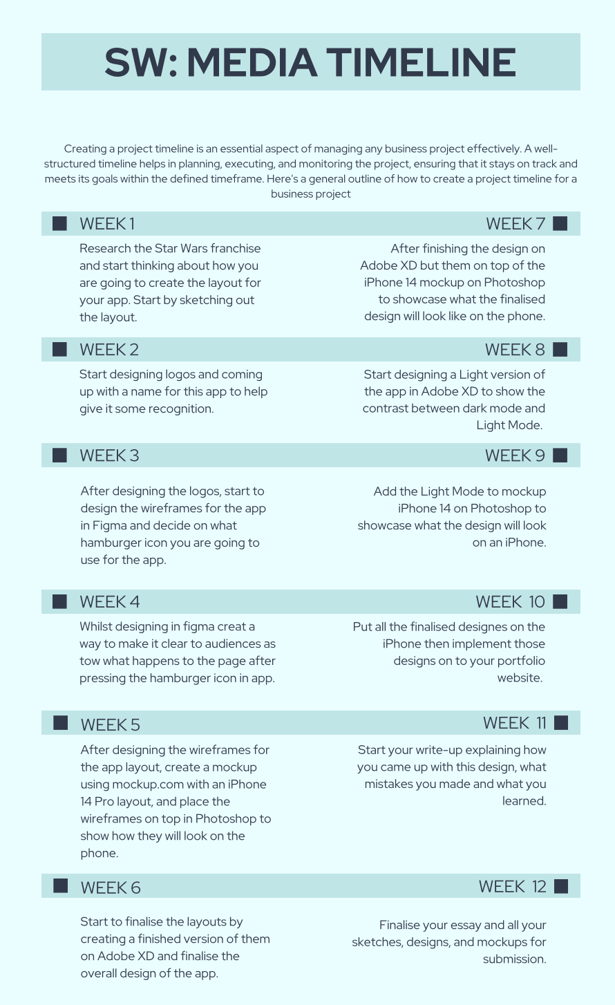
Here is my time management, which gives me structure when doing my work. These steps I laid out gave me structure and an understanding of what I need to do next, and helped me refine and create the necessary design work for my app. Each week, I took many steps to adapt the app, bringing it to its current state. I started with sketching, wireframes, and layouts, then refined them to help bring this app to life.
Appendix E:
Appendix F:
This work was assisted by Grammarly under my learning agreement and was approved for use by my teacher, Tina Scahill.
Application Overview
Logos
Wireframes
Pages
Dark Mode
Light Mode
Light and Dark Mode Options
iPhone
Wireframe
Dark Mode
Light Mode
Reflective Process
Final Outcome Evaluation
SDG 10
Conclusion
References
Bibliography
Appendices
App Food Icons
Sketches
Annotations
Time Management
Handover Document
Wireframing Prototype
Finalised Prototype