Word Count: 2175
List of Figures:
Figure 1: Sketch Designs (Oliver Lund, 2026)
Figure 2: Film Poster Redesign Iterations (Oliver Lund, 2026)
Figure 3: Upcoming Films Posters (Oliver Lund, 2026)
Figure 4: Poster Remakes (Oliver Lund, 2026)
Figure 5: Film Similarity Collages (Oliver Lund, 2026)
Figure 6: Remakes vs Originals Collages (Oliver Lund, 2026)
Figure 7: Time Management (Oliver Lund, 2026)
Figure 8: Original Posters (Film Industry/ Google images)
Figure 9: Annotations (Oliver Lund, 2026)
List of programmes used:
Photoshop
Introduction
This case study is a reflective, research-led evaluation of my film poster design project. This is a continuation from my Major Research Project: How do design elements in film posters influence audience engagement and interest in seeing a film? This essay builds on my major research project's focus on colour, typography, composition, and imagery. This project applies secondary research and primary audience opinions and findings within the final film poster designs.
My primary research findings from my major research project highlighted that audiences respond strongly to emotional cues, recognisable genre conventions, and professional visual execution, with "curiosity" as the dominant emotional response to film posters. These insights helped me redesign my new film posters, encouraging me to prioritise tonal communication, strong focal points, and unique colour palettes. In addition, research on visual perception and recognition (Ware, 2012), facial recognition and emotional processing (Bruce and Young, 1986), and the role of composition (Lupton, 2015) informed my design decisions throughout the design process.
Ultimately, this case study demonstrates how my dissertation research can inform design practices.
The research for this project consisted of primary and secondary research. The secondary research focuses on books and journals that helped me gain a better understanding of how to make posters and which key aspects audiences look for in poster design.
A key theme identified in the literature on poster design is the importance of layout and composition. Lupton (2015) discusses how specific layouts and compositions in poster design play a key role in directing the audience's attention and helping them interpret visual information. In the context of film posters, this suggests that key elements must be carefully controlled to ensure they are easily recognisable to the audience.
Another key theme is typography, which plays a big role in poster design. Typography must further integrate with the overall poster design to become part of it and, overall, make it a much-improved design rather than feeling out of place. Hall (2012) further explained that visual signs and symbols can influence how audiences interpret meaning, underscoring the role of typography and symbolism in poster design.
Character imagery is another key theme in poster design, as poor character placement can make all the difference, weakening the overall design. Bruce and Young (1986) highlight the human tendency toward facial recognition and explain how it can make the poster more recognisable and increase audience engagement, as people are naturally drawn to faces and expressions.
Overall, these themes help demonstrate their importance in poster design and further evaluate the combination of visual hierarchy, typography, colour, and layout. This is further supported by Lynch et al. (2020), who argued that visual literacy and its aesthetics can further influence how audiences emotionally engage with visual media and its branding.
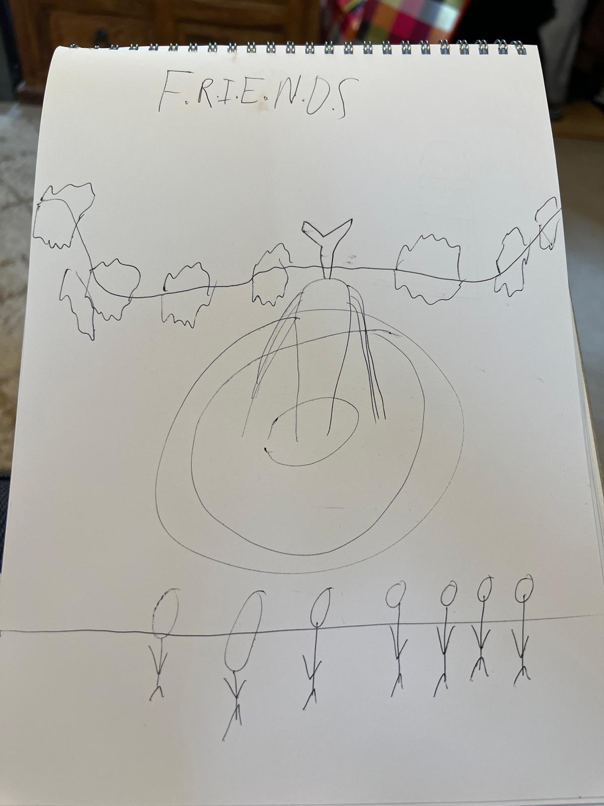
Figure 1: Sketch Designs,
Source: Author's own work (Oliver Lund, 2026).
These early sketches played an important role in the development process of my poster designs. These sketches helped me gain a clearer understanding of what my poster designs should look like and how I could further improve them. These helped me gain a strong understanding of how to apply key aspects of poster design to my own iterations, including layout, composition, and focal points. Creating these sketches helped me to experiment with visual layout and identify which ideas will work best for my poster designs. This process helped overall to fix the structure of the poster designs whilst also supporting a more organised design workflow.
Figure 2: Film Poster Redesign Iterations,
Source: Author's own work (Oliver Lund, 2026).
I made many iterations of film poster redesigns. These redesigns were done with the knowledge gained from my primary research in my major research project. These redesigns focused on character imagery, typography, colour palette, and visual tone to create curiosity and communicate the themes of the films.
I redesigned these films and made these iterations whilst taking inspiration from the original film posters. I maintained the original theme and understanding while creating new versions to appeal to modern audiences, using insights from my prior research. This process further aligns with Kuba and Jeong's (2023) discussion of iterative visual composition, where experimentation and refinement are key to effective design development.
When doing these redesigns, I tried to identify which elements were used in the original film posters and find new ways to use them in a fresh, creative style to support the redesigns further. To see the original posters that these designs are based on, go to Appendix B.
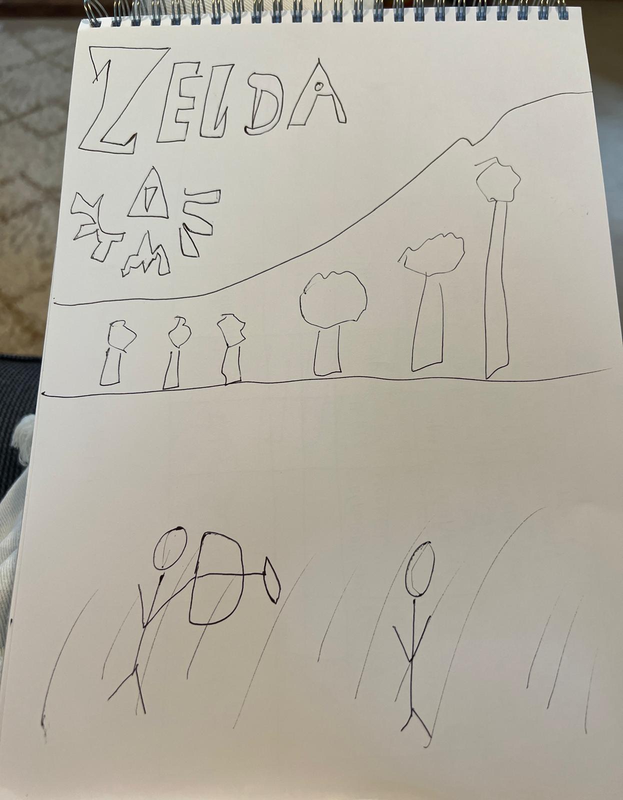
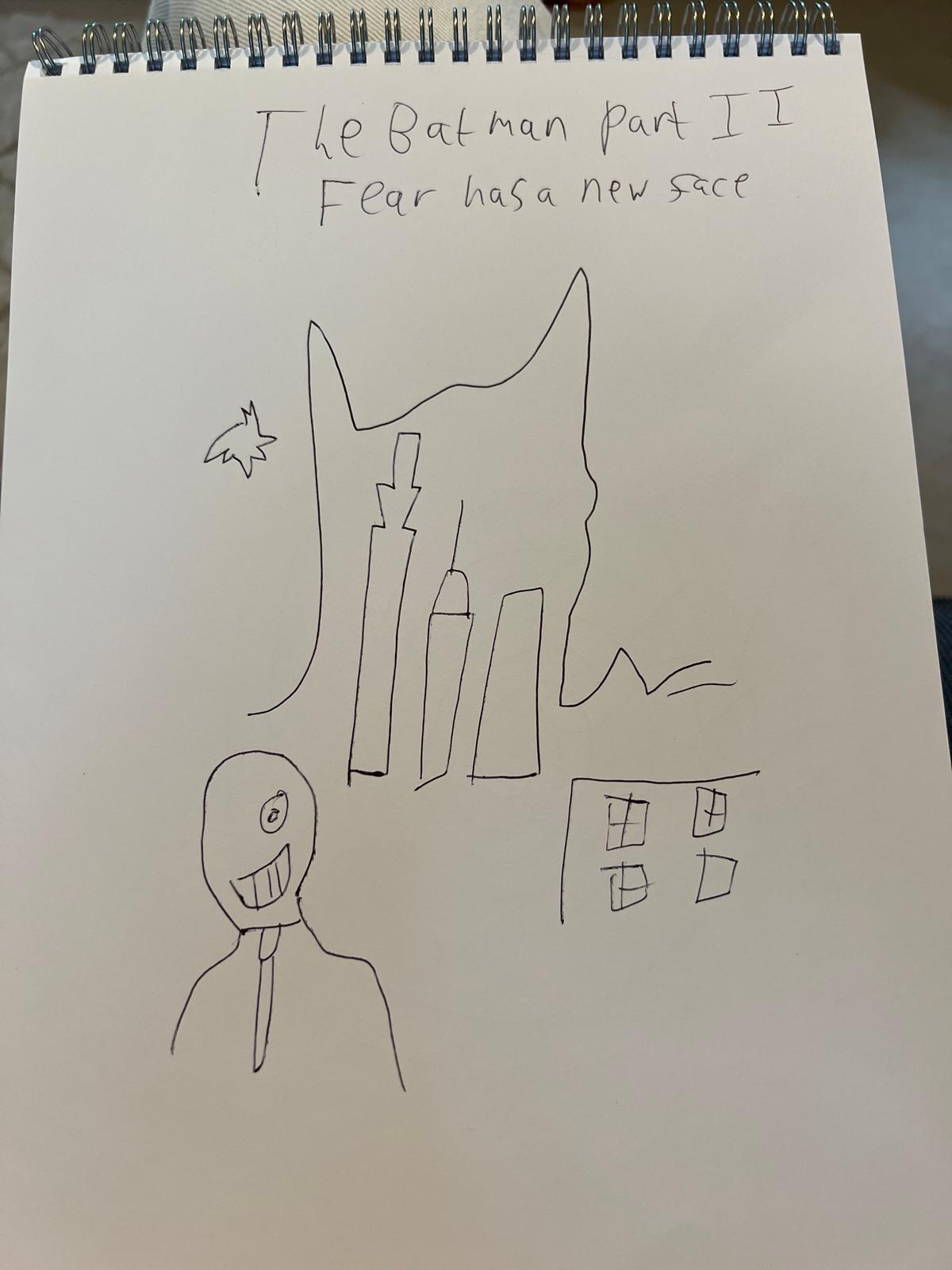
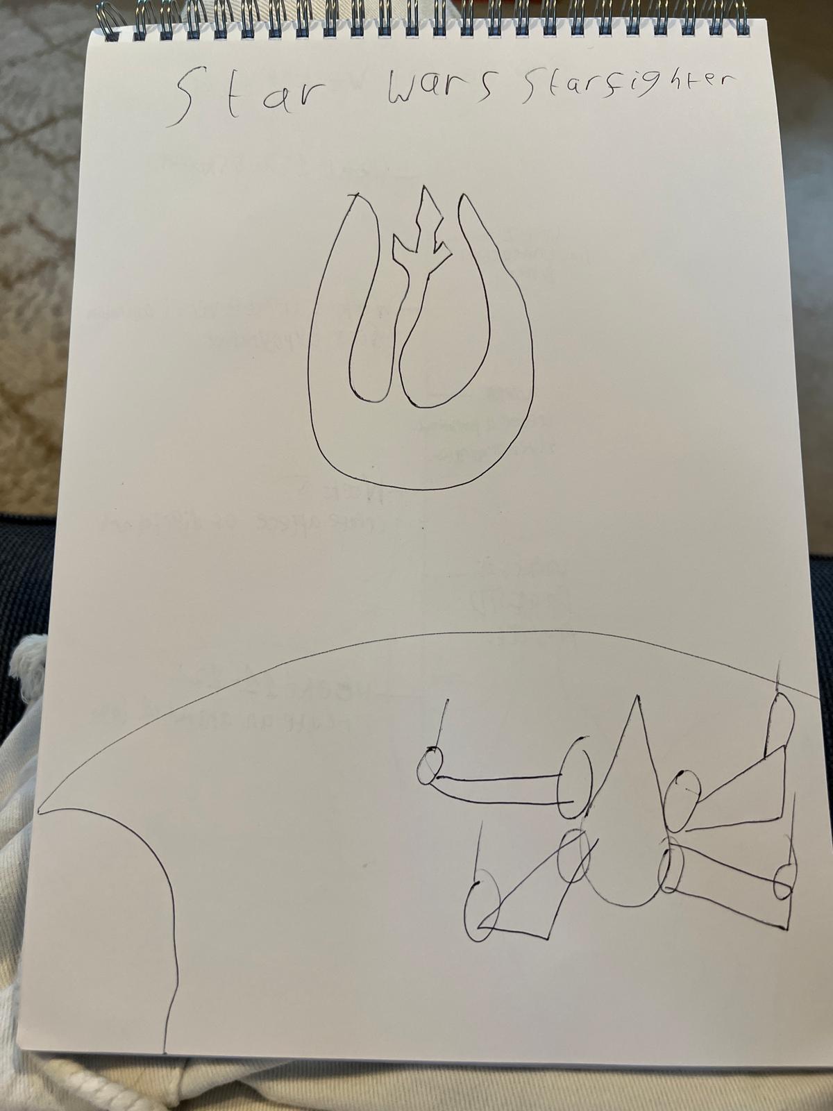
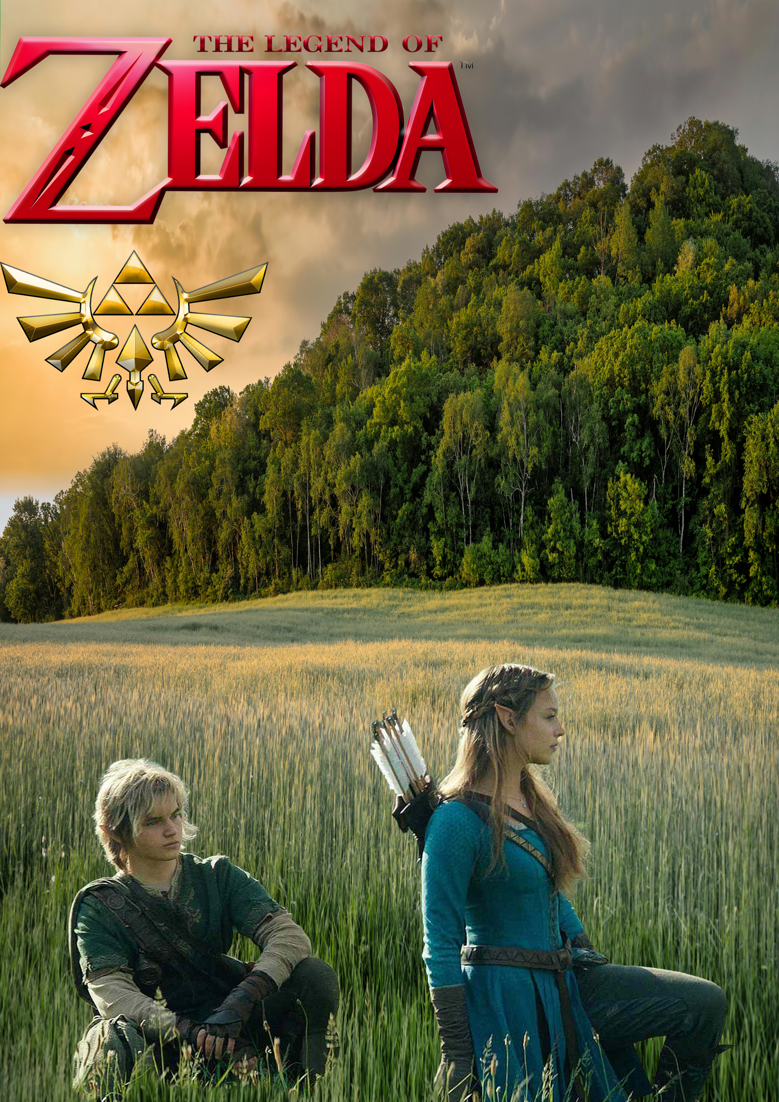
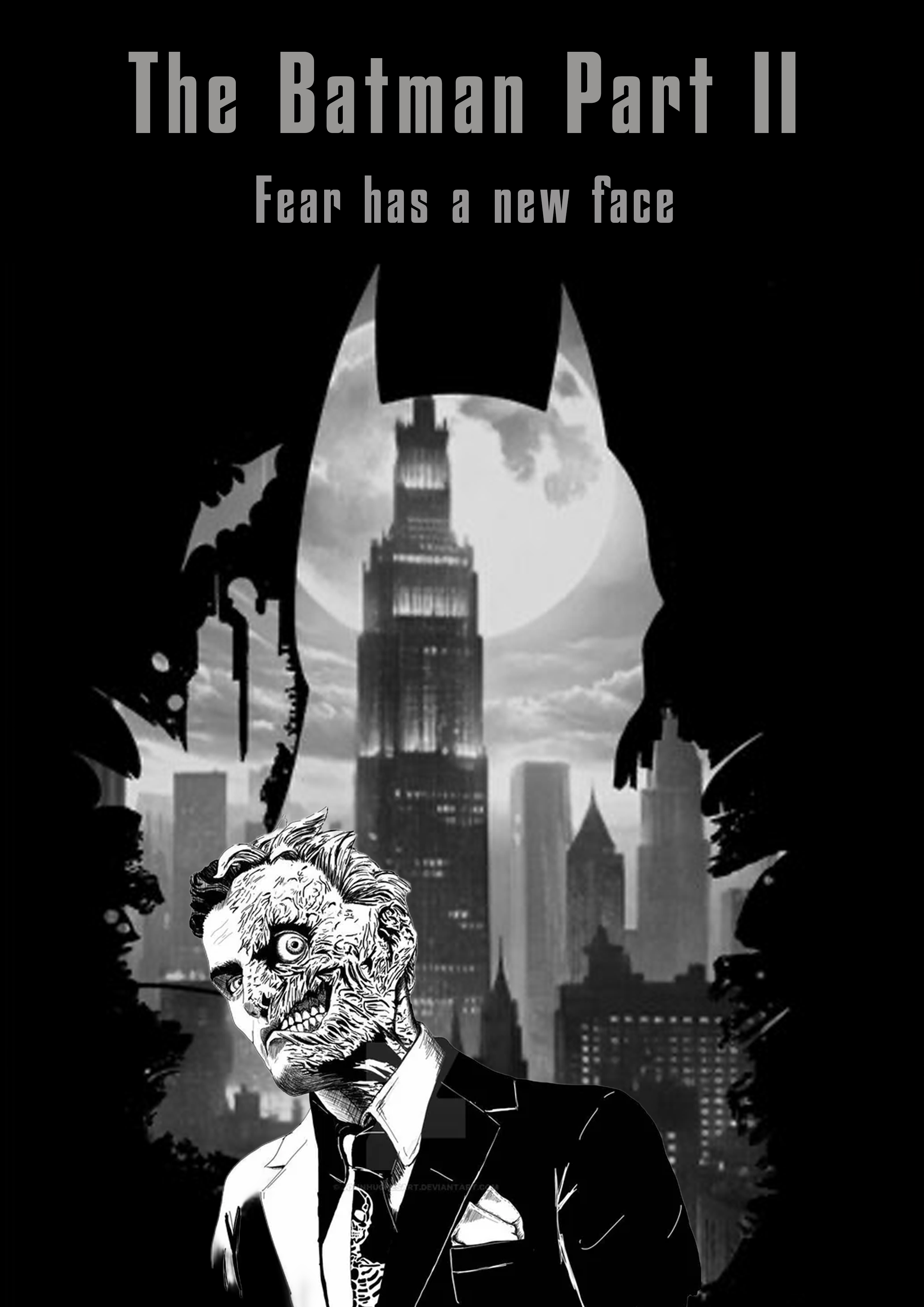
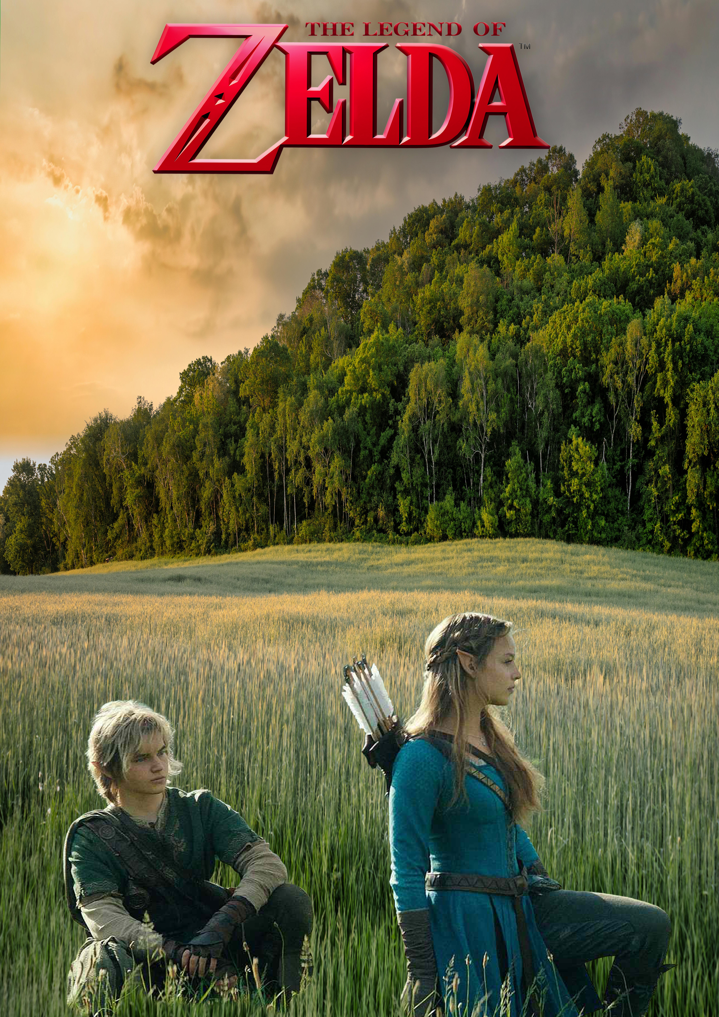
Figure 3: Upcoming Films Posters,
Source: Author's own work (Oliver Lund, 2026).
The development of these film posters focused solely on creating original designs for upcoming films that have yet to release their respective marketing material.
To achieve this, multiple films from different genres were selected, including action/adventure (The Batman Part II), Fantasy (The Legend of Zelda), and science fiction (Star Wars). Research by Matbouly (2020) also highlighted how colour and lighting influence the emotional tone in film imagery, which further informs the colour palettes used throughout these poster concepts.
For The Batman Part II, Two-Face was positioned at the centre of the poster to create a strong focal point and highlight his importance within the film. Research on visual hierarchy (Ware, 2012) provided me with a deeper understanding of how people are naturally drawn to focal elements, especially human faces (Bruce and Young, 1986). Also, widely discussed rumours about upcoming projects, especially regarding characters, enabled their inclusion in the design.
The participants were shown a wide variety of film posters. When shown these film posters, they were asked what they liked and disliked about them, and they shared their opinions on what needed improvement.
The Batman Part II received positive feedback for its use of visual hierarchy and silhouette composition. The aspect the audience liked a lot was the silhouette in the background, which helped reinforce the poster’s tone and identity. Guo et al. (2024) suggested that audiences are naturally drawn towards visually dominant focal points. This suggests that the use of silhouette and contrast was effective in establishing a strong focal point and reinforcing the poster's tone.
The Zelda poster received positive feedback for its composition and environmental design. One critical aspect of the film poster that did not help was the placement of the logos, which were too close to the edge and felt out of place. This highlights a compositional imbalance: although the logo was made more visible, its placement disrupted the design's overall visual harmony. Saw and Gatzke (2024) explain that visual hierarchy and layout structure influence how audiences process visual information, reinforcing the importance of balanced composition in poster design.
Another poster for Star Wars: Starfighter was shown and received significant criticism for its use of colour and typography. The main problem was that the writing did not fit well with the poster and seemed to be pasted on top. This indicates that the typography was ineffective in its integration, failing to cohere with the composition, underscoring the importance of visual unity in poster design. This further aligns with research by Farace et al. (2025), who argued that text overlays and typography must be visually integrated with surrounding imagery to maintain audience engagement.
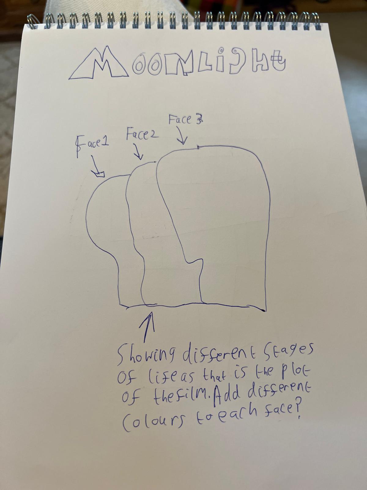
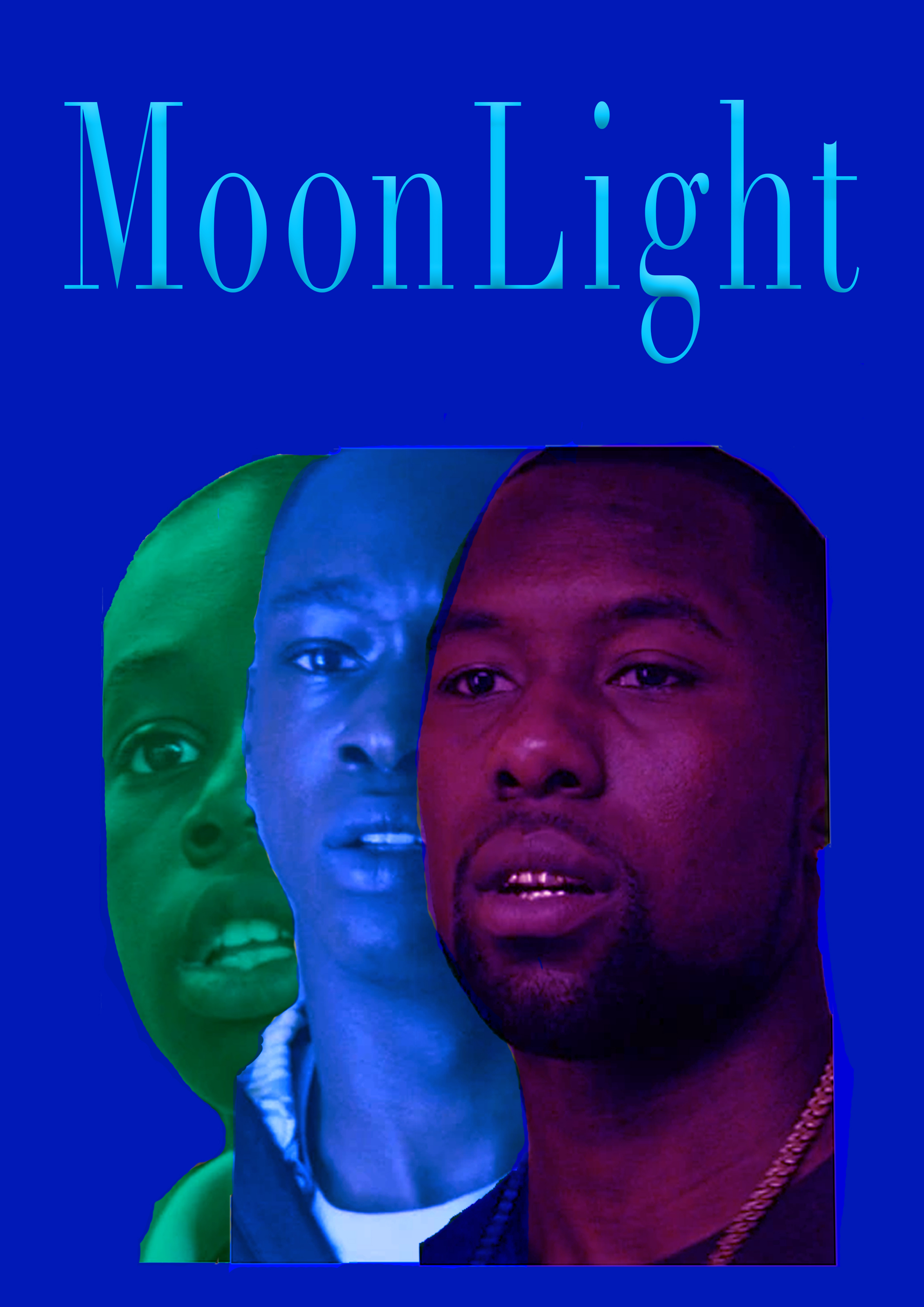
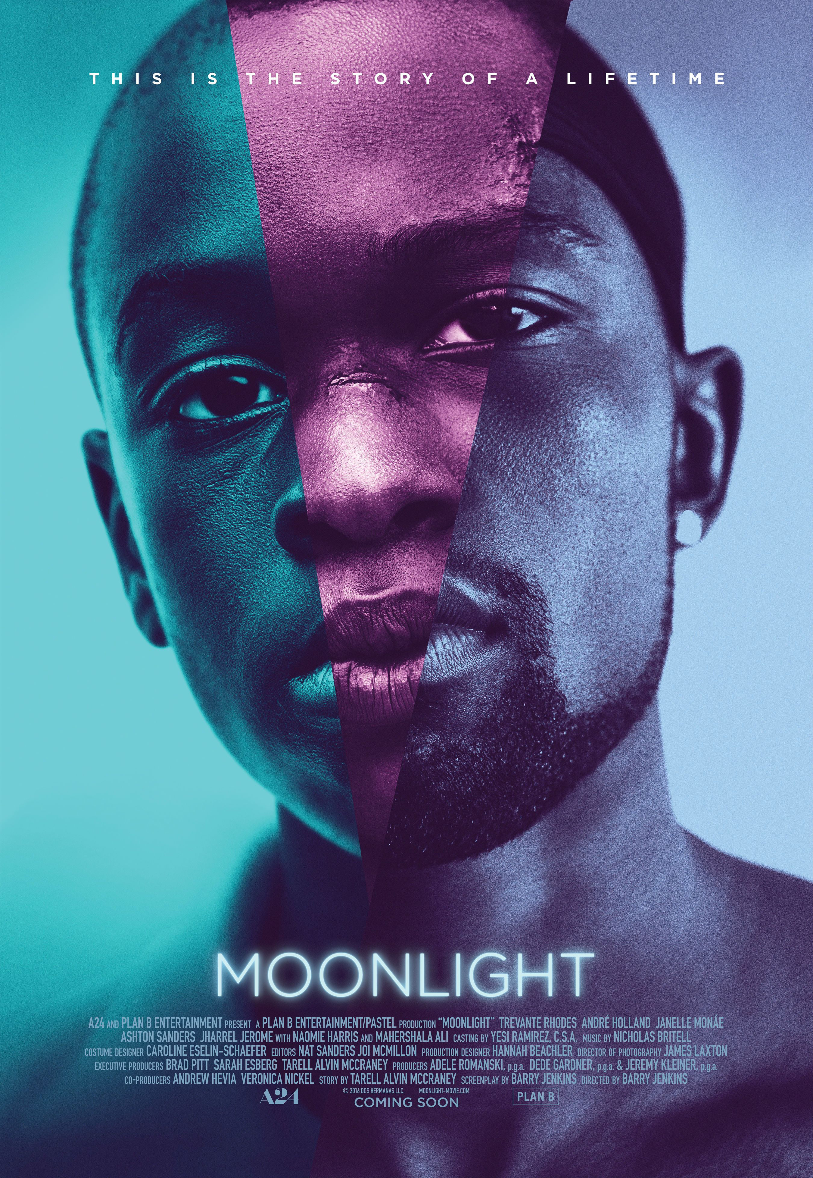
Moonlight, which drew criticism for its rough editing, especially in the green area. The audience liked the colour used for the character, as it seemed to help convey the different stages of the character's life, a key plot point in the film. This suggests that while the conceptual use of colour effectively communicated narrative themes, the lack of technical refinement reduced the overall quality of the design.
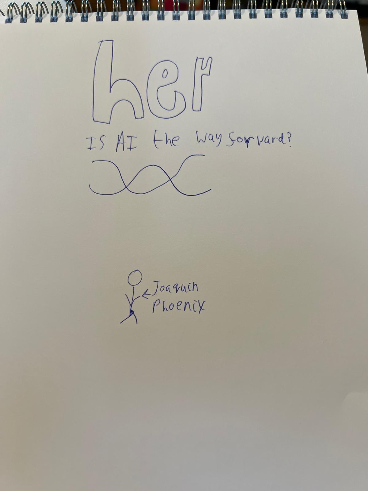
Another poster, Her, received positive feedback for its simple and colourful design, which clearly reflected the film’s tone.
Overall, the feedback demonstrates that strong use of visual hierarchy and composition can effectively attract audience attention and communicate tone. At the same time, weaknesses in typography integration and technical refinement can reduce a poster's overall impact.
Figure 4: Poster Remakes,
Source: Author's own work (Oliver Lund, 2026).
These poster design remakes focus primarily on applying audience feedback further to improve the effectiveness and clarity of the posters.
The Moonlight poster received some criticism for its rough editing, particularly in the green colour grading. To further improve this, I reviewed the colour grading in Photoshop using a more controlled editing approach and refined it to better align with the design. Overall, the layout remained the same; these refinements were intended to enhance the poster's quality and appeal further.
For the Zelda poster, audience feedback indicated that the logo's placement near the edge disrupted the overall composition. To help address the issue, the symbol that the audience was not so fond of was removed, leaving only the main logo, which was moved to the centre. This was done to help create a visual balance and further reduce distractions.
The Star Wars: Starfighter poster received heavy criticism for its typography, which did not seem to fit the poster and stood out in a rather negative way. To improve this, I bevelled and embossed the typography to give it a more 3D effect, further integrating it into the poster design and adding a cinematic feel. This helped make the posters' typography feel more consistent with their visual style and helped make the overall posters stand out more.
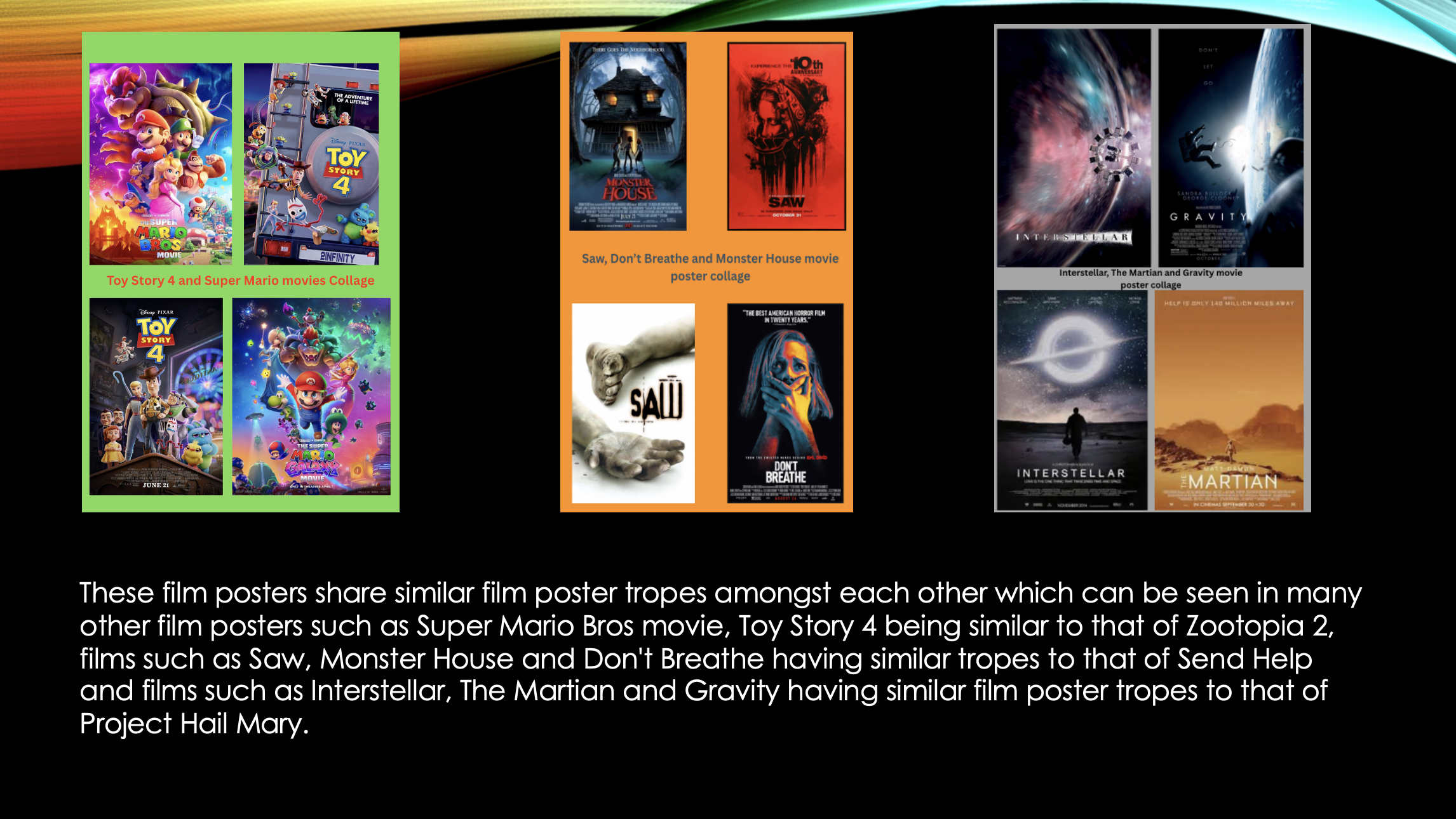
Figure 5: Film similarity collages,
Source: Author's own work (Oliver Lund, 2026).
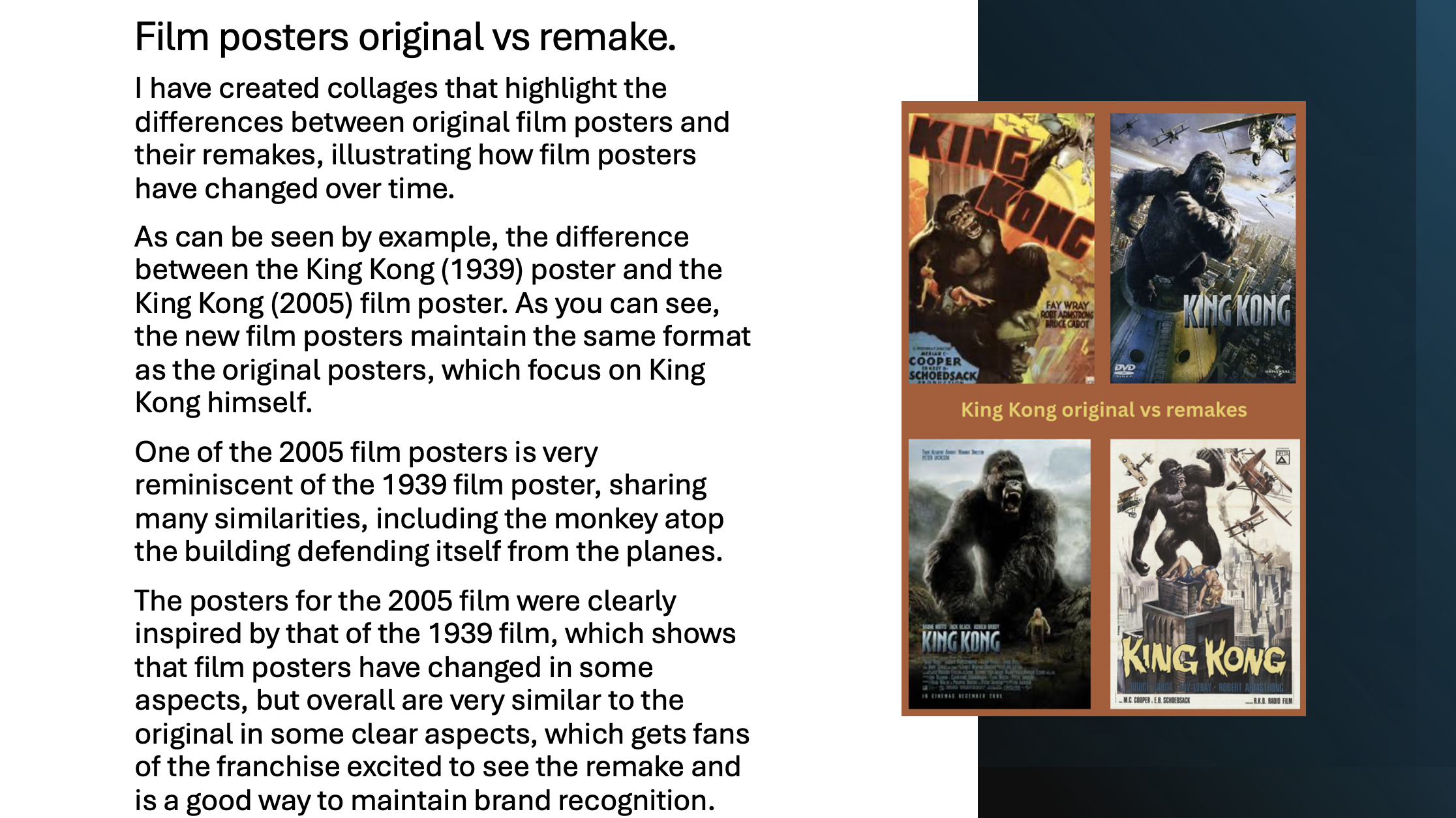
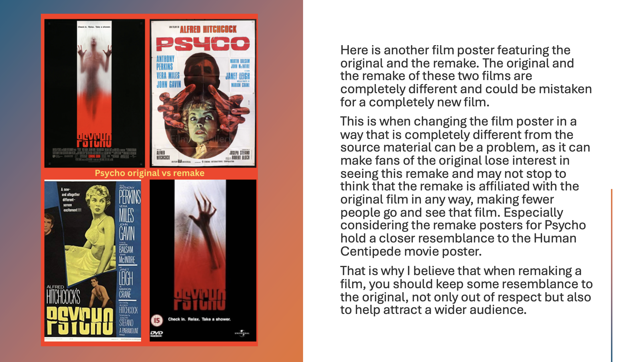
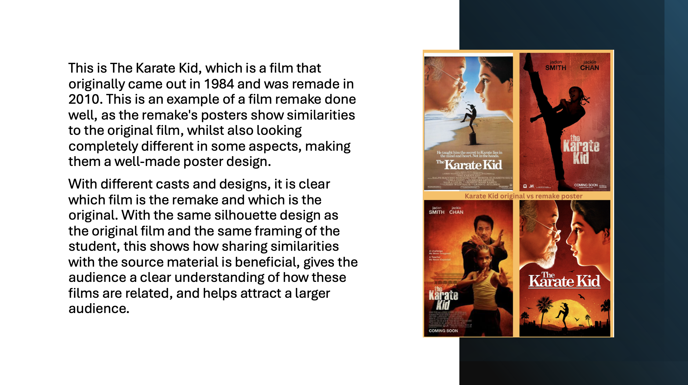
Figure 6: Remake vs Original Collages,
Source: Author's own work (Oliver Lund, 2026).
When evaluating this project further, I considered the audience's feedback and refined my work accordingly. One key area for improvement was logo placement and typography, which should be used to elevate the posters rather than make them seem less appropriate for the poster's design.
Another aspect that needed further refinement is the editing in the poster's design, ensuring it appeals to the audience rather than standing out in a negative way. This can be done by further refining the editing and ensuring it is more appropriate for the poster. Dai et al. (2022) explain that colour and viewing time influence people's aesthetic judgment, suggesting that refined colour balance and clearer composition can further enhance an audience's perception.
Many key aspects were done well, such as the colour in Her and the Batman Part II poster for its unique art style, with the silhouette in the background that really drew the audience's attention to the film poster.
Sustainable Development Goal 4 focuses on improving access to quality education and supporting learning through clear communication and understanding. In the context of this design project, film posters can be seen as a form of visual communication that helps audience members to interpret information more quickly and effectively. Sieghart (2020) argues that typography plays a key role in improving text comprehension, as reflected in my poster designs, which use composition, typography and colour to guide the viewer's attention and communicate tone and narrative.
Throughout this design process, I gained a greater understanding of the visual hierarchy and the influence of layout on how audiences interpret meaning. By further refining important elements within these film posters, such as their typography, composition, and colour layout, I was able to make these film posters easier for audience members to engage with. This further demonstrates how visual design can support informal learning by enabling viewers to understand key information without relying on extensive text. Choi and Seo (2024) argue that accessible and inclusive design enhances usability and understanding for wider audiences, which supports the accessibility considerations within this project.
Overall, this project has highlighted the importance of clear, accessible visual communication, aligning with Sustainable Development Goal 4 and further demonstrating how design can improve understanding and learning experiences for a wider audience. This highlights how visual design can serve as a form of informal learning, enabling audiences to quickly interpret meaning without relying solely on written information.
In conclusion, this case study has shown how research-led design decisions can influence audience engagement when used properly. By applying key features identified in the literature themes and exploring their important role in poster design, we have gained a greater understanding of how to use those key aspects in design work. The findings from the major research project helped establish a clear baseline for this case study, clarifying which aspects I should focus on when creating these poster designs and helping bring them to fruition.
Overall, this case study enhanced my understanding of film poster design and audience engagement. Research by You (2026) further suggests that visual impact and memorable imagery play a key role in helping audiences retain and interpret visual information.
This further demonstrates that design is not only an aesthetic but also an educational tool; it can be an effective form of visual communication that enhances understanding and accessibility for a much wider audience. This also reflects the United Nations' Goal 4 objective of improving access to learning and communication through inclusive educational practices (United Nations, 2025).
Bruce, V. and Young, A. (1986). Understanding Face Recognition. British Journal of Psychology, [online] 77(3). Available at:
https://www.proquest.com/docview/1293637827/fulltext/324285E53BF640A4PQ/1?accountid=27803&sourcetype=Scholarly%20Journals&imgSeq=1
[Accessed 2 January 2026].
Choi, G.W. and Seo, J.Y. (2024). Accessibility, Usability, and Universal Design for Learning: Discussion of Three Key LX/UX Elements for Inclusive Learning Design. TechTrends, vol. 68, no. 5, pp. 936–945. Available at:
https://research.ebsco.com/c/evpzds/viewer/pdf/iqcbi724cf?route=details
[Accessed 22 April 2026].
Dai, A. et al. (2022). The Influence of Viewing Time and Color on Architectural Aesthetic Judgment. Frontiers in Psychology, 12, Article 752996. Available at:
https://doaj.org/article/c7f1a99927264695a2a6717d012b8a83
[Accessed 26 April 2026].
Farace, S. et al. (2025). Standing out while fitting in: Visual Design of Text Overlays in Social Media Communication. Journal of Marketing, vol. 90, no. 1. Available at:
https://journals.sagepub.com/doi/full/10.1177/00222429251322773
[Accessed 3 May 2026].
Guo, R. et al. (2024). Empirical Insights into Eye-Tracking for Design Evaluation: Applications in Visual Communication and New Media Design. Behavioral Sciences, vol. 14, no. 12, Article 1231. Available at:
https://go.gale.com/ps/i.do?id=GALE%7CA821761242&v=2.1&it=r&u=ucwinch&p=AONE&aty=shibboleth
[Accessed 29 April 2026].
Kuba, R. and Jeong, A. (2023). Demystifying Visual Design: A Sequential Analysis of Design Processes in Infographic Visual Composition. Journal of Visual Literacy, vol. 42, no. 1, pp. 1–22. Available at:
https://www.tandfonline.com/doi/full/10.1080/1051144X.2023.2168394#d1e319
[Accessed 29 April 2026].
Lupton, E. (2015). Graphic Design: the New Basics (2nd Edition, Revised and Expanded). 2nd ed. [online] Princeton Architectural Press. Available at:
https://books.google.co.uk/books?hl=en&lr=&id=FYwVCgAAQBAJ&oi=fnd&pg=PA1&dq=Lupton,+E.+(2014).+Graphic+Design:+The+New+Basics&ots=caGZy8nI-h&sig=CBHM7aLxOanhPO009106aSNICBg&redir_esc=y#v=onepage&q&f=false
[Accessed 5 January 2026].
Lynch, L. et al. (2020). Visual Literacy in Consumption: Consumers, Brand Aesthetics and the Curated Self. European Journal of Marketing, vol. 54, no. 11, pp. 2777–2801. Available at:
https://www.emerald.com/ejm/article/54/11/2777/90224/Visual-literacy-in-consumption-consumers-brand
[Accessed 24 April 2026].
Matbouly, M.M.Y. (2020). The Effects of Film Illumination Hues – an Exploration Study. CINEJ Cinema Journal, vol. 8, no. 2, pp. 353–376. Available at:
https://www.proquest.com/docview/2488269604?_oafollow=false&pq-origsite=primo&sourcetype=Scholarly%20Journals
[Accessed 25 April 2026].
Saw, J.J. and Gatzke, L.P. (2024). Designing Visual Hierarchies for the Communication of Health Data. Journal of the American Medical Informatics Association, vol. 31, no. 11. Available at:
https://academic.oup.com/jamia/article/31/11/2722/7725703?login=true
[Accessed 30 April 2026].
Sieghart, S. (2020). The Influence of Macrotypography on the Comprehensibility of Texts in Easy-To-Read Language: An Empirical Study. Visible Language, vol. 54, no. 3. Available at:
https://www.journals.uc.edu/index.php/vl/article/view/4611
[Accessed 5 May 2026].
United Nations (2025). Goal 4: Ensure Inclusive and Equitable Quality Education and Promote Lifelong Learning Opportunities for All. United Nations. Available at:
https://sdgs.un.org/goals/goal4
[Accessed 21 April 2026].
Ware, C. (2012). Information Visualisation: Perception for Design. 3rd ed. [online] Elsevier Science & Technology. Available at:
https://ebookcentral.proquest.com/lib/winchester/reader.action?docID=892223&c=RVBVQg&ppg=1
[Accessed 10 January 2026].
You, J. (2026). Research on the Enhancement of Visual Impact and Memory Points in Image Design through Multimedia Elements. International Journal of Information and Communication Technology Education, vol. 22, no. 1, pp. 1–20. Available at:
https://www.igi-global.com/gateway/article/full-text-html/404701
[Accessed 26 April 2026].
Baldwin, J. and Roberts, L. (2005). Visual Communication: From Theory to Practice. Crans-Pres-Celigny; Worthing: Ava. Available at:
https://ebookcentral.proquest.com/lib/winchester/reader.action?docID=4654142&c=UERG&ppg=1
[Accessed 12 May 2026].
Conner, L. (2013). Audience Engagement and the Role of Arts Talk in the Digital Era. Basingstoke: Palgrave Macmillan. Available at:
https://ebookcentral.proquest.com/lib/winchester/reader.action?docID=1588823&c=UERG&ppg=1
[Accessed 7 May 2026].
Gilbert, R. (2019). Inclusive Design for a Digital World: Designing with Accessibility in Mind. S.L.: Apress. Available at:
https://ebookcentral.proquest.com/lib/winchester/reader.action?docID=6000719&c=RVBVQg&ppg=1
[Accessed 6 May 2026].
Hall, S. (2012). This Means This, This Means That. 2nd ed. London: Laurence King Publishing. Available at:
https://ebookcentral.proquest.com/lib/winchester/reader.action?docID=1876119&c=RVBVQg&ppg=1
[Accessed 8 May 2026].
Lupton, E. (2010). Thinking with Type: A Critical Guide for Designers, Writers, Editors, & Students. 2nd ed. New York: Princeton Architectural Press. Available at:
https://ebookcentral.proquest.com/lib/winchester/reader.action?docID=3387329&c=UERG&ppg=1
[Accessed 9 May 2026].
Luna, P. (2018). Typography: A Very Short Introduction. Oxford: Oxford University Press. Available at:
https://academic.oup.com/book/817
[Accessed 13 May 2026].
Machin, D. and Ledin, P. (2020). Introduction to Multimodal Analysis. S.L.: Bloomsbury. Available at:
https://ebookcentral.proquest.com/lib/winchester/reader.action?docID=6933812&c=RVBVQg&ppg=1
[Accessed 8 May 2026].
Malamed, C. (2015). Visual Design Solutions. Hoboken, NJ: John Wiley & Sons. Available at:
https://onlinelibrary.wiley.com/doi/book/10.1002/9781119153801
[Accessed 10 May 2026].
Pincus, H., Wojcieszak, M. and Boomgarden, H. (2016). Do Multimedia Matter? Cognitive and Affective Effects of Embedded Multimedia Journalism. Journalism & Mass Communication Quarterly, [online] 94(3), pp. 747–771. Available at:
https://journals.sagepub.com/doi/full/10.1177/1077699016654679
[Accessed 11 May 2026].
Redrobe, K. (2014). Animating Film Theory. Durham: Duke University Press. Available at:
https://ebookcentral.proquest.com/lib/winchester/reader.action?docID=1647711&query=&c=UERG&ppg=1
[Accessed 10 May 2026].
Appendix A:
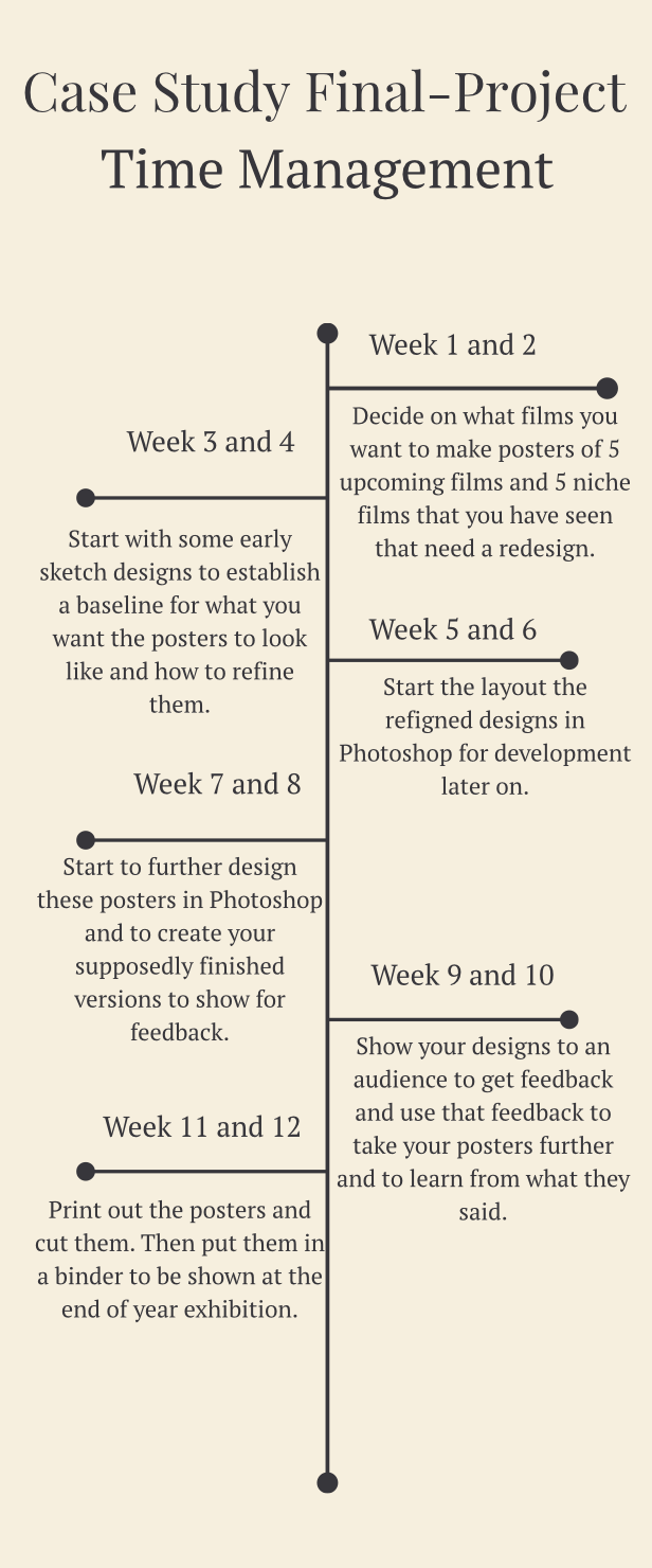
Figure 7: Time Management,
Source: Author's own work (Oliver Lund, 2026).
Here is a time management schedule that I made for this project. This time management helped me establish a baseline for my project and understand what I needed to do next to take it further. This time management schedule helped me stay on top of my work and keep to the schedule.
Appendix B:
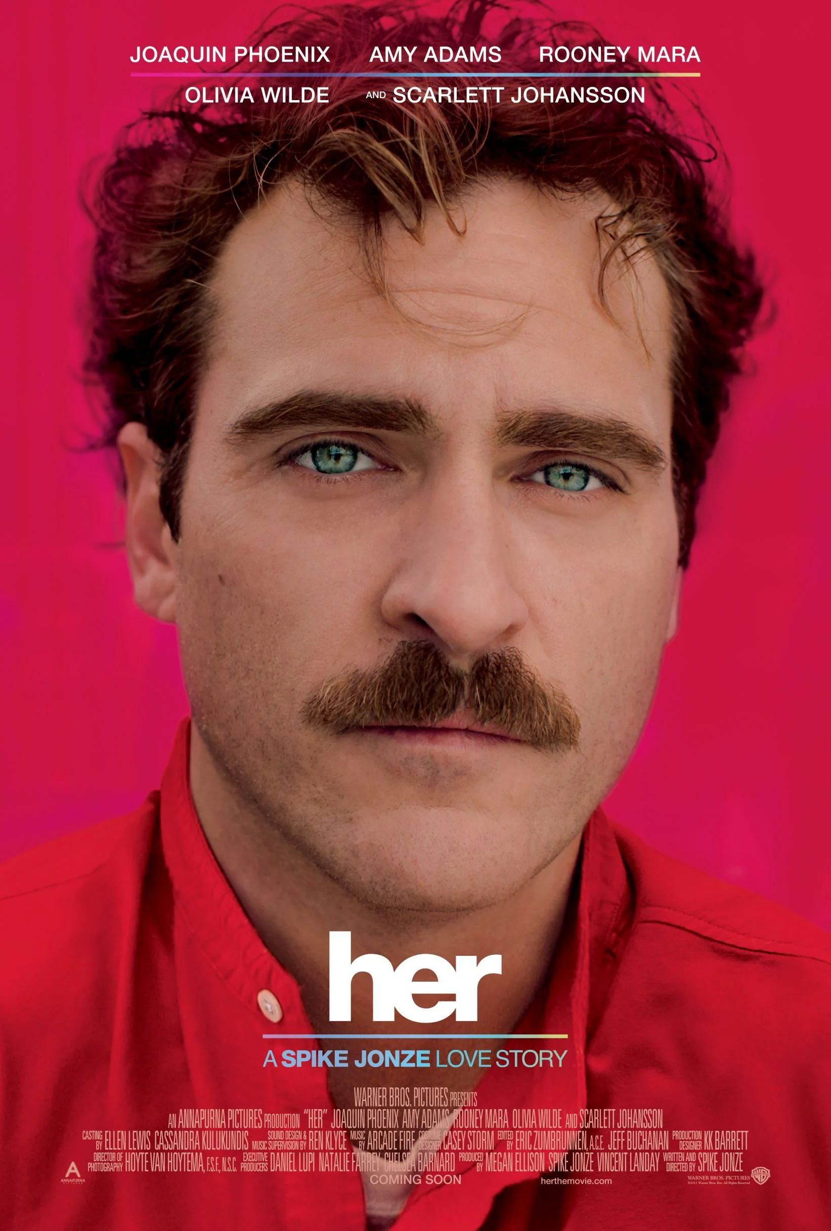
Figure 8: Original Posters,
Source: Film Industry/ Google images.
Here are the original posters that my iteration of poster designs were based upon.
Appendix C:
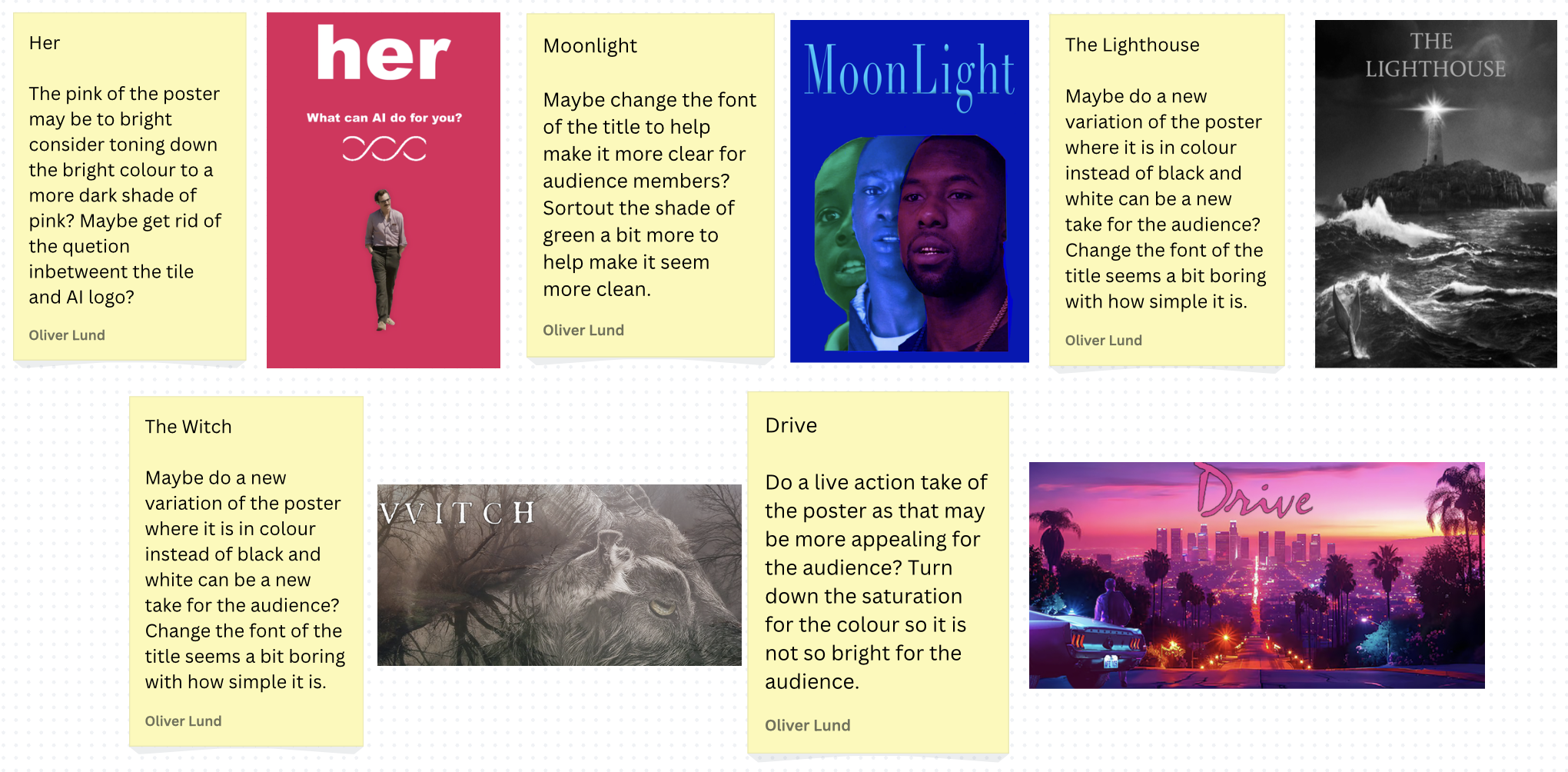
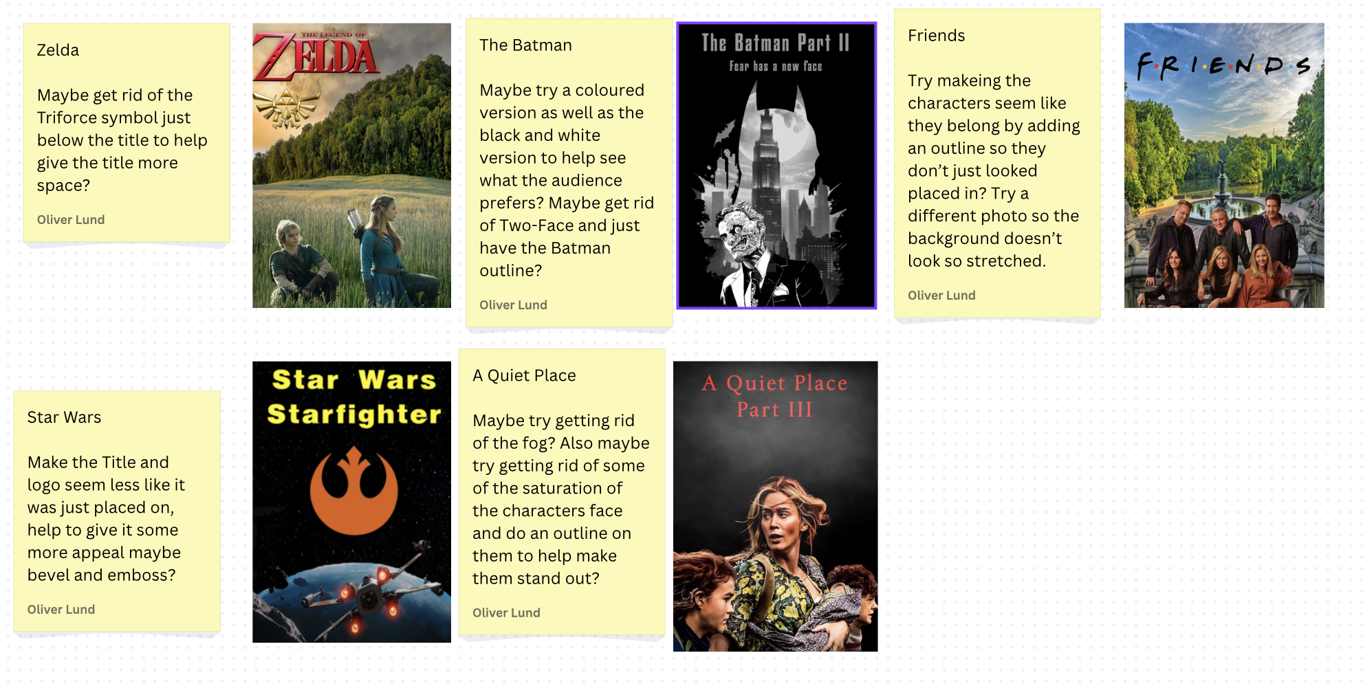
Figure 9: Annotations,
Source: Author's own work (Oliver Lund, 2026).
Here are some annotations of my original poster designs that helped to further give me an understanding of how I could improve my designs so they can be more appealing for the audience.
Appendix D:
This work was assisted by Grammarly under my learning agreement and was approved for use by my teacher, Tina Scahill.
Research Content and Literature Themes
Research Content
Literature Themes
Practice Development and Iteration
Practice Development
Redesign Iterations
Upcoming Films Posters
Feedback
Remakes
Findings
Remakes vs Originals
Evaluations
SDG 4
Conclusion
References
Bibliography
Appendices
Time Management
Original Posters
Annotations