Airlock
This page will showcase the work that I have done for my 5th group project, which is where we as a group designed and created a game called Airlock, which is a sci-fi brawler similar to that of Super Smash Bros, but set in space. Here you will see the design work that I did for the group, such as logo design, main menu design and pause menu design.
Synopsis: Why this project was created
This project was created to develop a unique and original video game known as Airlock this game was an idea from the game design teacher and it is our job to help bring the teachers idea into fluition. This game in a sci-fi, brawler game that will be realeased on Steam. If the game does well it will also help with us finding jobs in the future as it will be put on our website porfolios.
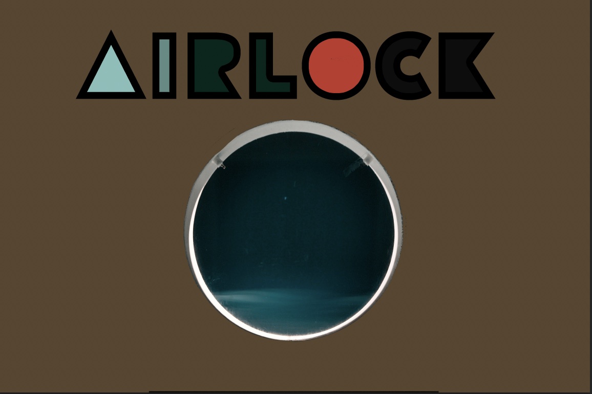
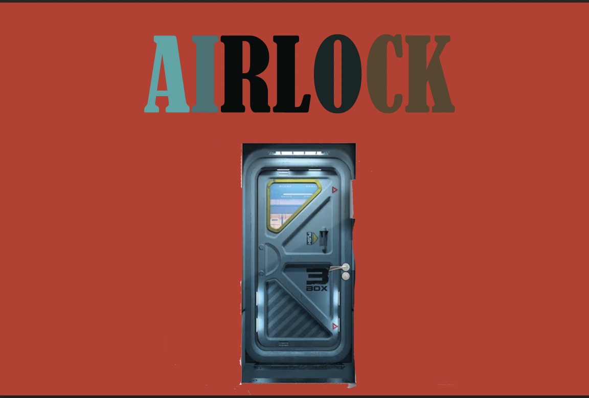
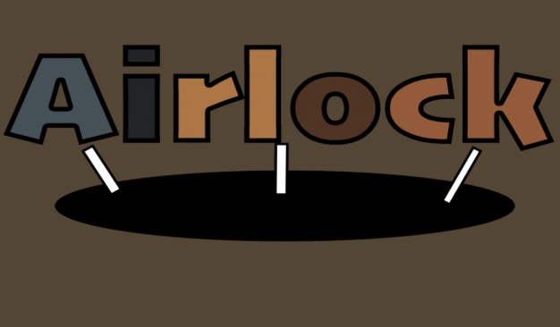
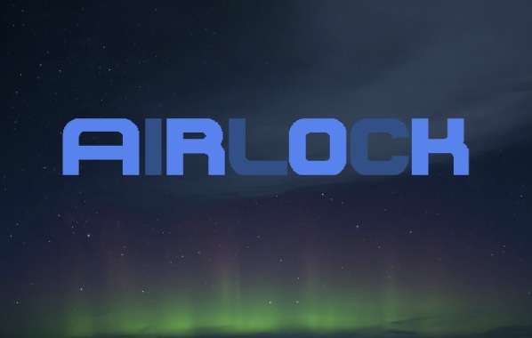
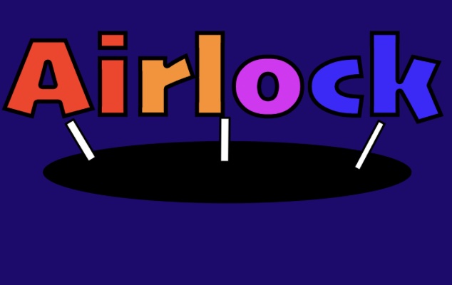
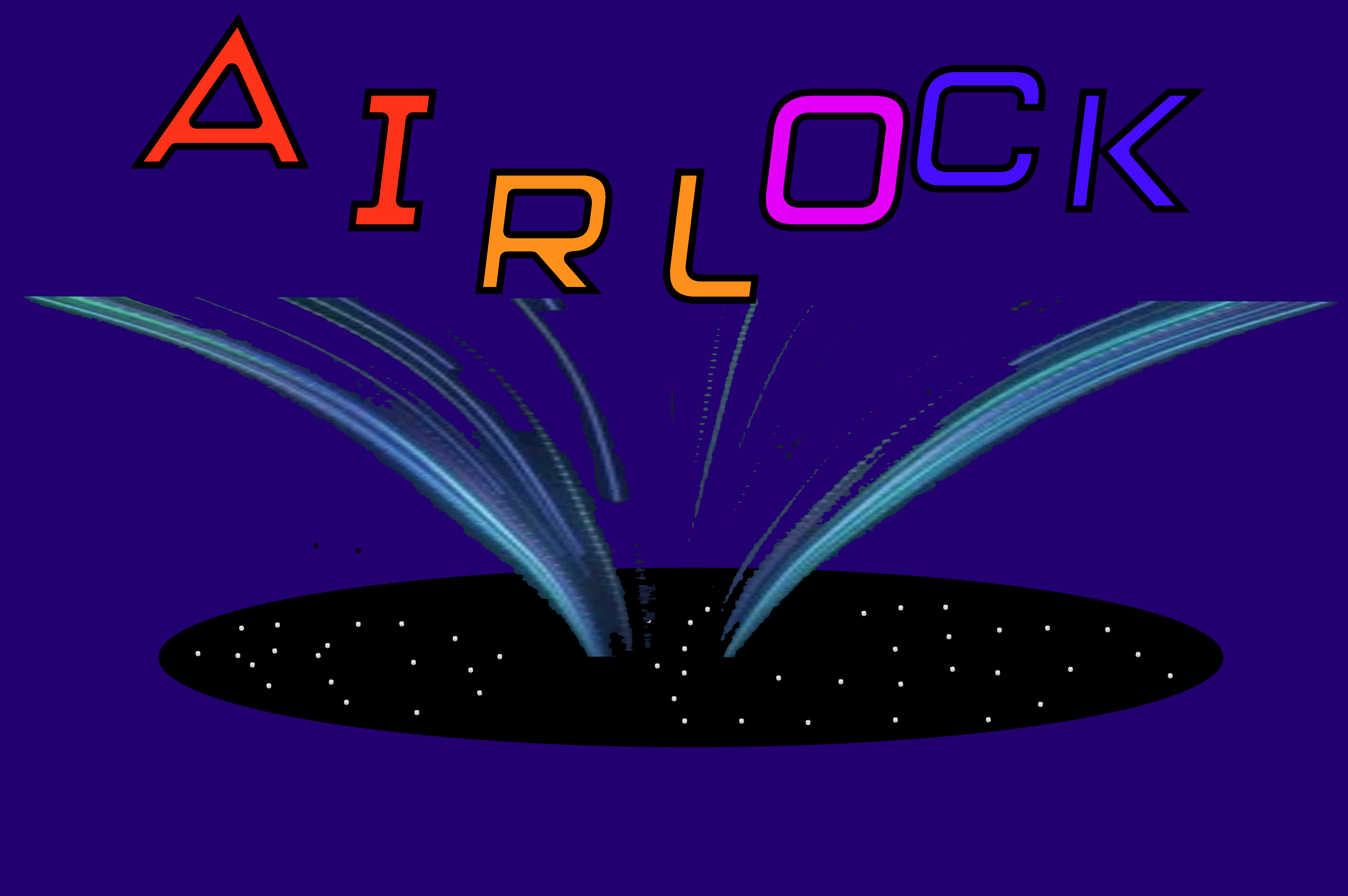
Logo design was a very important role as it's what gave the game an image and a bit of an understanding of what the game could be about. Creating the right logo was quite difficult as I wanted to incorporate an airlock in some sense into the logo design but getting the right sense of the airlock was quite difficult as you can see in some of my logo designs I just incorporated an image of an airlock but the team didn't like it so we incorporated the motion of an airlock instead. As you can see at the end of the slide the letters being sucked in black as that is what happens when an airlock is opened and we thought that went well with the logo design. I used the Ink Bot Design website to help give me tips on how to create an efficient logo. (Crawford, S, 2025)
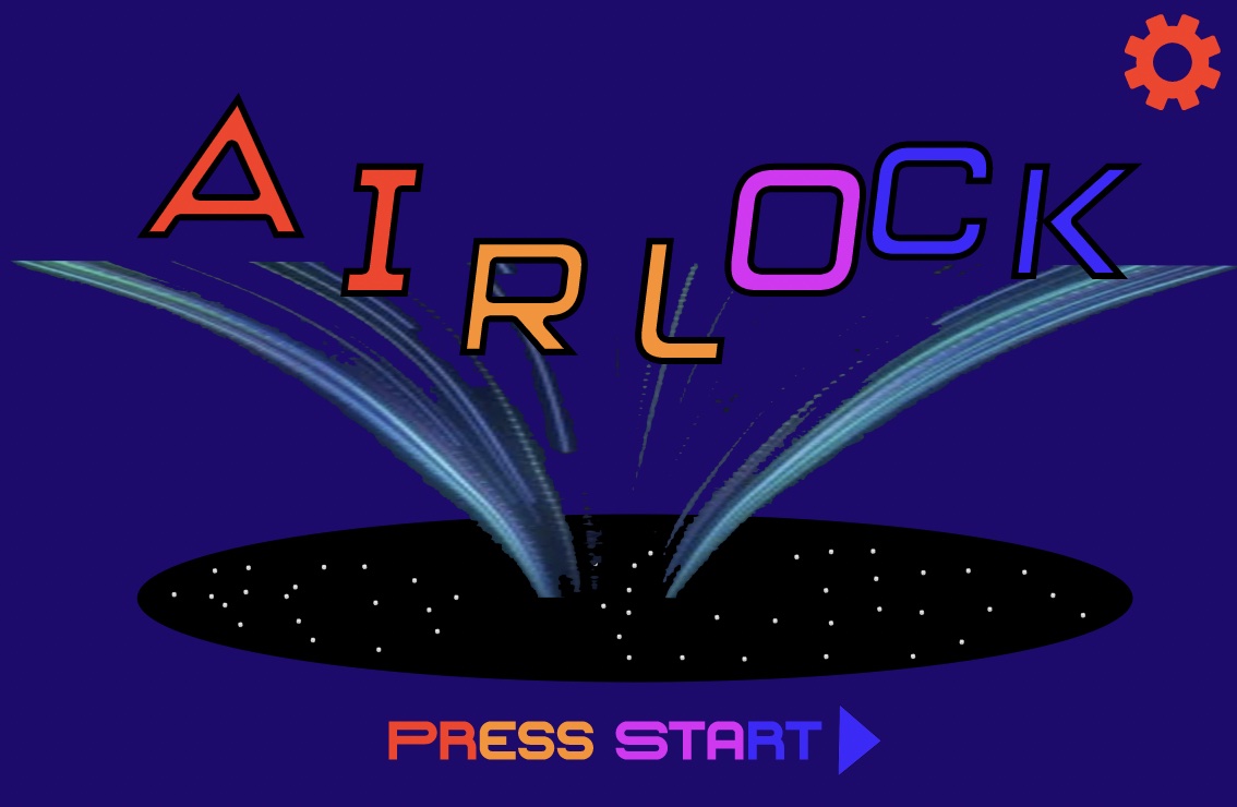
This is the main menu design for the airlock that we came up with. As you can see, it is the final logo design, I added some new elements such as the press start button and the cog wheel to the top right. The cog wheel in the top right is what will make the settings accessible to the user. The press start icon is new and helps to give the audience an understanding of how to start the game. Game Developer was a big help when it came to designing the main menu. I remembered it talked about how it's important for main menus to feel alive and interactive, and so we tried to incorporate that into the main menu by letting the buttons light up when hovered over. Both LinkedIn websites were also a great help, as the tips on effective game menus and how to enhance the user's experience were very useful. (Pears, M, 2016), (Linkedin, 2025), (Linkedin, 2025)
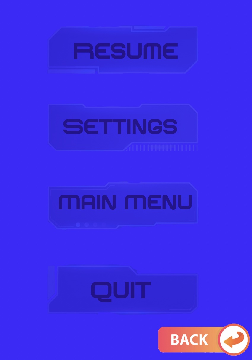
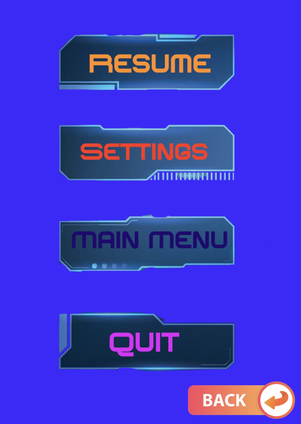
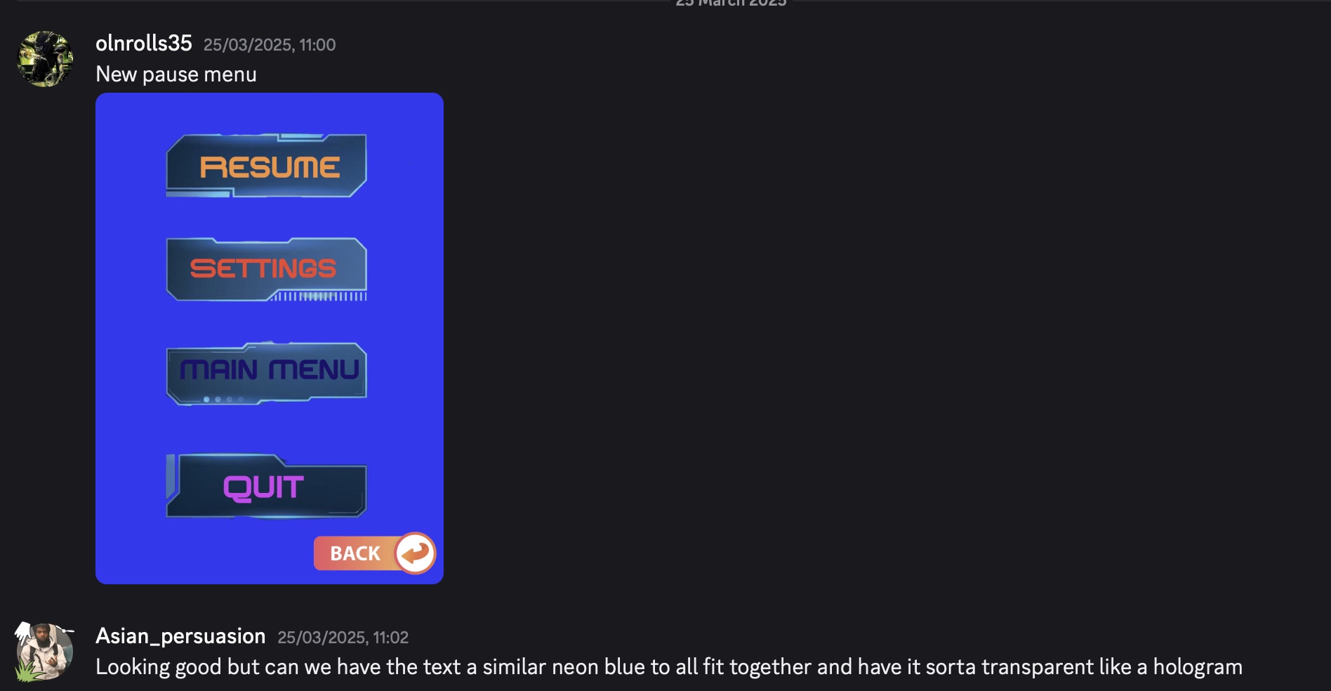
This is the pause menu that has been designed for the game. The main goal was to make the pause menu seem futuristic as futuristic as possible, considering this was a sci-fi game. Originally, I used simple blue buttons and added colour to the writing, but the group didn't like the concept. We decided as a group that we wanted the pause menu to have a faded style of bright blue to help make this seem more sci-fi-like. We also chose a style of typography that we believed helped to make the writing seem more futuristic. There will also be an element added to this pause menu where, if you hover over the pause menu buttons, resume, settings, main menu and quit, the buttons will be highlighted to help make the buttons seem more holographic and also more futuristic. I used the Wayline website to help give me tips on how to design a pause menu. One of the quotes was "Dead Space stands as a prime example of masterful diegetic design." That is why Dead Space is one of the key inspirations for the menu design. (Wayline, 2025)
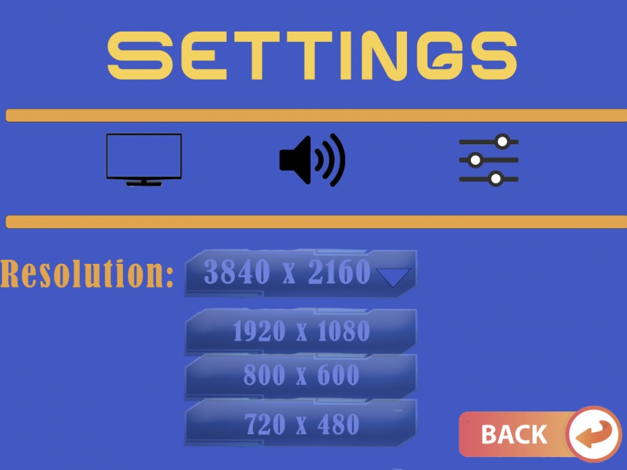
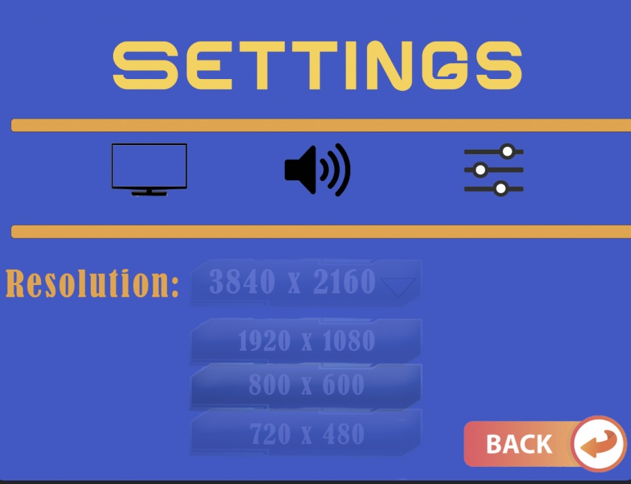
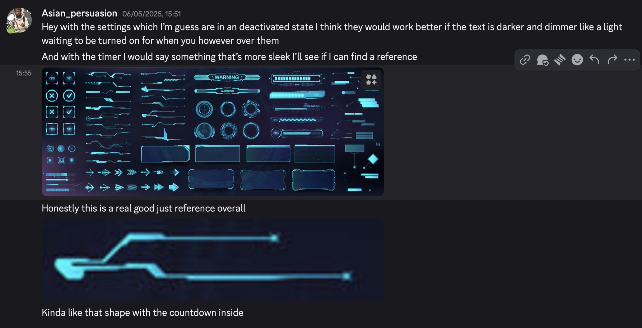
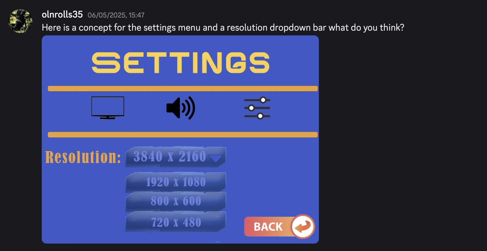
These are a look at what the settings for Airlock will look like. As you can see, we have added some icons on the top, such as a TV icon, an audio icon, slider icon. This icon will send you to different parts of the settings where you can edit the resolution of the game, the audio and adjust the brightness and more with the sliders. This will be a fundamental part of the video game. The resolution will be a drop-down button, and as you can see, the buttons are similar to those of the pause menu. As you can see in the second image, we decided to dim down the writing and buttons similar to that of the pause menu, as we want the buttons to be brighter and be highlighted, similar to the first image.
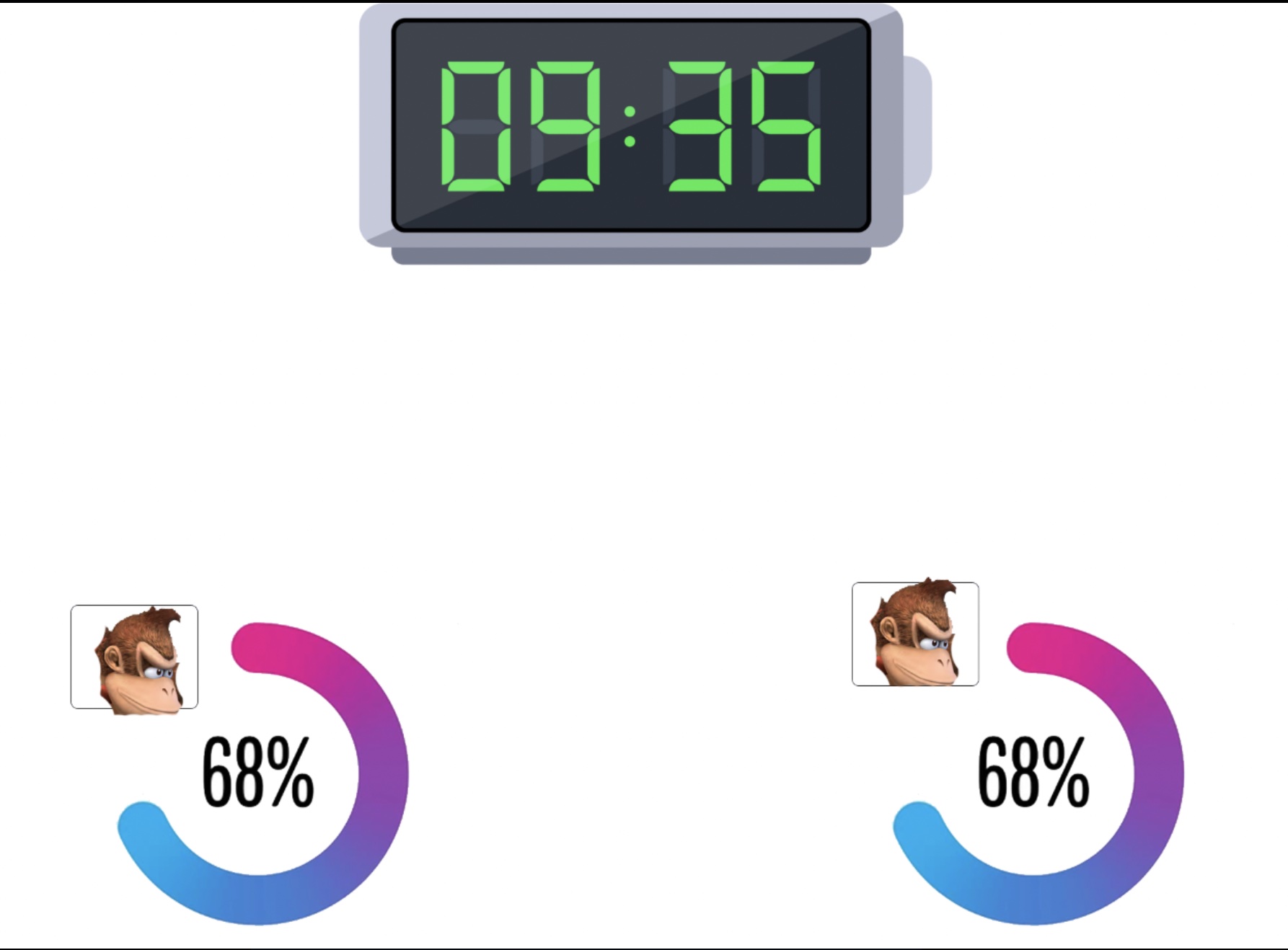
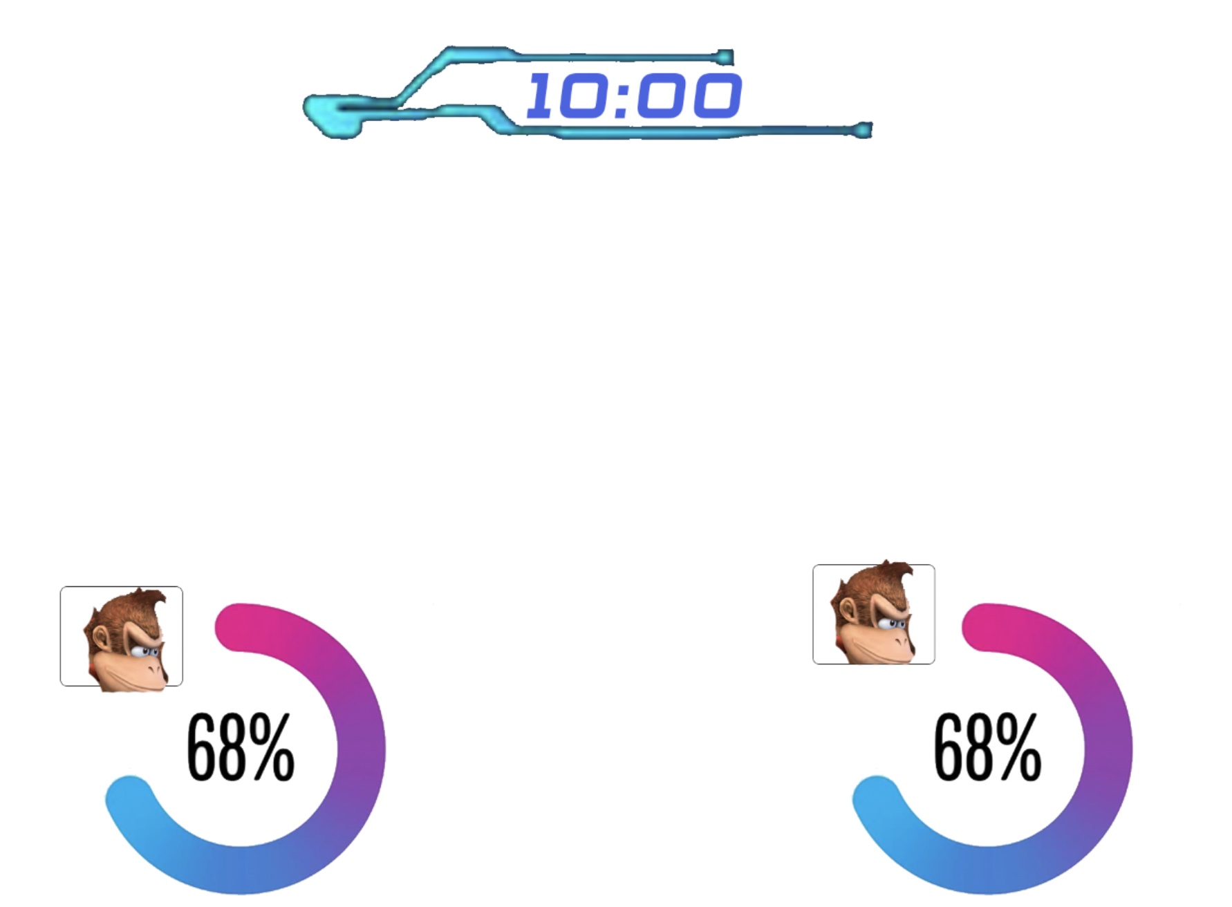
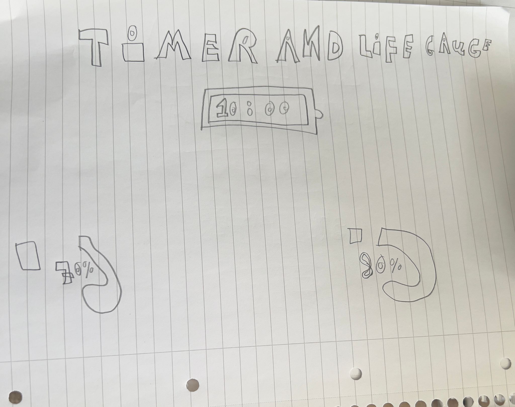
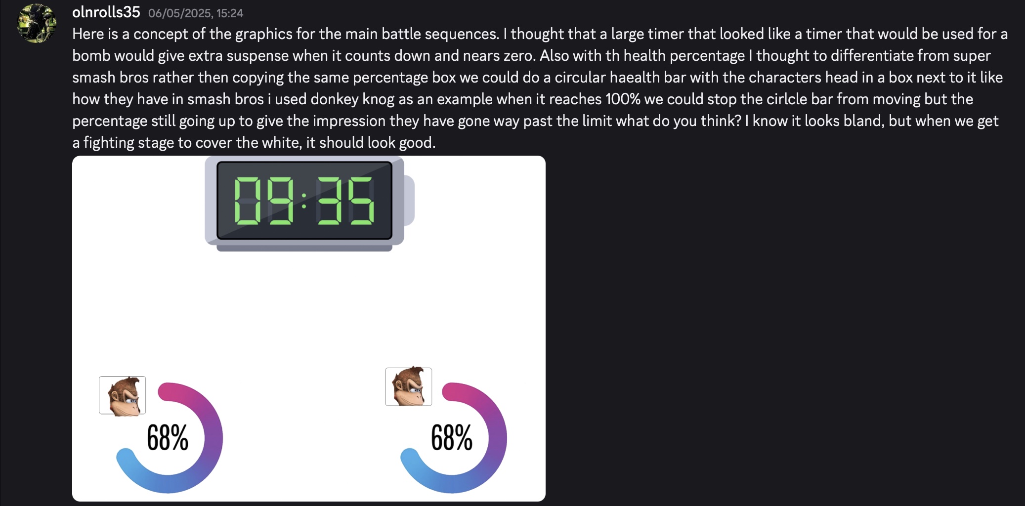
This is a slideshow showcasing a design that I had created for the timer and life gauge that would be represented in the game the group leader did not like the design of the timer in the first image so as you can see in the second image there was a change made to the timer that helped made it seem more sci-fi like. The health gauge was inspired by the game Super Smash Bros I didn't want it to be similar, so rater then being just a percentage number that goes up in front of a blue bar, I changed it to a circle to help differentiate is still similar to Super Smash Bros in the way it utilises percentages.
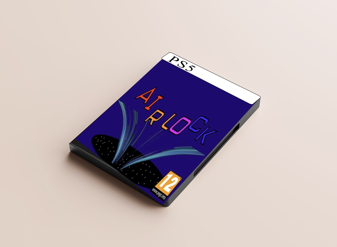
This is a mock-up that I created to help represent what our game, Airlock, would look like on a DVD case. The mock-up is loosely based on what a PS5 Video Game looks like. To create this, I simply downloaded a mock-up photo of a DVD case and put our games logo on it, then I took an image of the PEGI 12 rating and put it on top of it and created the white band with PS5 on it. The website that I used for this mockup was called mockup-designs.com. (Mockup Designs, 2025)
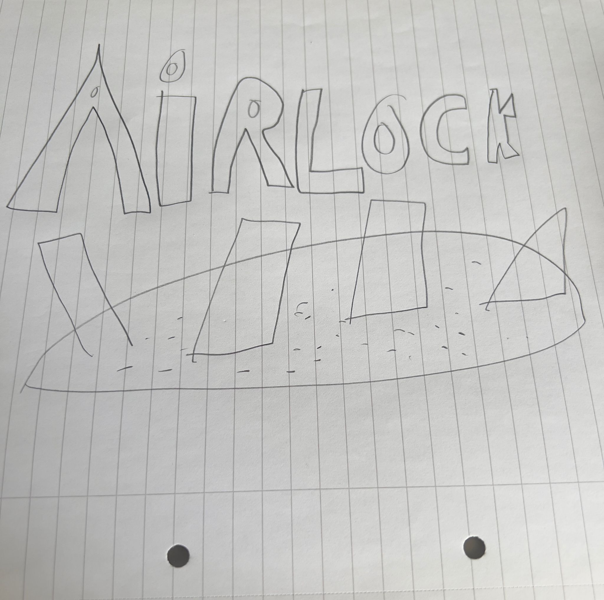
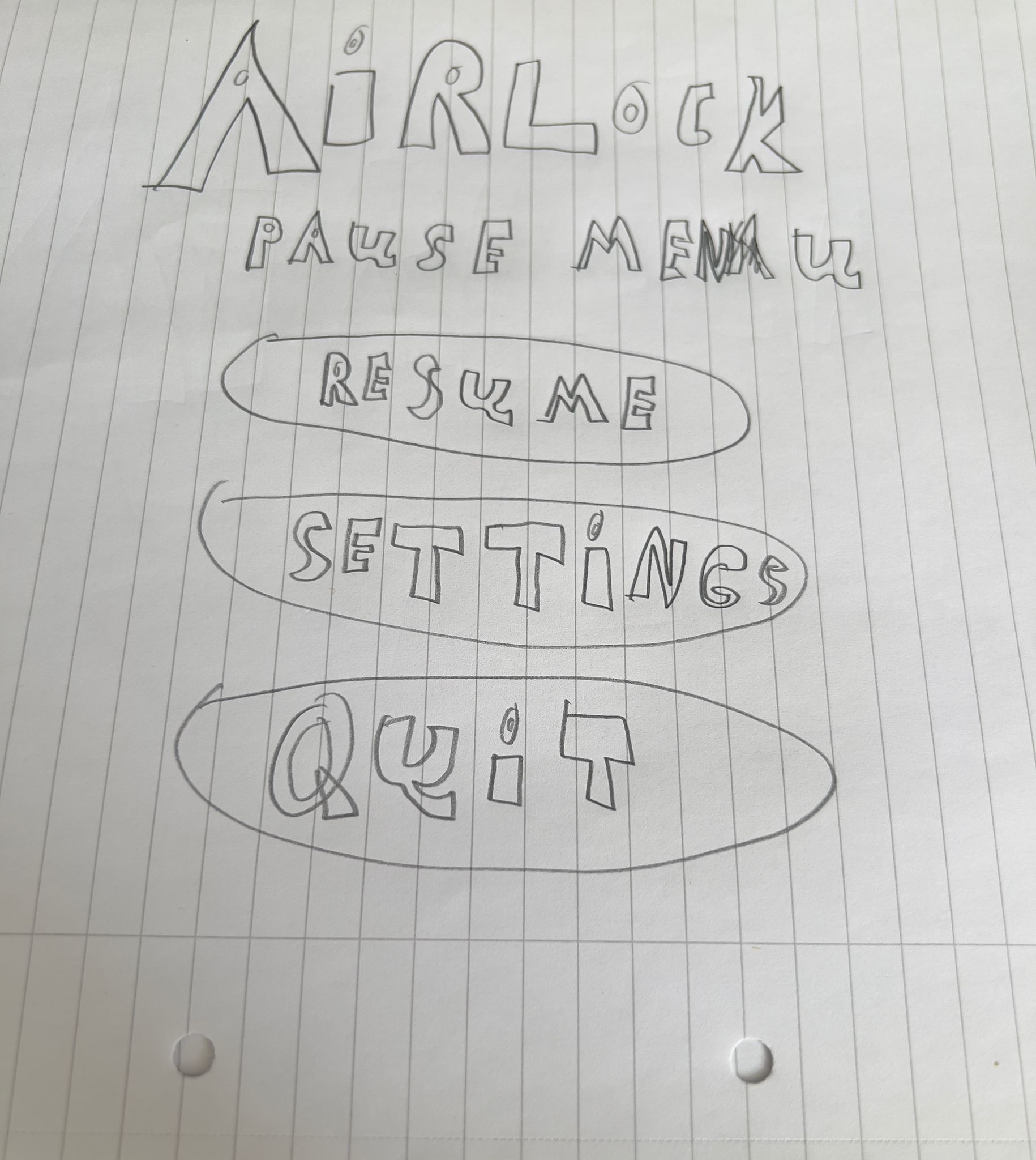
These are some very early sketches of my work. These are sketches of the Logo,Pause Menu and Timer and Life Gauge that I had designed for this game Airlock. As you can see some of the sketches have some resemplence to the finished project. I did these sketches to begin with to help give me an understanding of what I wanted my work to look like.
Here is a slideshow showcasing some of the annotations that my team leader had added, explaining what changes he wanted made.
The list of programmes that my team and I have used:
Me:
Adobe Photoshop.
The Team:
Unity
Visual Studio Code
Fusion360
The research I had done for this work was primarily using the internet to help me search for photos and influences to help me come up with ideas of how to incorporate and present our logo best. I have also used the internet for help with designing the buttons for our pause menus and settings menu. The websites, to be exact, that have helped me are Shutterstock, Unsplash and iStock, as these websites helped to provide the necessary images that I needed for my work and were free to use. (Shutterstock, 2003-2025), (Unsplash, 2025), (IStock, 2025)
We had a group chat on Discord where we would communicate with one another, which helped us to talk with one another, and it helped our leader, Dan King, give us an understanding and pointers on what we should do next. It was rather smooth sailing working as a team; we communicated with one another quite efficiently and were able to get a great understanding of what we needed to do next.
I emailed my course lecturer at times to help me with my work at times. My course lecturer also helped advise me as to what websites to look at to help with my work and research. I did not do my talking to my actual client, as the client was not my course lecturer, as I do Digital Media Design, and my course lecturer teaches Game Design. The client was the course lecturer for 3 of my team members, including our team leader, so they most likely spoke to the course lecturer more often, who helped guide them with what they needed to do.
Airlock Brand Guidlines
Airlock Handover
This is a slideshow showcasing some of the texts that I had sent to my group in group to help show our communication with one another and help to establish that communication was a key part of game development, and it was quite successful as a group. As you can see in the texts that what was being discussed was my work that was being sent for an early preview to the group, so I can see if there was anything wrong with the work I had done and see if there can be any improvements made. Above is a link to the brand guidelines that we had developed as a group, which showcase some of the important rules that we had developed as a group.
If there was anything that I could have improved upon when doing my work, is maybe come up with some more original designs, then taking inspiration from the internet, as I could then show more of a creative side of my work. I could of also used some more unique apps when esigning this work, I primarily use photoshop because it is a web browser that I am very familiar with and I find it very easy to use but it would be a good way to develop my design skills further by branching out more and using something such as Figma for example.
I believe that I could of possibly had done some more research into my work to help gain a better understanding of how to improve my work and help to make it stand out better, although I am currently quite content with my work I always believe that there is more that I could have potentially improved upon that would help to make my work seem much better. I believe that I should have done more research into different software apps, which I plan on doing, as I believe that I should try branching out from Photoshop and try different software apps.
The model plan that I followed was instructions that where given to me by the group leader. That helped to guide me and helped give me an understanding of what I needed to do next. If there where any issues with what I had to do next my group leader would help to guide me by telling me what was wrong and what could be improved upon and guide me in the right step which was incredibly useful and appreciated.
I would not change my role as I was very happy with my role and what I was able to accomplish, I enjoyed doing my work and I hope to continue doing marketing work similar to what I have been doing right now as I have enjoyed it very much. I think I have been good at designing marketing work such as the logos, pause menu, settings menu and more and I am proud of my work.
Crawford, S (2025) Logo design for gaming: crafting a memorable identity. Ink Bot Design. Available at: https://inkbotdesign.com/logo-design-for-gaming
[Accessed at 12th May 2025].
Wayline (2025) The Art of the Unseen Pause: Designing Immersive Pause Menus. Available at: https://www.wayline.io/blog/designing-immersive-pause-menus
[Accessed at 15th May 2025].
Linkedin (2025) How can you design game menus and interfaces to enhance the user experience? Available at: https://www.linkedin.com/advice/3/how-can-you-design-game-menus-interfaces-enhance-user
[Accessed at 9th May 2025].
Pears, M (2016) Setting the Tone: Main Menus are the Game. Game Developer. Available at: https://www.gamedeveloper.com/design/setting-the-tone-main-menus-are-the-game
[Accessed at 10th May 2025].
Linkedin (2025) What are some tips for designing effective game menus? Available at: https://www.linkedin.com/advice/3/what-some-tips-designing-effective-game-menus-skills-game-design-6jyqe#:~:text=Keep%20It%20Simple%20and%20Intuitive,the%20game's%20theme%20and%20feel.
[Accessed at 13th May 2025].
Shutterstock(2003-2025) One library, millions of ways to tell your story. Available at: https://www.shutterstock.com/?consentChanged=true
[Accessed at 2nd May 2025].
Unsplash (2025) The internet’s source for visuals.
Powered by creators everywhere. Available at: https://unsplash.com
[Accessed at 3rd May 2025].
IStock (2025) Get free stock photos, illustrations and videos. Available at: https://www.istockphoto.com
[Accessed at 1st May 2025].
Canva (2025) Create Inspiring Mood Boards Online with Canva. Available at: https://www.canva.com/create/mood-boards/
[Accessed at 4th May 2025].
mockups-designs (2025) Free DVD case mockup Available at: https://mockups-design.com/free-dvd-case-mockup/
[Accessed at 13th April 2025].
mockups-designs (2025) Free DVD case mockup Available at: https://mockups-design.com/free-dvd-case-mockup/
[Accessed at 13th April 2025].
Canva (2025) Create Inspiring Mood Boards Online with Canva. Available at: https://www.canva.com/create/mood-boards/
[Accessed at 4th May 2025].
IStock (2025) Get free stock photos, illustrations and videos. Available at: https://www.istockphoto.com
[Accessed at 1st May 2025].
Unsplash (2025) The internet’s source for visuals.
Powered by creators everywhere. Available at: https://unsplash.com
[Accessed at 3rd May 2025].
Shutterstock(2003-2025) One library, millions of ways to tell your story. Available at: https://www.shutterstock.com/?consentChanged=true
[Accessed at 2nd May 2025].
Here is the mood board that helped to inspire my logo design. As you can see, there are many parts to this mood board, such as the typography Venite Adoremus, which was the typography that I used for my final logo design. The leader of this project, Dan King, explained that he wanted the game and logo to be set in a dystopian future, which the top image represents. The rest of the images are space and an open airlock, which were key inspirations to the logo design, as I wanted to incorporate the name of the game into the logo itself, not just as a word, but as a physical airlock. The coloured circles on the right side are the colours that my team said they wanted to be used for the logo, and were great inspirations.
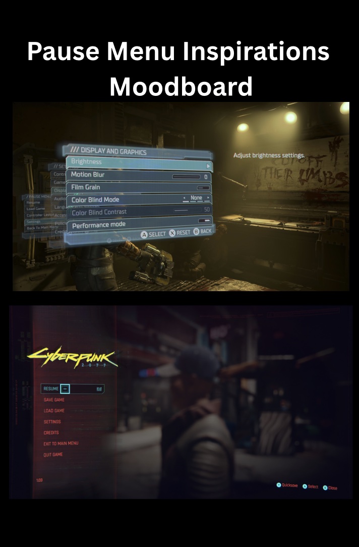
Here are some inspirations for the pause menu design. These pause menus come from video games that I have played, Dead Space Remake (2023) and Cyberpunk 2077. These are games that I thought were suitable for the design of the pause menu of this game, as they are of the same theme, and the pause menus have all the elements that we are looking for in our pause menu. Canva had all the tools to help create these moodboards. (Canva, 2025)
Here is a downloadable copy of my CV, which is also available on my experience page.
I would like to thank everyone in my group Dan King, Dan Peters, Kanchan and Josh for helping me with this group project if it wasn't for all of you I don't think I would have been able to do all of this.
IStock (2025) Get free stock photos, illustrations and videos. Available at: https://www.istockphoto.com
[Accessed at 1st May 2025].
Unsplash (2025) The internet’s source for visuals.
Powered by creators everywhere. Available at: https://unsplash.com
[Accessed at 3rd May 2025].
Shutterstock(2003-2025) One library, millions of ways to tell your story. Available at: https://www.shutterstock.com/?consentChanged=true
[Accessed at 2nd May 2025].
Idea Development: Logos
Main Menu
Pause Menu
Settings
Timer and Life Gauge
DVD Case
Sketches
Annotations
List of programs used
Research
Team Work
Client Conversations
Handover Documents
Reflection
Conclusion: Did I do enough research
Conclusion: What model plan did you follow if any?
Conclusion: What would you change in your role?
References
Bibliography
Mood Boards

CV:
Download CV
Acknowledgement
Key Research References